Feedback from my users
-
@mschwartz you should be able to add a widget with such a "register now!!" message.
-
@PitaJ said in Feedback from my users:
@mschwartz you should be able to add a widget with such a "register now!!" message.
It can be on/off depending on if the user is already registered/logged in?
-
@mschwartz said in Feedback from my users:
In the admin cp, I am verifying their IP is not some bot from China or whatever and then verifying the email manually by selecting the user and choosing “validate email” from the menu. The user is being sent a “please verify your email address, click here” email and when they click on the link in the email, they get a 404 type page.
Are they seeing this after you've already validated their email address, or is it the email sent upon register? If you've manually validated their email then it explains why the link is 404, because the code no longer exists since the account is now validated.
-
@julian They are clicking on the link in the email after I validate the email manually. Think about what the user sees!
“Click here to verify your email” -> 404.
I don’t want the email sent out at all. I am not requiring the user to enter an email address.
At worst case the user should see something like “your email address has already been validated, you are good to go!”
-
-
When they sign up, they enter an email address on the registration form.
I have registrations moderated, so they go into the queue. I have require email turned off.
Once in the queue, I check the IP and select the user(s) and choose “validate email” from the menu.
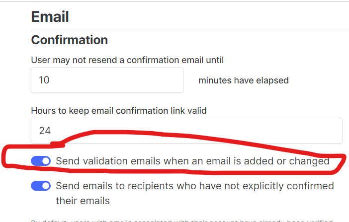
In the process, somewhere along the way, the user who registered is getting this “validate your email address” email. I want to disable this feature entirely! It is unneeded, since I am validating the email manually and because the user is in the moderation queue and can’t post until I approve.
I have no idea if the user is clicking right away (not likely) or after I validate their email. The latter is likely since they are getting the 404 and complaining to me about it by email. I really don’t like having to deal with complaints by email. And I have no idea what word of mouth is happening saying the site is not working right.
Like I said, instead of 404, how about “your registration is successful” - can’t you tell on the server side that the user is valid?
-
Another problem is that the post quote/reply/upvote/3 dots (menu) buttons are hidden and people don’t even realize they are there.
It’s slick to hide and show them, but my users don’t grok it.
Is there a way to have them show on every post all the time?
-
@mschwartz said in Feedback from my users:
Is there a way to have them show on every post all the time?
[component="post/actions"] { opacity: 1 !important } -
@josef said in Feedback from my users:
@mschwartz said in Feedback from my users:
Is there a way to have them show on every post all the time?
[component="post/actions"] {
    opacity: 1 !important
}
Thank you!
-
@josef said in Feedback from my users:
@mschwartz said in Feedback from my users:
Is there a way to have them show on every post all the time?
[component="post/actions"] {
    opacity: 1 !important
}
Worked like a champ. I’m truly dealing with computer illiterate people. I’m exchanging text messages and emails explaining “tap on the post and these buttons appear” with before and after screenshots. They don’t get it.
The constant complaints are that the site is too hard to use and not intuitive. A small fix like this goes a long way.
Thanks again “
-
There’s still this issue to resolve.
On my desktop browser, not so much a problem. But in my iPad…

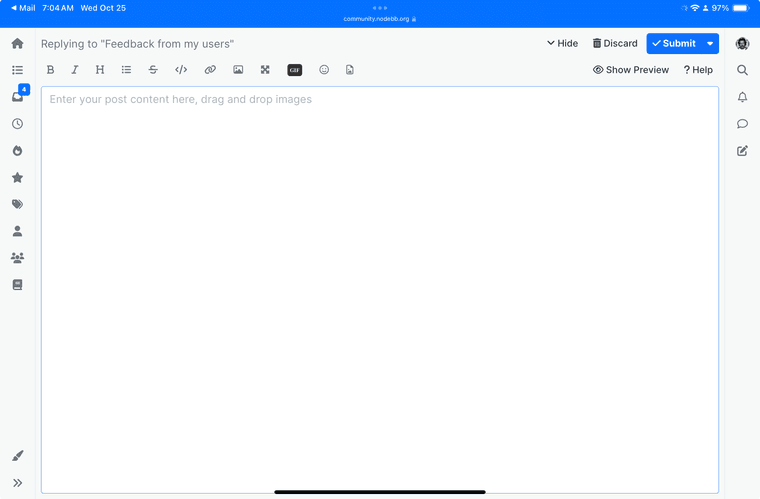
The editor obscures the entire content between the left/right toolbars. Click on any of the left/right toolbar buttons and it appears nothing happens because the editor is still there obscuring the new content.
I’ve already made the discard button bright red. But it’s not out of the box…
-
@mschwartz would minimizing the composer automatically when hitting those buttons be better?
The risk is that they then can't find what they were working on.
-
@PitaJ said in Feedback from my users:
@mschwartz would minimizing the composer automatically when hitting those buttons be better?
The risk is that they then can't find what they were working on.
Sure would be! And if no title or content, just throw it away….
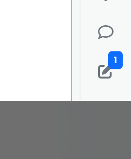
It would show up like this:

-
A related “bug” (I call it a bug) is that when I type in the Quick Reply box some text, then click on the expand button (go to full blown editor) and click submit in the editor, my text is still in the Quick Reply box - clicking Quick Reply button ends up making the post twice.
-
@mschwartz said in Feedback from my users:
A related “bug” (I call it a bug) is that when I type in the Quick Reply box some text, then click on the expand button (go to full blown editor) and click submit in the editor, my text is still in the Quick Reply box - clicking Quick Reply button ends up making the post twice.
I don't see that happening here at community.nodebb.org


