Feedback from my users
-
The issue with many of the buttons is that they are icons that non tech people aren’t very familiar with.
Using CSS to color a button isn’t going to cut it. Many of them don’t even see the blue buttons until I tell them, “look upper right on the page.”
I think ntfy is neat, but users aren’t going to install a client for it.
I think any time a user clicks on a link in an email from the site and gets a 404, it’s a bug, don’t you? It should not send the email in the first place, and even if it must, it should put up a “you are already verified” kind of page, no?
Again, I’m just passing on the problems I’m seeing with trying to get new users using the site. We have hundreds of site visitors and many of them don’t realize the cryptic button on the right side means “register for an account.”
It is what it is. Feedback

-
I love the topic, but I agree that it requires a load on the brain 🧠, there is no feeling of instantly joining the forum, first you need to make an effort to get comfortable, get used to the interface
 this is probably what scares and confuses some users, including the category of young people 20-35, It's difficult even for them.
We need to find a compromise and calibrate Harmony for everyone!
I have an idea to improve Harmony, but I will need your help.
I want each of you who noticed the inconvenience of using the forum to find a site on the Internet with easy navigation/menu/text editor and send here a screenshot of this site.
Any website (Facebook, Instagram, YouTube, Twitter), whatever, the main thing is to determine which design element is the most convenient and intuitive for all age groups.
When publishing a screenshot, specify the version of the site: mobile or desktop (it will be better if you publish several versions at once for comparison)
-
A really easy change that would make the software much easier to use is having the left/right toolbars expanded by default. If for new users only, fine.
People just don’t get what the icons mean, don’t get it that they can hover and get tooltips.
What we developers think is obvious may not be obvious to non techies.
When I suggested people click on the >> button, lower left, use of the site definitely increased.
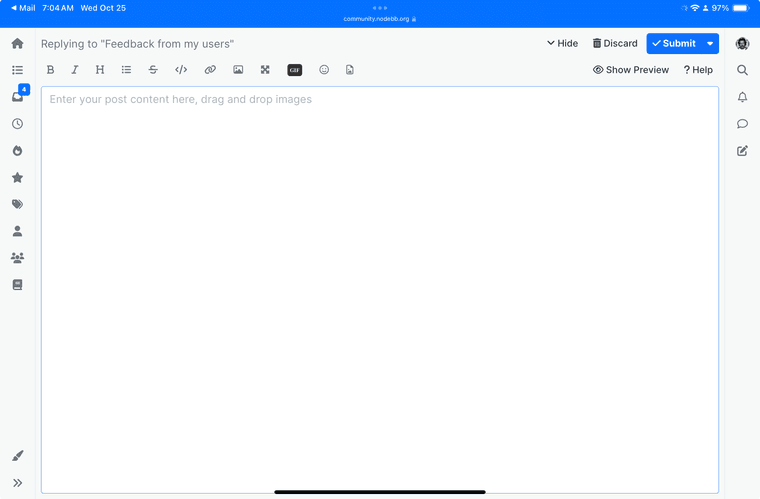
The problem with the editor obscuring everything after clicking on new topic is a big deal. All of the buttons left/right appear to do nothing and the editor just stays there. It can’t be hard to have it minimize to the “drafts” state if people click away. If the editor is empty, no point in even making it a draft.
My users don’t grasp the concept of categories. They will after using the site for a while, but the categories page as home page was not good for my site. I changed the default home page to recent topics and views and membership increased a lot.
I do get it. I run a sports site (600K monthly page views) with numerous categories (sports -> leagues -> teams) and my users there have no problem. That site is running XenForo. However, my biggest team fan forum has its own URL and people just bookmark that or type in the URL.
For my purposes in having a general purpose collaboration website, this isn’t a solution…
-
The email validation thing is definitely hurting my site’s ability to sign up new users. To describe it again: user signs up and enters email address. In the admin cp, I am verifying their IP is not some bot from China or whatever and then verifying the email manually by selecting the user and choosing “validate email” from the menu. The user is being sent a “please verify your email address, click here” email and when they click on the link in the email, they get a 404 type page. I get dozens of emails asking about their registration status. I think some users are just giving up on even trying the site at that point. I do not have “require email” option even on in the admin settings.
The lack of any real attention grabbing “sign up here!” kind of advert is making it so I get thousands of views and hundreds of unique visitors but few signups.
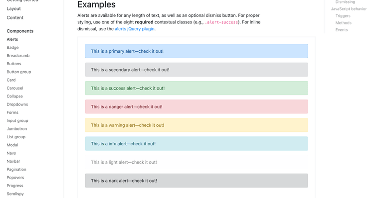
A pop up dialog would work (on page load), or a Bootstrap style Alert at the very top of every page with a link to the register and signup pages would be good on every page. Ideally, I would be able to edit the content of the alert to be whatever text I choose.

-
@mschwartz you should be able to add a widget with such a "register now!!" message.
-
@PitaJ said in Feedback from my users:
@mschwartz you should be able to add a widget with such a "register now!!" message.
It can be on/off depending on if the user is already registered/logged in?
-
@mschwartz said in Feedback from my users:
In the admin cp, I am verifying their IP is not some bot from China or whatever and then verifying the email manually by selecting the user and choosing “validate email” from the menu. The user is being sent a “please verify your email address, click here” email and when they click on the link in the email, they get a 404 type page.
Are they seeing this after you've already validated their email address, or is it the email sent upon register? If you've manually validated their email then it explains why the link is 404, because the code no longer exists since the account is now validated.
-
@julian They are clicking on the link in the email after I validate the email manually. Think about what the user sees!
“Click here to verify your email” -> 404.
I don’t want the email sent out at all. I am not requiring the user to enter an email address.
At worst case the user should see something like “your email address has already been validated, you are good to go!”
-
-
When they sign up, they enter an email address on the registration form.
I have registrations moderated, so they go into the queue. I have require email turned off.
Once in the queue, I check the IP and select the user(s) and choose “validate email” from the menu.
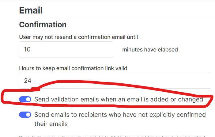
In the process, somewhere along the way, the user who registered is getting this “validate your email address” email. I want to disable this feature entirely! It is unneeded, since I am validating the email manually and because the user is in the moderation queue and can’t post until I approve.
I have no idea if the user is clicking right away (not likely) or after I validate their email. The latter is likely since they are getting the 404 and complaining to me about it by email. I really don’t like having to deal with complaints by email. And I have no idea what word of mouth is happening saying the site is not working right.
Like I said, instead of 404, how about “your registration is successful” - can’t you tell on the server side that the user is valid?
-
Another problem is that the post quote/reply/upvote/3 dots (menu) buttons are hidden and people don’t even realize they are there.
It’s slick to hide and show them, but my users don’t grok it.
Is there a way to have them show on every post all the time?
-
@mschwartz said in Feedback from my users:
Is there a way to have them show on every post all the time?
[component="post/actions"] { opacity: 1 !important } -
@josef said in Feedback from my users:
@mschwartz said in Feedback from my users:
Is there a way to have them show on every post all the time?
[component="post/actions"] {
    opacity: 1 !important
}
Thank you!
-
@josef said in Feedback from my users:
@mschwartz said in Feedback from my users:
Is there a way to have them show on every post all the time?
[component="post/actions"] {
    opacity: 1 !important
}
Worked like a champ. I’m truly dealing with computer illiterate people. I’m exchanging text messages and emails explaining “tap on the post and these buttons appear” with before and after screenshots. They don’t get it.
The constant complaints are that the site is too hard to use and not intuitive. A small fix like this goes a long way.
Thanks again “
-
There’s still this issue to resolve.
On my desktop browser, not so much a problem. But in my iPad…

The editor obscures the entire content between the left/right toolbars. Click on any of the left/right toolbar buttons and it appears nothing happens because the editor is still there obscuring the new content.
I’ve already made the discard button bright red. But it’s not out of the box…
-
@mschwartz would minimizing the composer automatically when hitting those buttons be better?
The risk is that they then can't find what they were working on.


