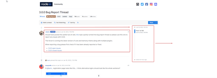
3.0.0 Bug Report Thread
-
Thanks about the bugs resolved.
There is a code for category icons to be back ?
-
@baris add or replace ?

<div class="category-children row row-cols-2 g-2"> {{{ each ./children }}} {{{ if !./isSection }}} <span class="category-children-item small"> {{{ if ./link }}}{buildCategoryIcon(@value, "24px", "rounded-circle")} <a href="{./link}">{./name}</a> {{{ else }}} <a href="{config.relative_path}/category/{./slug}">{./name}</a> {{{ end }}} </span> {{{ end }}} {{{ end }}} </div> -
Ok thanks my friend, I test it
-
Hello @baris
I just upgraded this morning and I see that. When a topic has a label it's no longer displayed on the left but on the right.
Instead we have the avatar of the creator of the topic.The topic selector is now below the topic icon
--> I don't know if it's normal...

-
-- Other bugs with Recent Card Widget and Font Awesome Pro loaded on custom header ACP, if you use a Pro version of Font Awesome that you use via the ACP/Custom Header like this :
<!-- Font Awesome 6 Pro -->
<link href="/assets/customfonts/FontAwesome-Pro-6.3/css/all.css" rel="stylesheet" />
--> The arrows in the Recend Card are not displayed correctly :

-
-- There is something that bothers me a little in the topics @baris , in particular on the scroller container and the screen width used for reading.
In fact, very little space (screen width) is used for reading.
It would be a good idea to widen this space and shift the slider to gain a little bit.We finally lose a considerable amount of reading space

-
@DownPW This should fix that
@media (min-width: 1200px) {
.page-topic .topic .posts {
    max-width: 1200px;
    width: 1200px;
  }
}
And
@media (min-width: 1400px) {
.container, .container-lg, .container-md, .container-sm, .container-xl, .container-xxl {
    max-width: 1320px;
  }
}
-
@DownPW most of those are normal design changes to harmony, not sure about the fontawesome pro icons, but you can probably fix the position of the arrows via css.
@FrankM you screenshot looks
 to me. What's wrong?
In fact, very little space (screen width) is used for reading.
Actually reading text is easier when it is narrow, think about books/newspapers. If you want you can change it with css @phenomlab provided.
-
Yep ok I'm sure for font awesome pro, if I don't use it, Recent card is ok
-
@baris said in 3.0.0 Bug Report Thread:
To bring back icons for sub categories you need to add
{buildCategoryIcon(@value, "24px", "rounded-circle")}at https://github.com/NodeBB/nodebb-theme-harmony/blob/main/templates/partials/categories/item.tpl#L23I think i got the icons back in this view!?
-
 J julian referenced this topic on
-
@julian said in 3.0.0 Bug Report Thread:
@FrankM If you updated the theme, then that change you made manually will have to be re-done.
After upgrade my forum to rc2 i got this.

I thought the forum icons were supposed to be displayed there? Or am I understanding something wrong?
Sorry, english is not my main language
Thanks for rc2

-
Maybe explain cli commands to update rc1 (devellop) to RC2 (main) correctly ?
Oups talk to fast


NodeBB v3.0.0-rc.2 — the second release candidate
Hi all! If you've been browsing this forum in the past two weeks, you'll have noticed a couple of design changes. Thanks for @baris and @vladstudio for worki...
NodeBB Community (community.nodebb.org)
-
 B baris forked this topic on
-
 J julian referenced this topic on

