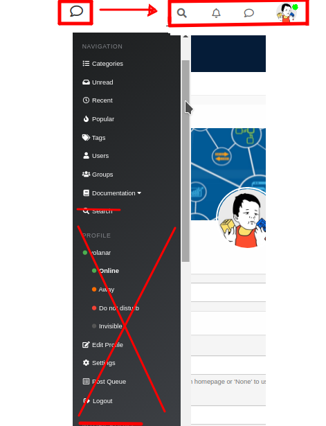
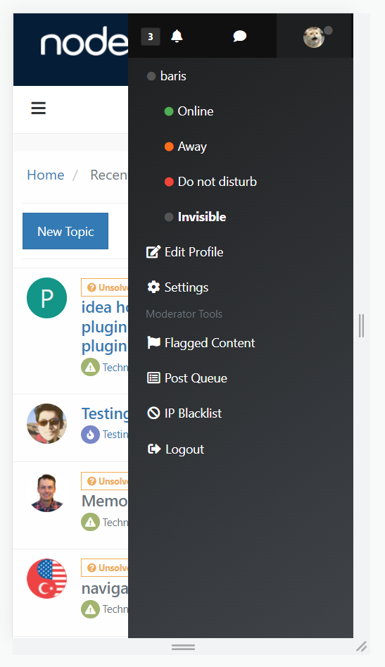
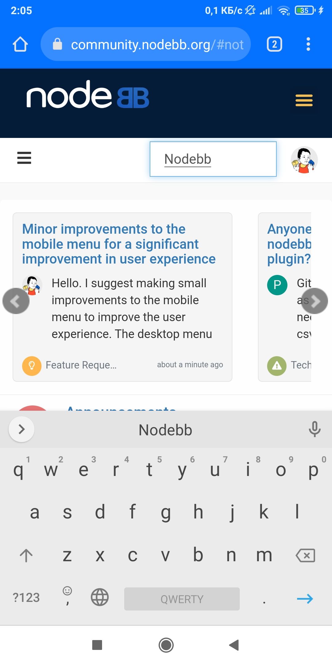
Minor improvements to the mobile menu for a significant improvement in user experience
-
@crazycells said in Minor improvements to the mobile menu for a significant improvement in user experience:
That is also what set us apart from others... all other related subject forums turned into "facebook groups", whereas we advanced quite well...
Alas, such was/is not the case for my forums - we lost the war of attrition to a competing Facefart Group. I only keep them up for historical value at this point. Sad. Not to mention embarrassing. I could maybe have "saved them" if I were a NodeJS developer and rolled out some custom functional plugins. Oh yeah, banning hate politics likely put quite a few nails in the coffin.

As for the breakdown of mobile versus "conventional", I expected to see the same, based on preconceived "common wisdom". Then I tossed up a Matomo instance and saw a different picture. At least among the fewer and fewer members who posted more interesting stuff w/a bit of substance to it. Conversely , the mobile user dominates the lookie-lou's and quick drive by posts.
@phenomlab said in Minor improvements to the mobile menu for a significant improvement in user experience:
Certainly agreed for screen sizes over 1200px, but absolutely should be considered for viewports up to 767px.
Cool that NodeBB is blessed with a nice adaptive UI, eh?

Caveat: My members are a bit older and not necessarily "tech types" so that may account for the workstation bias among registered members.
-
@crazycells said in Minor improvements to the mobile menu for a significant improvement in user experience:
can I see your website please? just curious. I do agree with you about content quality.
Uh, yeah, missed this bit...
A few examples of threads I consider "high quality":
-
https://forums.redpointuniversity.com/topic/186/cerro-torre-trip-report-ancient-climbing-history
-
https://forums.redpointuniversity.com/topic/151/fitzroy-loomes-trip-report-ancient-history
That last one has become pretty much THE definitive source on the 'net on that topic. Lots and lots of hits from all over world yet - or at least last time I looked.

I guess my forums were not a total fail in that threads such as these:
-
https://forums.redpointuniversity.com/topic/10/random-photo-thread
-
https://forums.redpointuniversity.com/topic/227/winter-climbing
motivated change amongst the competition in the form of allowing much higher quality images than previously and fewer/no advertisements (e.g. Mountain Project Forums), wh/used to distinguish us from the "competition"
And I guess while I am at it, I should point to the prior community my forums were supposed to replace - a long running community of almost two decades before being taken over and destroyed by hate politics: SuperTopo Forums and copyright violations. The latter of which resulted in some big lawsuit so the operators summarily deleted all images. This combined with post by users who were banned being deleted made for pretty spotty review of long running threads that referenced them. Hence I had to enforce the no politics rule, defying expectations, and likely prompting many to jump to the Facefart group but I was simply not going to host that 'chit.
Speaking of expectations, the "old" ST forums were such that people posted to long running threads with massive topic creep. Endeavoring to have even minimal information hierarchy rubbed many of these independent rock jock types the wrong way because nobody is going to tell them what to do, nor how to do it... After 18 years certain behaviors had become deeply ingrained. Change was tough, but after some months, most feedback was that it was for the best. Nevertheless, many still missed and longed for "the good 'ol days".
Alrighty, 'nuff w/the sour grapes.
Edit: As long as I am driftin'... for those who may have missed it @Julian-H-Lam posted up a bee loggin' post a couple years back that is pretty spot on:
https://nodebb.org/blog/thoughts-on-content-ownership-and-long-meaningful-discussions/
I would love to have a long running, meaningful conversation about how the heck any of us small operators are supposed to survive the evil Meta, Inc.
-
-
@gotwf said in Minor improvements to the mobile menu for a significant improvement in user experience:
I would love to have a long running, meaningful conversation about how the heck any of us small operators are supposed to survive the evil Meta, Inc.
I'm more than happy to host that discussion over at sudonix if you want to start the thread

-
You might be able to address some of these issues to some degree of satisfaction with custom CSS and possibly even javascript in a theme fork, but I'll defer to those that know on the javascript point.
-
@phenomlab said in Minor improvements to the mobile menu for a significant improvement in user experience:
I'm more than happy to host that discussion over at sudonix if you want to start the thread
I'd rather discuss it here - larger community affords more opportunity for greater input. Maybe @julian or someone with mod bits can fork this thread?
Or not. Cuz I have discussed this with more than a few folks and we all pretty much end up chasing our tails. How to maintain parity, much less beat, a stacked deck?
-
@gotwf said in Minor improvements to the mobile menu for a significant improvement in user experience:
@crazycells said in Minor improvements to the mobile menu for a significant improvement in user experience:
can I see your website please? just curious. I do agree with you about content quality.
Uh, yeah, missed this bit...
Thanks for sharing @gotwf , you have a very good forum.
Am I right to assume the audience of your forum is rather limited (university folks) than general (general public)? I guess that explains your argument because I can see those folks are spending more time in front of the computer than using phones to browse the forums.
-
@crazycells Even if users rarely access from mobile devices (which I doubt), this does not mean that the mobile menu should be inconvenient. Or am I wrong?
-
@volanar said in Minor improvements to the mobile menu for a significant improvement in user experience:
@crazycells Even if users rarely access from mobile devices (which I doubt), this does not mean that the mobile menu should be inconvenient. Or am I wrong?
Yes, of course. I was just explaining @gotwf 's perspective

I think most forums have more general audience/public, therefore in most forums I am sure mobile users will pass desktop users in numbers.
-
@crazycells I think the more convenient the forum, the more users will stay on the forum. For example, in e-commerce, the positioning of elements is very important. If the layout of the elements does not meet common standards, then the number of purchases will decrease dramatically. Usability is one of the main factors for the success of the forum. No one wants to deal with an inconvenient platform
-
-
@baris said in Minor improvements to the mobile menu for a significant improvement in user experience:
Not sure about the dropdowns in the navigation, if a site uses too many of them it might be too many items if they are visible by default.
I see. Since I felt that the left side window is quite plain now, it can take some lists/items easily.
-
@crazycells Yeah there are forums out there using the dropdowns heavily. For example


