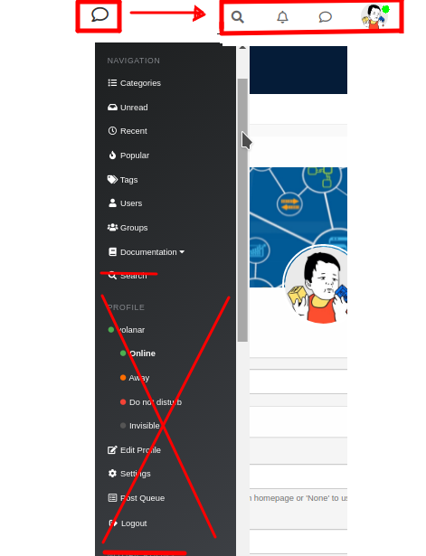
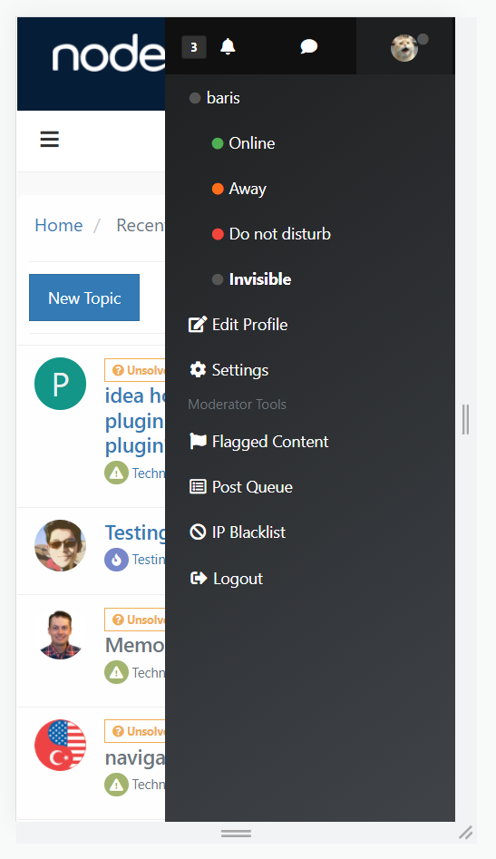
Minor improvements to the mobile menu for a significant improvement in user experience
-
@gotwf said in Minor improvements to the mobile menu for a significant improvement in user experience:
@crazycells said in Minor improvements to the mobile menu for a significant improvement in user experience:
can I see your website please? just curious. I do agree with you about content quality.
Uh, yeah, missed this bit...
Thanks for sharing @gotwf , you have a very good forum.
Am I right to assume the audience of your forum is rather limited (university folks) than general (general public)? I guess that explains your argument because I can see those folks are spending more time in front of the computer than using phones to browse the forums.
-
@crazycells Even if users rarely access from mobile devices (which I doubt), this does not mean that the mobile menu should be inconvenient. Or am I wrong?
-
@volanar said in Minor improvements to the mobile menu for a significant improvement in user experience:
@crazycells Even if users rarely access from mobile devices (which I doubt), this does not mean that the mobile menu should be inconvenient. Or am I wrong?
Yes, of course. I was just explaining @gotwf 's perspective

I think most forums have more general audience/public, therefore in most forums I am sure mobile users will pass desktop users in numbers.
-
@crazycells I think the more convenient the forum, the more users will stay on the forum. For example, in e-commerce, the positioning of elements is very important. If the layout of the elements does not meet common standards, then the number of purchases will decrease dramatically. Usability is one of the main factors for the success of the forum. No one wants to deal with an inconvenient platform
-
-
@baris said in Minor improvements to the mobile menu for a significant improvement in user experience:
Not sure about the dropdowns in the navigation, if a site uses too many of them it might be too many items if they are visible by default.
I see. Since I felt that the left side window is quite plain now, it can take some lists/items easily.
-
@crazycells Yeah there are forums out there using the dropdowns heavily. For example

-
@baris said in Minor improvements to the mobile menu for a significant improvement in user experience:
@crazycells Yeah there are forums out there using the dropdowns heavily. For example

yes, that would be a problem for those forums...
Do you think it is possible to implement "hide on mobile" "hide on desktop" options for the navigation bar? This way, everyone could edit the navigation bar icon for each medium; and can have different navigation options (in a different format) for mobile and desktop.
-
@crazycells Yes you can give custom class names there, I think you can even use the default bootstrap classes to hide it on mobile. Try
hidden-xsand it should not show up on mobile. -
@baris said in Minor improvements to the mobile menu for a significant improvement in user experience:
@crazycells Yes you can give custom class names there, I think you can even use the default bootstrap classes to hide it on mobile. Try
hidden-xsand it should not show up on mobile.Yes,
hidden-xsworks... Thanks a lot.
But I will probably go with something not default... so I do not have any problem/conflict in the future... I will go with
hiddeninmobilehiddenindesktopclasses and write custom CSS codes for various screen resolutions. -
@baris The inscription Navigation in the left mobile menu can be removed. Now it is not needed. Instead, add an X for closing, as in the standard menu.

If possible, add the word search... and an icon to enable search. As in this example


