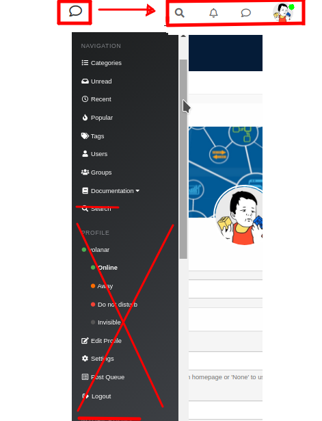
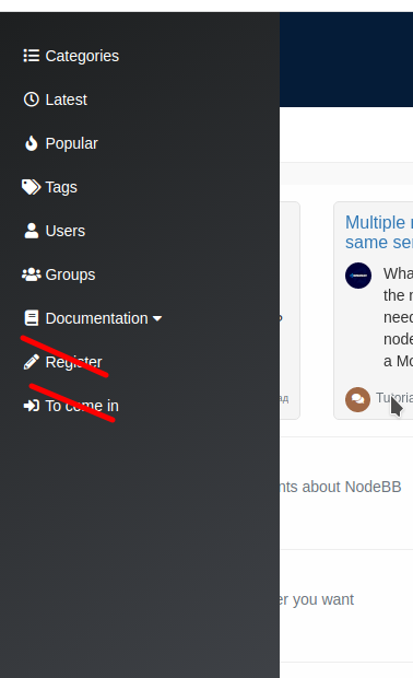
Minor improvements to the mobile menu for a significant improvement in user experience
-
@phenomlab said in Minor improvements to the mobile menu for a significant improvement in user experience:
@volanar A cheap workaround here would be to set the default homepage as recent

Why set up workarounds when you can do it more conveniently? We limit ourselves in the settings to only recent ones. We need to think about the convenience for all users
-
@baris said in Minor improvements to the mobile menu for a significant improvement in user experience:
The number on the profile image show the number of notifications. I guess you are talking about unread topics, which could be added to the left menu icon.
Yes, actually; I believe that is a very important addition. Unread topics counts should be seen on the sandwich menu icon, and the total number of notifications + private messages should be seen on the avatar.
Should I open a GitHub issue for this?
 Thanks.
 -
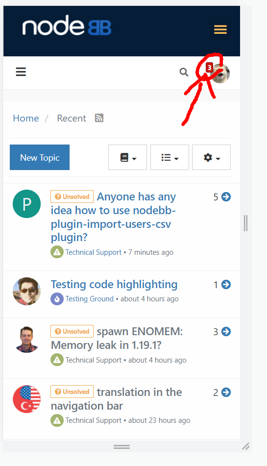
@baris And the last wish for creating the perfect mobile menu. Clicking on the number area takes you directly to messages, notifications, or unread messages. For example, in the photo, when you click on the number 3, you go to the notifications tab
-
https://i.imgur.com/6laLhwg.jpg
The number next to the notification bell is not deleted without clicking on the notifications. Wouldn't it be better if a button like read or close is added?
-
@kurulumu-Net said in Minor improvements to the mobile menu for a significant improvement in user experience:
https://i.imgur.com/6laLhwg.jpg
The number next to the notification bell is not deleted without clicking on the notifications. Wouldn't it be better if a button like read or close is added?
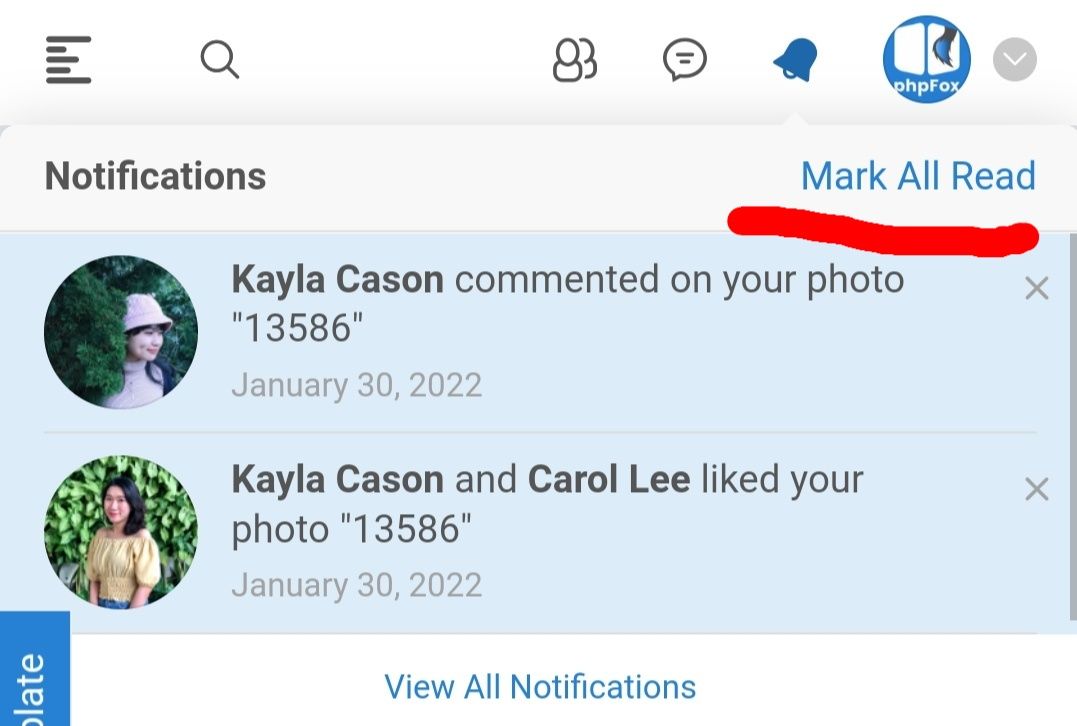
Yes. Should be similar to this example
-
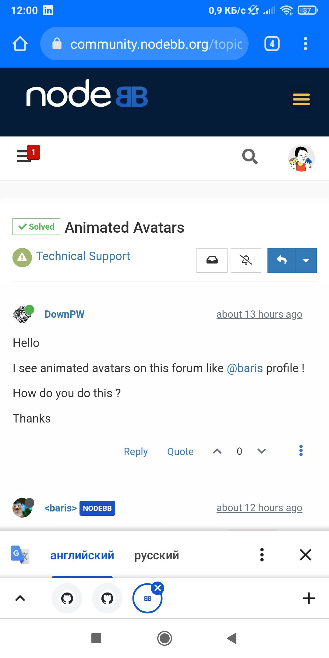
I have a bug. Counter disappears after page reload
-
@kurulumu-Net said in Minor improvements to the mobile menu for a significant improvement in user experience:
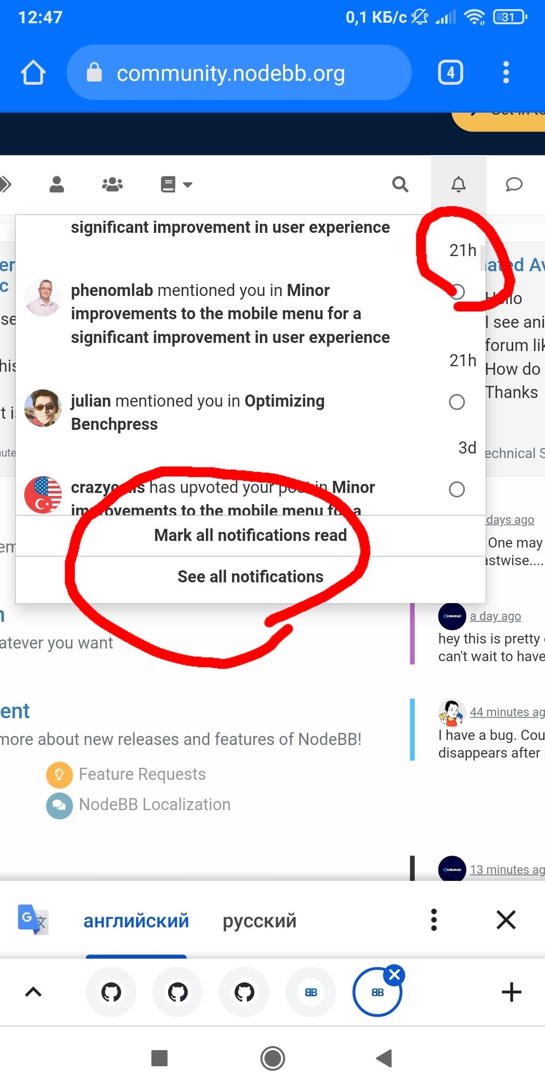
@volanar there are already explanations in the notifications. I think it should be marked as read.
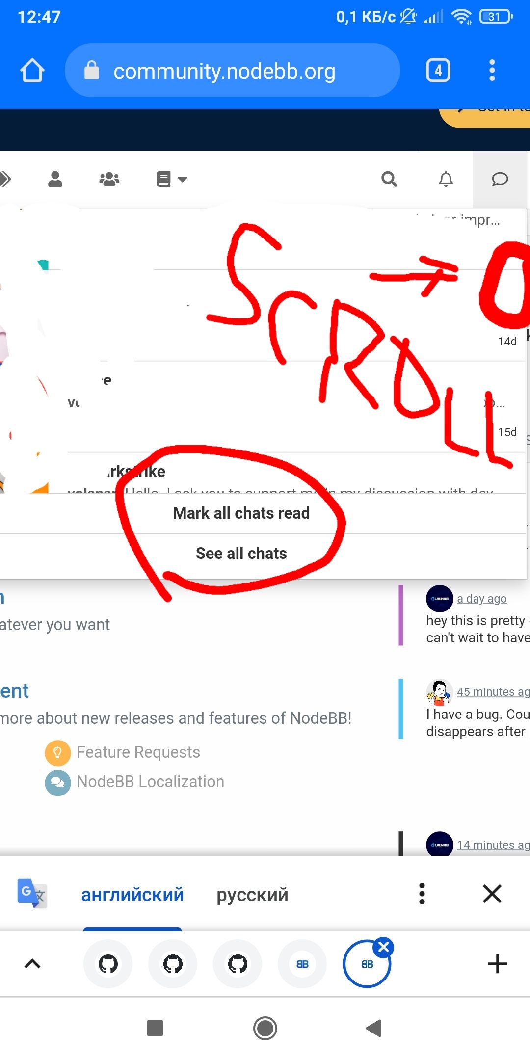
This functionality is available in the desktop version. We need to ask @baris to transfer it to the mobile version
-
The new right menu on Smartphone is good but there isn't not enough space for the site logo and title

See the screen shot on OnePlus 8T :

Any idea to handle this problem? @baris @phenomlab
-
@DownPW said in Minor improvements to the mobile menu for a significant improvement in user experience:
Any idea to handle this problem?
Use short logo
-
It's not just a logo, is a logo and site name (no logo, just police)
I will test to play with CSS because I want to keep logo and name site.
Not just logo or just name.
Maybe disable research function.it would be great to move the search icon which is very little used and put it back in a menu as before.
It's really a pity. what we gain in functionality, we lose in identity.
-
@DownPW said in Minor improvements to the mobile menu for a significant improvement in user experience:
It's not just a logo, is a logo and site name (no logo, just police)
I will test to play with CSS because I want to keep logo and name site.
Not just logo or just name.
Maybe disable research function.it would be great to move the search icon which is very little used and put it back in a menu as before.
It's really a pity. what we gain in functionality, we lose in identity.
I have a logo with a picture and a name. I created a logo in AAA logo and I'm happy. I advise you to make one logo and not use the name and image separately. That's what all good websites do.
-
@volanar said in Minor improvements to the mobile menu for a significant improvement in user experience:
That's what all good websites do.
Not sure I share that view

I have a logo and text. On mobile, I just hide the text and leave the logo showing

