Minor improvements to the mobile menu for a significant improvement in user experience
-
@baris said in Minor improvements to the mobile menu for a significant improvement in user experience:
@crazycells Yeah there are forums out there using the dropdowns heavily. For example

yes, that would be a problem for those forums...
Do you think it is possible to implement "hide on mobile" "hide on desktop" options for the navigation bar? This way, everyone could edit the navigation bar icon for each medium; and can have different navigation options (in a different format) for mobile and desktop.
-
@crazycells Yes you can give custom class names there, I think you can even use the default bootstrap classes to hide it on mobile. Try
hidden-xsand it should not show up on mobile. -
@baris said in Minor improvements to the mobile menu for a significant improvement in user experience:
@crazycells Yes you can give custom class names there, I think you can even use the default bootstrap classes to hide it on mobile. Try
hidden-xsand it should not show up on mobile.Yes,
hidden-xsworks... Thanks a lot.
But I will probably go with something not default... so I do not have any problem/conflict in the future... I will go with
hiddeninmobilehiddenindesktopclasses and write custom CSS codes for various screen resolutions. -
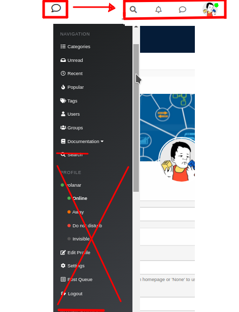
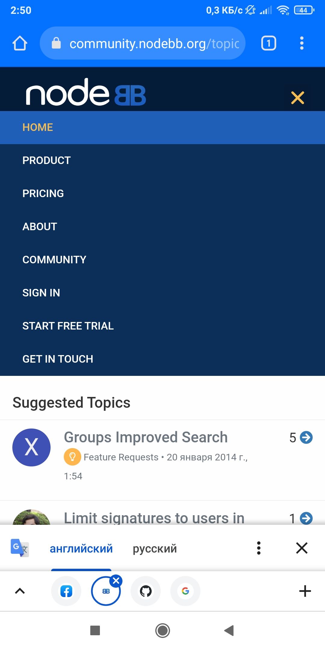
@baris The inscription Navigation in the left mobile menu can be removed. Now it is not needed. Instead, add an X for closing, as in the standard menu.
If possible, add the word search... and an icon to enable search. As in this example

-
@phenomlab said in Minor improvements to the mobile menu for a significant improvement in user experience:
@volanar A cheap workaround here would be to set the default homepage as recent

Why set up workarounds when you can do it more conveniently? We limit ourselves in the settings to only recent ones. We need to think about the convenience for all users
-
@baris said in Minor improvements to the mobile menu for a significant improvement in user experience:
The number on the profile image show the number of notifications. I guess you are talking about unread topics, which could be added to the left menu icon.
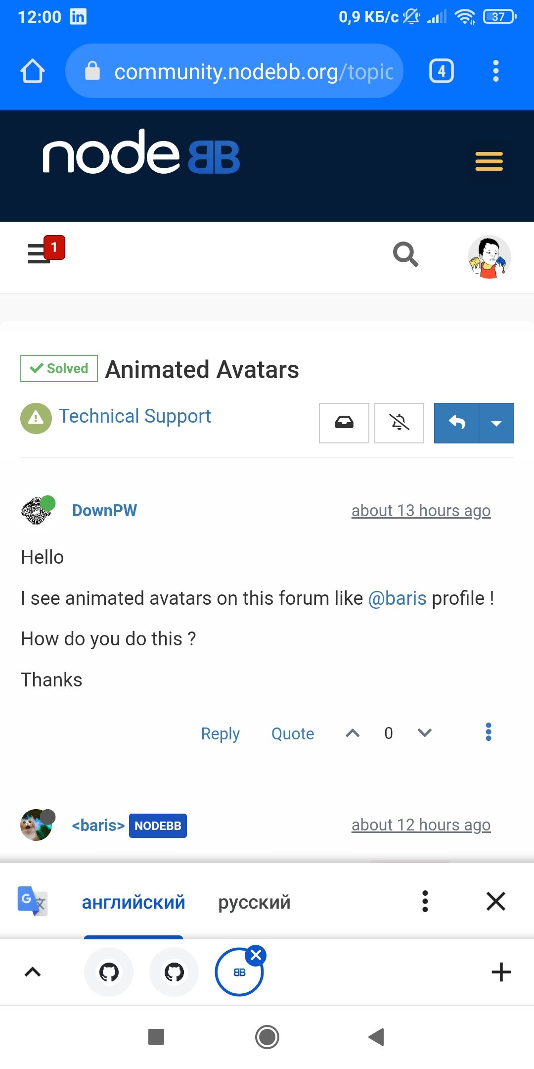
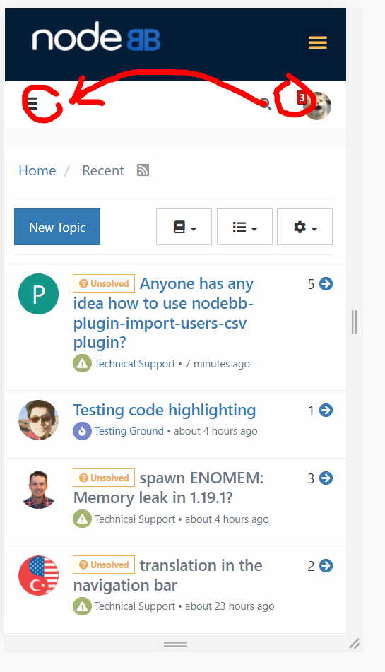
Yes, actually; I believe that is a very important addition. Unread topics counts should be seen on the sandwich menu icon, and the total number of notifications + private messages should be seen on the avatar.
Should I open a GitHub issue for this?
 Thanks.
 -
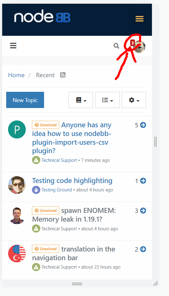
@baris And the last wish for creating the perfect mobile menu. Clicking on the number area takes you directly to messages, notifications, or unread messages. For example, in the photo, when you click on the number 3, you go to the notifications tab
-
https://i.imgur.com/6laLhwg.jpg
The number next to the notification bell is not deleted without clicking on the notifications. Wouldn't it be better if a button like read or close is added?
-
@kurulumu-Net said in Minor improvements to the mobile menu for a significant improvement in user experience:
https://i.imgur.com/6laLhwg.jpg
The number next to the notification bell is not deleted without clicking on the notifications. Wouldn't it be better if a button like read or close is added?
Yes. Should be similar to this example

-
I have a bug. Counter disappears after page reload
