3.7.0 Upgrade Support
-
@crazycells Yeah, @baris uses characters in his display name to test escaping... it looks like it is double-escaped when sent via ActivityPub.
Unrelated to v3.7.0
-
@cagatay You should re-check your site. NodeBB
3.7.0has breaking changes for this my extension - "Threaded Posts" because of the changes to the HTML structure in the posts view.The result is that the Threaded Posts extension fails to render as the target has changed. See below for a fix
https://sudonix.org/topic/569/threaded-post-support-for-nodebb/143
-
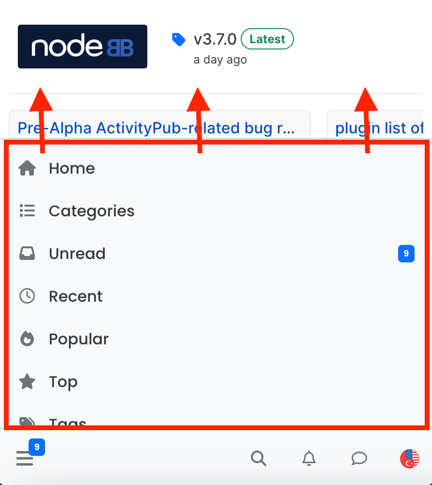
Hi @baris , I have a comment and a question about the navigation menu panel on mobile... what would be the easiest way to make this menu panel larger/longer on mobile?
I guess this is designed to be part of the "harmony" theme, but I believe a longer menu panel would be way more efficient. When someone wants to see the menu, I think it would make more sense to see all (or as many as possible) options at the same time, rather than opening a smaller panel? Basically, I do not need to see the background while I am selecting a menu option, right? Anyways, I respect the designer
 however, I would like to change the length of this menu panel on mobile for our forum without breaking anything else
  is there an easy way to achieve this? Thanks...
-
@crazycells that can easily be achieved using css.
-
@phenomlab then, please help
 I checked the developer tools, but failed to understand which parameters are determining this height...
 -
@crazycells let me have a look at this later today
-
@phenomlab said in 3.7.0 Upgrade Support:
@crazycells let me have a look at this later today
lol, I am ashamed to say this but I think I figured it out, and it was very easy... I believe this is the code?
.bottombar-nav .navigation-dropdown, .bottombar-nav .user-dropdown {
  max-height: 80vh !important;
}
Apparently, I was looking at the wrong parts of the CSS codes...
-
@crazycells yes, that would have been my suggestion to use
vhto control the height. -
@crazycells well, it is coded to be
60vh, I have changed it to80vh...I guess navigation dropdown is the left panel, and user dropdown is the right panel?
-
@crazycells if I recall correctly, yes
-
 J julian forked this topic on
-
I have encountered several issues while using the website on mobile, the bottom bar prevents the visibility of bottom sheet options
- When browsing sub-category options, tags/categories/topics filters, the bottom bar prevents the options from being fully visible on the screen. Sometimes, it doesn't appear on the first click, but the issue becomes more apparent when clicking on tags, categories, and filters sequentially. After clicking on the tag button, when categories are selected, the bottom bar reappears and prevents the visibility of all options.

- When using the website as a PWA, the tags list doesn't extend to the bottom of the screen. I have to manually pull the screen and drag it up to see the last tag options.
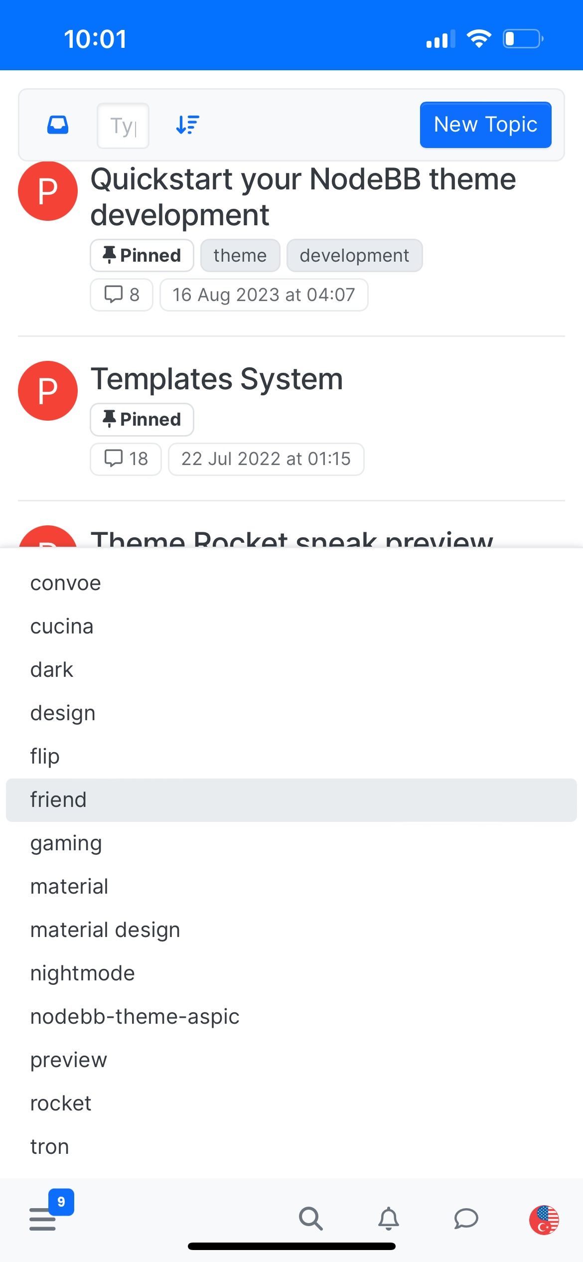
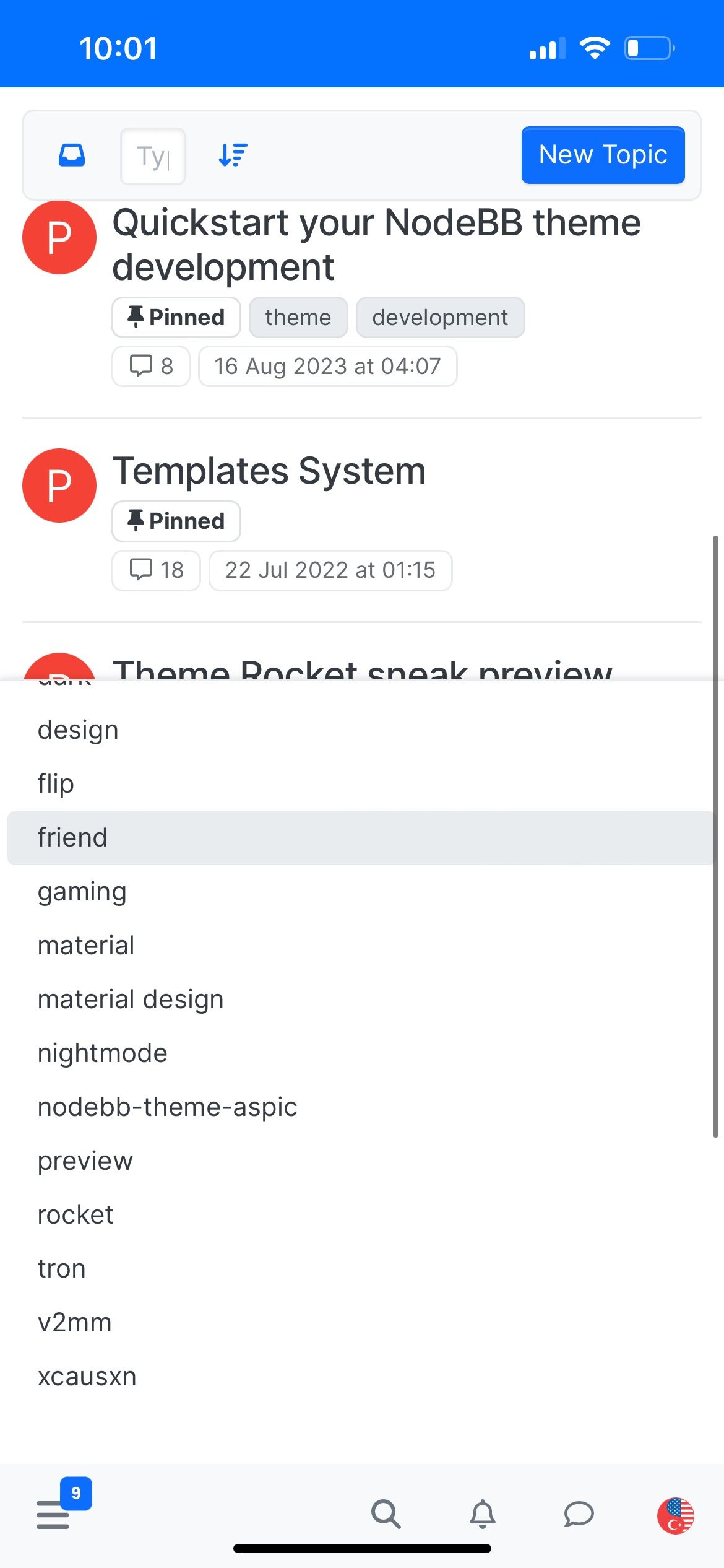
- This is more of an aesthetic critique rather than a bug... the tag screen on mobile uses excessive space unnecessarily. I suggest implementing two columns of tags instead of one, allowing for twice as many options to be visible on mobile screens at any time.
-
additionally, can you please extend this pagination bar on mobile for topics list? some of us have sausage fingers and cannot click on such a small area easily... lol...
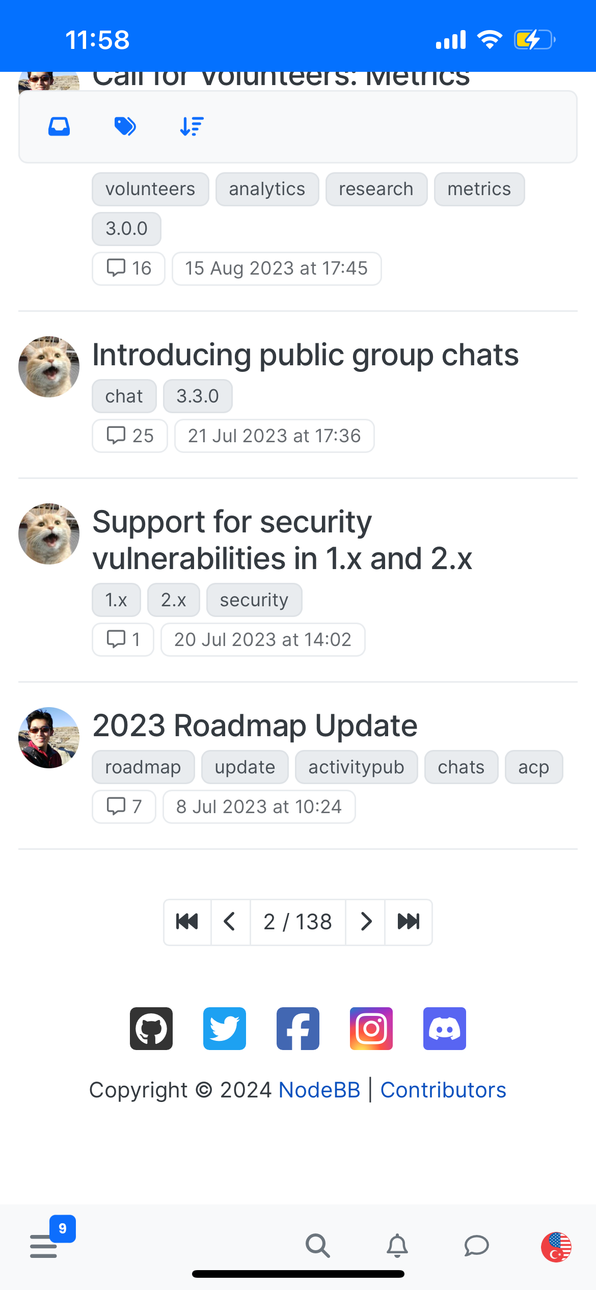
moreover, I guess you may want to update twitter logo to X...
-
-
-
 B baris unpinned this topic on

