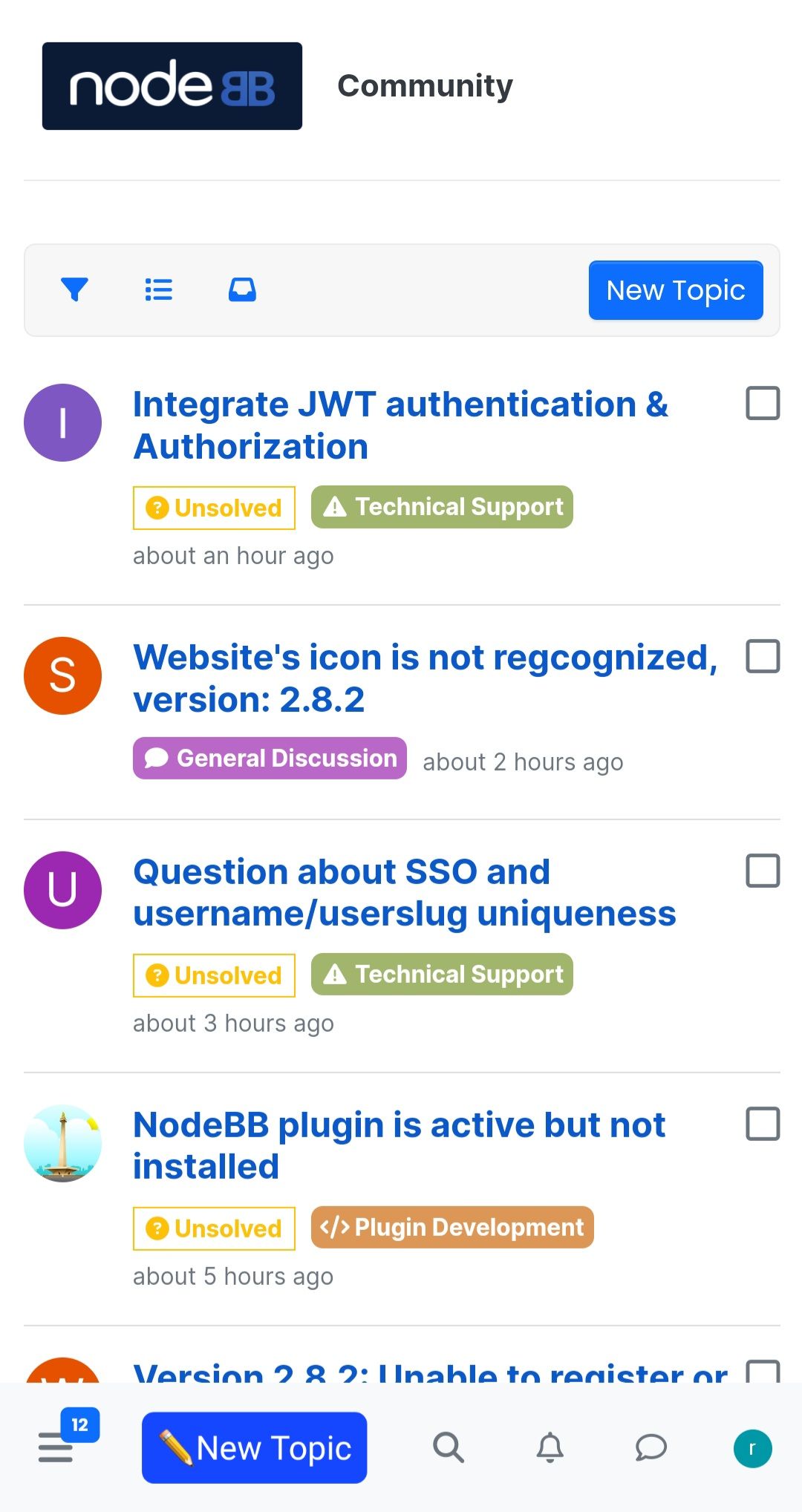
Change the place of new topic or post button
-
I agree and I was going to make similar recommendation myself
")
It would need some testing, as it could have a fat finger fail if the button is too large.
Perhaps it should be to the far right of the bottom bar. Something to consider alright.
-
I liked this idea

Since the logo is always at the top, that means that toolbar could be used for "login to post", "new topic", and "reply" buttons... -
I don't like this idea far from it and we already have the button in the bar in the header which is floating. No interest apart from overloading the bottom bar which will be overloaded on mobiles with small resolutions
-
@julian
Today, most of the phones that users use are taller than before
so that half or two-thirds of the page is more accessible
For this reason, the design goes towards most of the toolbars and the items that are used the most are placed at the bottom of the screen.Even if this is considered for the composer, the user experience will be much better
-
I have a Oneplus 8t which has a correct resolution and frankly if you put a reply button, you won't get anything else and it won't be pretty. because the bar won't have any space and won't be airy anymore like on your screenshot
On the other hand, this idea can be Ok for tablets but not smartphones
-
For what it's worth I also think that the elements we show in the bottom bar need to be curated carefully. Certainly there are times when you'd want to create a new topic, or reply to a topic, but I don't think it needs to be in as central a place as the bottom bar.
There are also multiple reply buttons along the topic, at the bottom-right of each post (those are visible all the time on mobile, too)
-
As for whether the top bar needs to be floating, that I think @baris and I are of two minds about

I think there doesn't even need to be a floating top bar at all, but I have a heavy emphasis on promoting the "reading" aspect of Harmony/NodeBB. This is why Baris added the "sticky toolbar" theme option

-
@julian said in Change the place of new topic or post button:
For what it's worth I also think that the elements we show in the bottom bar need to be curated carefully.
Exactlly
-
@DownPW Consider this - I am coming from the point of view as a iPhone 8 user, and I think it can be achieved.
You can see comparison here of specs re: display size differential https://versus.com/en/apple-iphone-8-vs-oneplus-8t
I will return with some screen shots.
-
@julian said in Change the place of new topic or post button:
For what it's worth I also think that the elements we show in the bottom bar need to be curated carefully.
Right now, it's a very good start.
Certainly there are times when you'd want to create a new topic, or reply to a topic, but I don't think it needs to be in as central a place as the bottom bar.
Yes to fully embrace the utility of the bottom nav
- no need to use 2nd hand or try to extend thumb
- within comfortable single digit range for one handed use.
Thus the top bar becomes totally superfluous to needs on mobile phone devices.
There are also multiple reply buttons along the topic, at the bottom-right of each post (those are visible all the time on mobile, too)
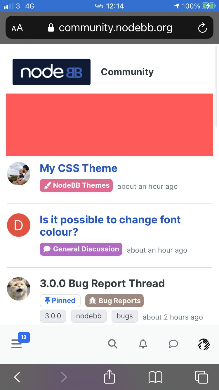
@julian ... ya snuck in your hide tool bar trick again...
 I might let you away with it this time, might...
 -
@julian said in Change the place of new topic or post button:
As for whether the top bar needs to be floating, that I think @baris and I are of two minds about
I think there doesn't even need to be a floating top bar at all...
Right, grand so let's find a way to get rid of it (more back to this point will follow), here is one reason why:
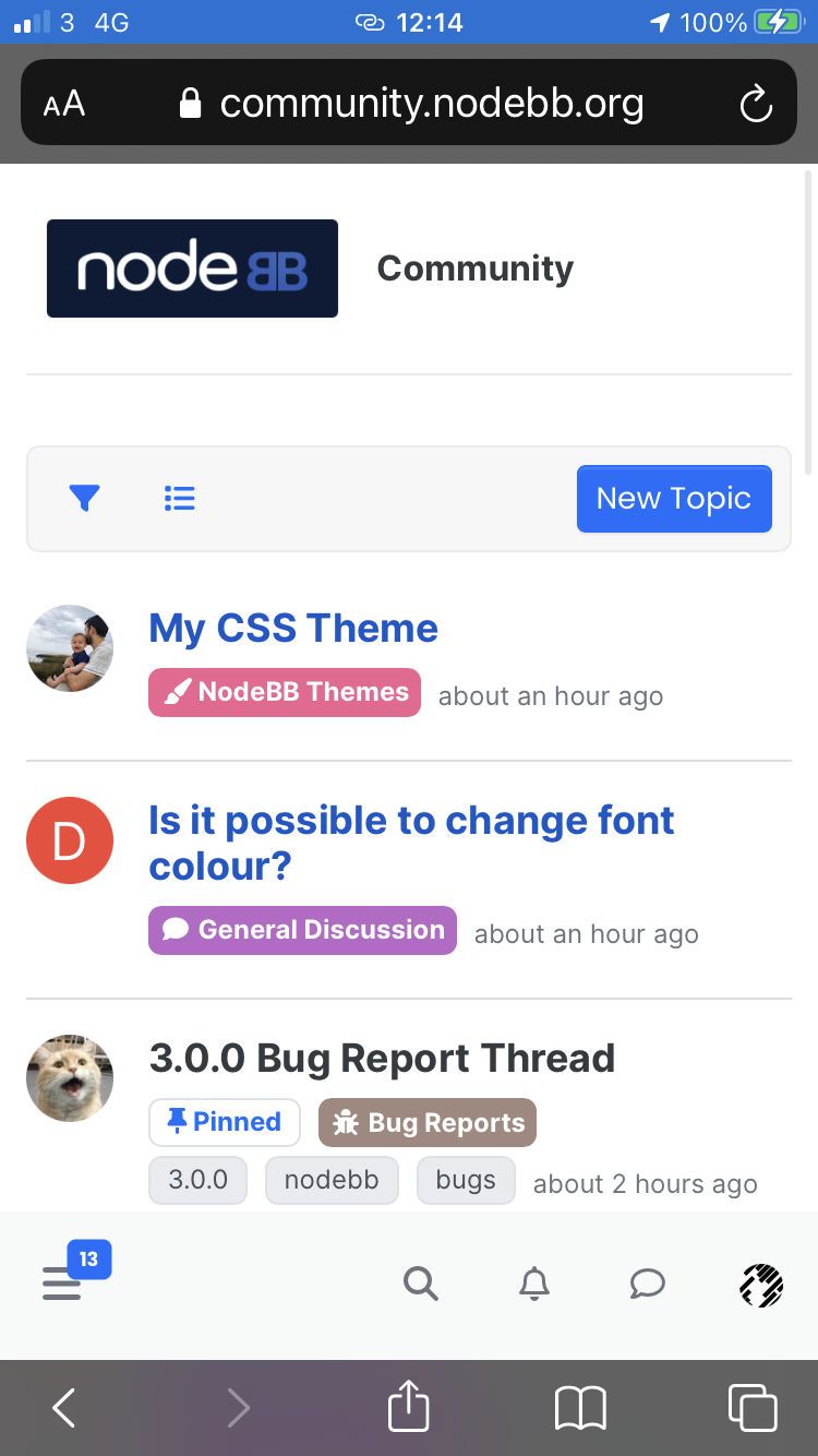
That's a whole topic listing used up by the toolbar!
... but I have a heavy emphasis on promoting the "reading" aspect of Harmony/NodeBB. This is why Baris added the "sticky toolbar" theme option
I need to test out that stick y tool bar, bu on the other point, I'm not totally following how this manifests, exactly what do you mean about the "reading emphasis" - I will say the font and formatting is much improved, some feedback on that later, but is that what you mean?
-
 J julian moved this topic from NodeBB Development on