3.0.0 Bug Report Thread
-
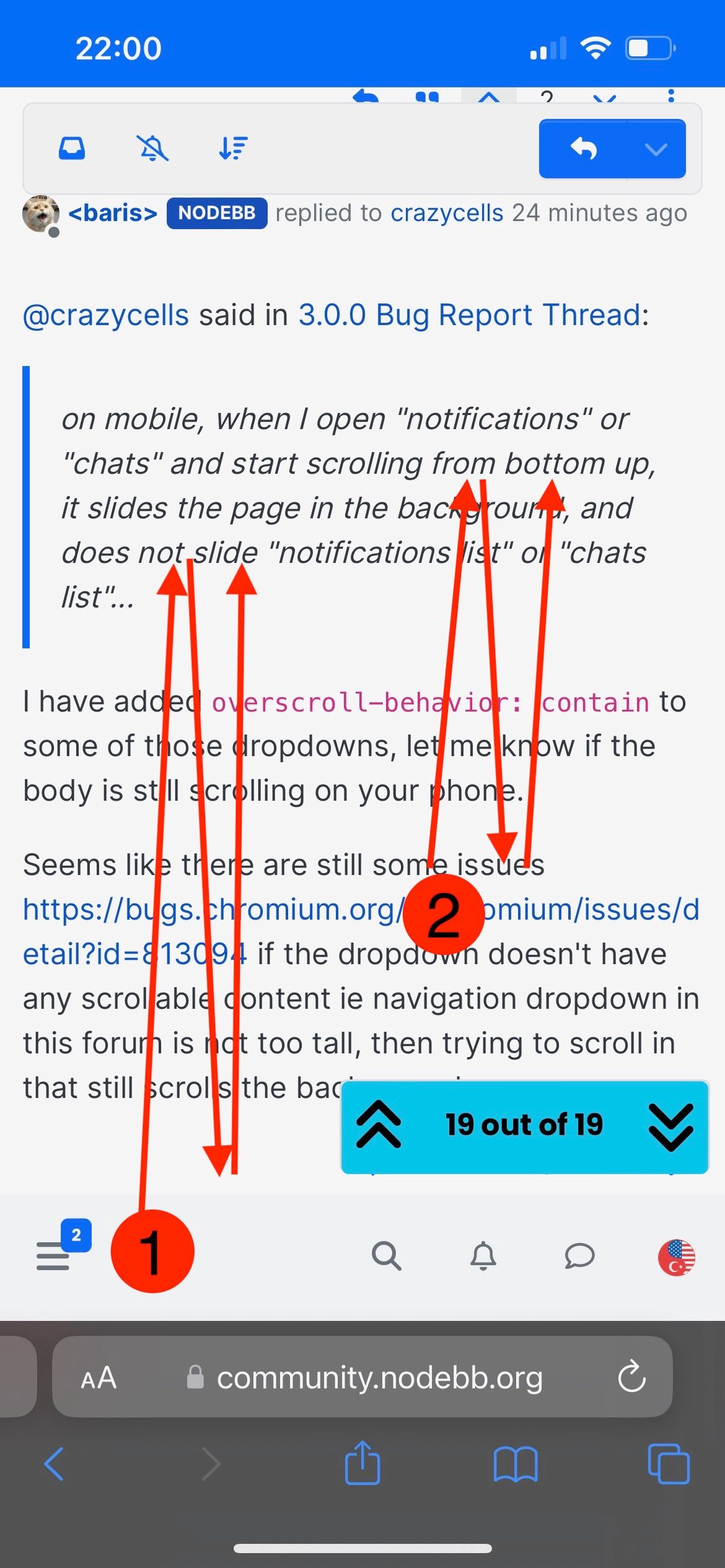
Hi @baris , please check the video here: https://app.box.com/s/mymxz8rsymfk5g80nmeooutz2608g73u
the first move is starting from the toolbar and going up and down (this moves the background)... the second move is starting from the middle of the screen and going up and down (this moves the foreground - namely notifications) ...
-
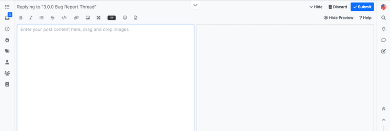
When the reply window is extended to the top, the "hide", "discard" and "submit" buttons on the upper right corner become unclickable.
-
@crazycells thanks, filed it https://github.com/NodeBB/NodeBB/issues/11181
-
I do not know if this is considered a bug, names are inconsistent in notifications...
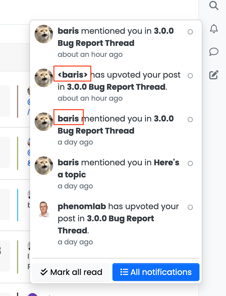
-
ha ha

keep the good work !
-
How to use NodeBB with new Bootstrap, but without with new theme dis-Harmony?
-
@d3ppsbtgsz just use the Persona theme instead of Harmony

-
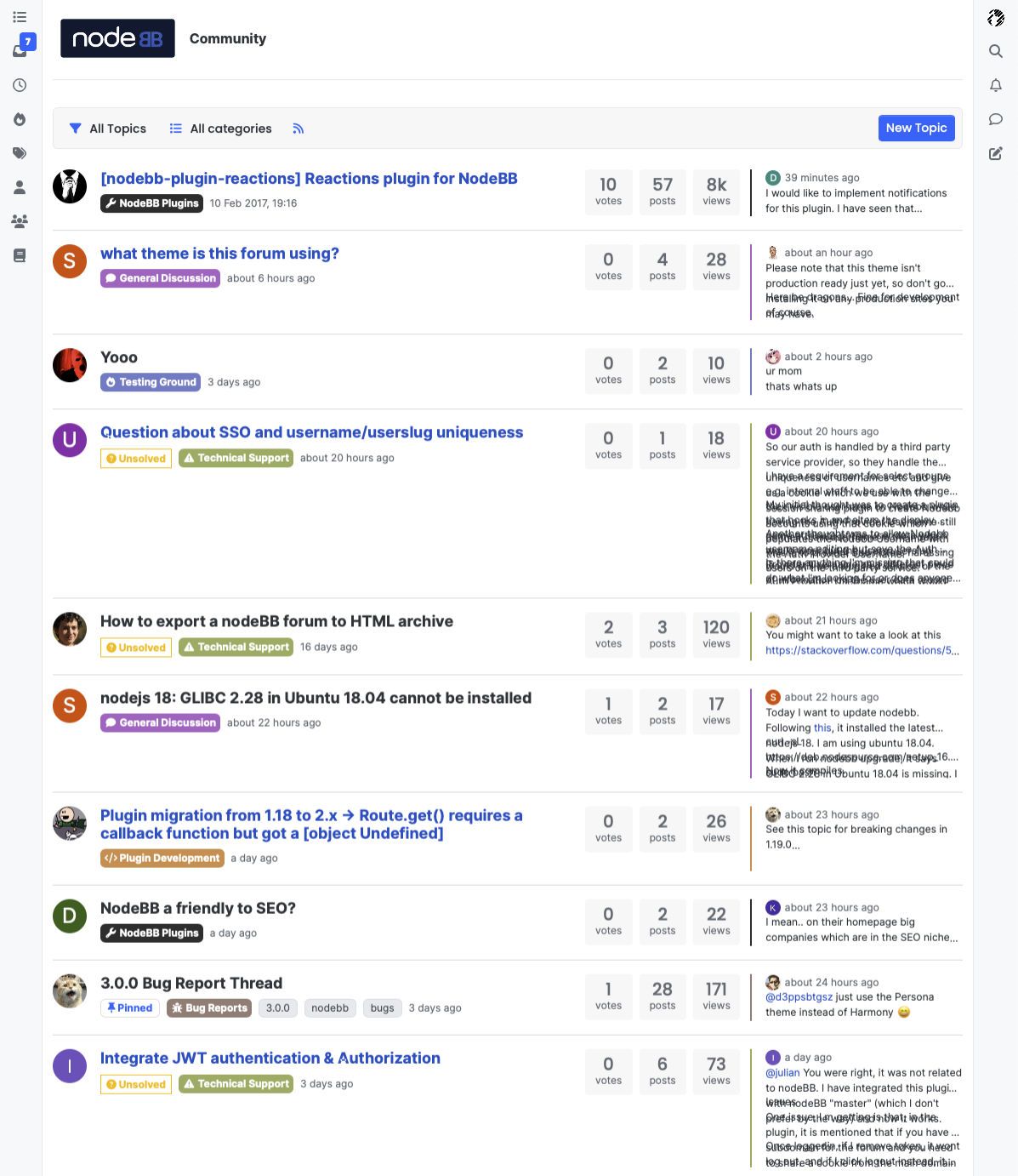
My experience with Safari - initially I thought it was a a combo of a beta bug with Harmony new layout for listing topic (a larger preview pushing out spacing for individual listing), but switching to Firefox showed me it was most possibly a Safari specific issue, screenshot is from 15.6.1 (Safari latest is 16.x sorry don't have latest Safari to test against.)
-
That bug was already reported here https://community.nodebb.org/post/90818, looks like line-clamp doesn't work on safari. Filed issue https://github.com/NodeBB/NodeBB/issues/11188
-
Not sure if this is a bug or not, but on here, I see the below in the
recentview
Yet on my test instance, I see

Note the difference between "All categories" and "Topic Tools"....
Theme version is the latest (I think) at 1.0.0-beta.24
EDIT - I think I am a few commits behind (provided that the differences here aren't checked in yet to GIT), as my composer looks different to this one also.
EDIT 2 - just installed latest composer from GIT (https://github.com/NodeBB/nodebb-plugin-composer-default) so ignore that one

-
In order to have more space to read the content, I think it is necessary to hide the mobile menu when scrolling down. When scrolling up, it should appear again.
-
 J julian forked this topic on
-
Composer / scroll:
long/large posts composition wall hit
- I have to increase composer height to make more space.
- becasue there is no internal scrolling on edit & preview panes
- both remain static (firefox)

