December 2022 Design Preview (Harmony Theme)
-
I hope everybody's been staying warm
 we just got couple inches of snow that is now sticking around, so hopefully we will be on track for a snowy Christmas
In our last update, we shared the mockups that our designer @vladstudio shared with us.
Since then, we've been working on a couple of projects simultaneously:
- Bringing Persona up to date with Bootstrap 5 (this is the theme you currently see now)
- Starting the new base theme
- Resolving technical debt in core to allow for easier theming
I'm also happy to announce that the name of the new theme is
 Harmony. We've chosen this to signify our intention that all of the disparate elements that make up NodeBB be unified under a common design language.
Furthermore, it also communicates our desire for both frontend and backend to work in sync. Sometimes in our rush to move features out of the door, our implementation may be lacking in the frontend. We hope to resolve this in Harmony, and in our development going forward.
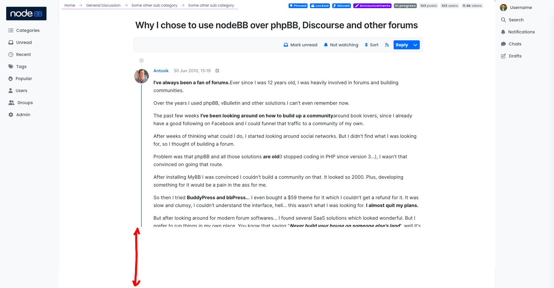
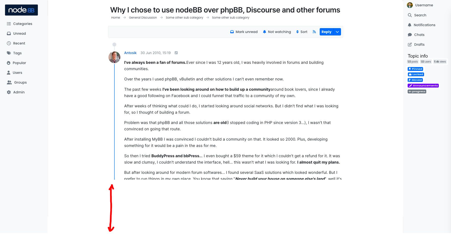
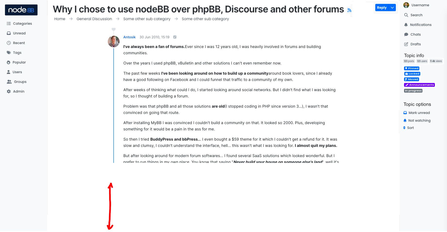
@baris, @vladstudio, and I have been working diligently on the new theme, and we're happy to tease a couple screengrabs. Ready?
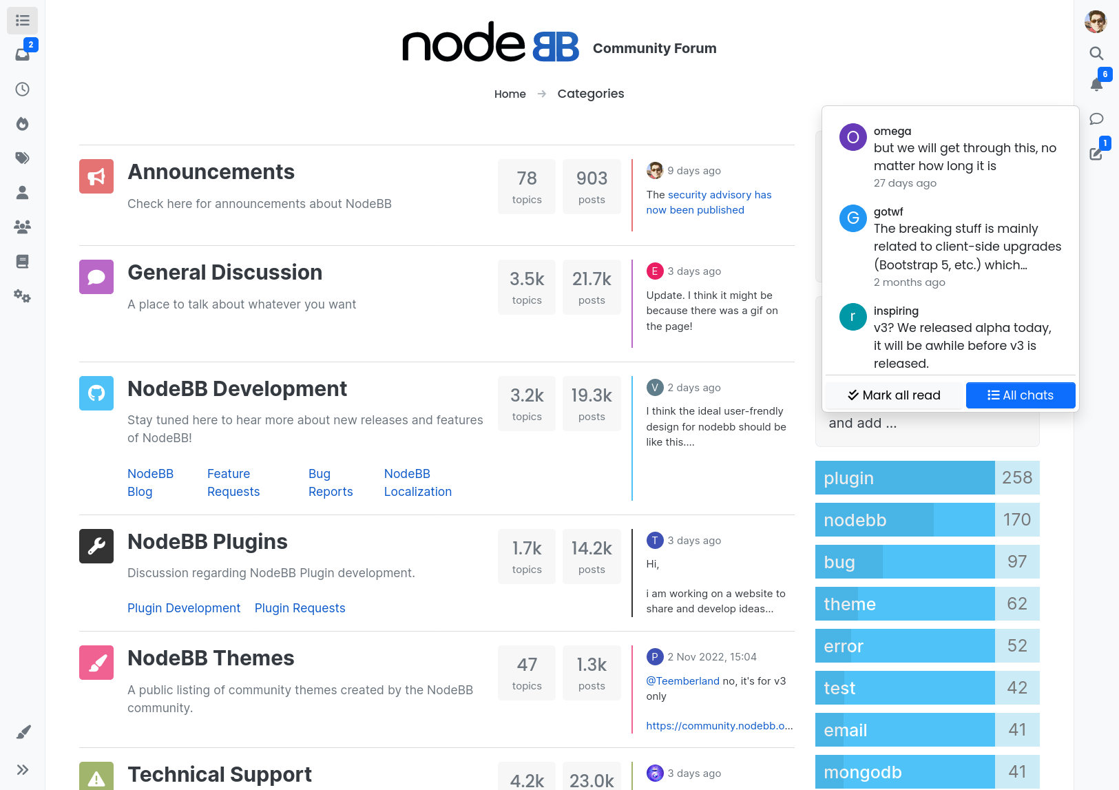
Home Page / Categories
Topic
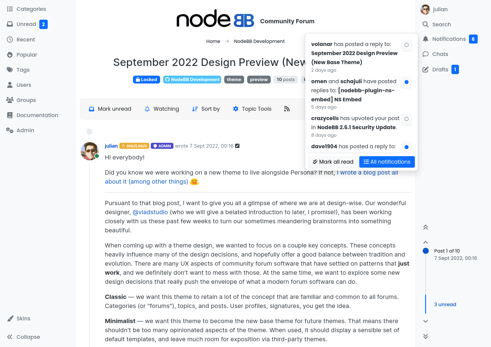
They certainly look different, don't they?
- I've expanded the notifications menu in one, and the chats menu in another.
- The biggest change is the elimination of the top bar. It may cause consternation in some, but we feel that sidebars are the way forward given that most desktop aspect ratios skew wider. Mobile devices will receive a single bottom bar.
- Very few elements have been preserved. Breadcrumbs are new, post bars, topic metadata, etc., were all redone from scratch.
- You'll also notice the new topic navigator, which I've personally been working on for the past week. It deserves its own introduction, so we'll leave it at that, but it does borrow from some of our competitors, while managing to deliver more

- Persona's "timeline style" remained, and quick reply was received with much positivity, so that will (probably) ship enabled by default in Harmony.
- We're taking care to ensure that the Harmony theme works even better than Persona when it comes to skins.
-
Astute readers will probably have already discovered the theme name, since we've been iterating on our theme in public

You won't be able to use this theme with NodeBB v2.x, but if you are running v3.x via the
bootstrap5branch or via our two alpha tags, you can enable the theme. It is still not production ready, there are a great many pages to go
-
I'll try to be ahead of the game here — some of you may be thinking that this looks generic.
You might be right! It's tough to strike a good balance between novel and traditional.
- Our first theme was vanilla, which used blocks reminiscent of Metro UI
- Our second theme was lavendar, which displayed post previews on the home page arranged via masonry
- Our third (and current) theme is persona, which uses a more traditional forum index design.
The moment Persona became the default, we stopped receiving
complaintssuggestions that we implement a more traditional forum index. With Harmony, we're sticking with what works, but pushing the boundaries in some smaller elements that we think will really improve the user experience.Harmony needed to strike a balance between being too out there (hence unthemeable), and too boring. The key here is the use of sensible defaults via Bootstrap that don't enforce their opinion on you, hopefully allowing it to be themed much more easily.
-
I think that the right panel is superfluous and the header should be returned. Or create a setting to select two options.
Another great option is to add a sidebar to persona, and set the search in the middle of the header to encourage users to use the search more often (The visible search bar increases traffic and time spent on the site)@julian said in December 2022 Design Preview (Harmony Theme):
The biggest change is the elimination of the top bar. It may cause consternation in some, but we feel that sidebars are the way forward
-
Hi everyone! I'm Vlad, the designer working with NodeBB team on the Harmony theme. I'd like to tell a bit more about the reasoning behind some of the design decisions we made.
A picture is worth a thousand words, and an interactive prototype is worth a thousand pictures
 Here is the design prototype for you to play with (work in progress, changing all the time):
Here are some of the goals that the new theme aims to achieve:
- improve the consistency of NodeBB design;
- convey the appropriate look&feel: readable, neutral, refreshing, comfortable;
- focus on content;
- be future-proof, avoid design trends, so that NodeBB will not look outdated for at least 4-5 years;
- have no strong personality of its own (to be the basis for further customization).
Removing the top bar and introducing sidebars was the radical change indeed; I'm glad Julian and the team thought it through and approved! I believe this deserves the detailed explaination.
Sidebars aim to solve 3 problems the current NodeBB theme design:
- When there are too many sticky elements on top of page, on smaller wide screens not much space remains to read actual content.
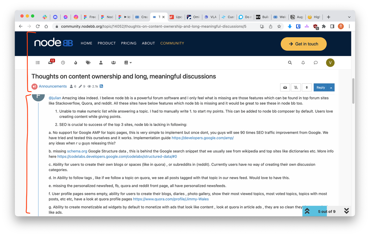
- When a post content uses the entire page width, the lines become too long to read.
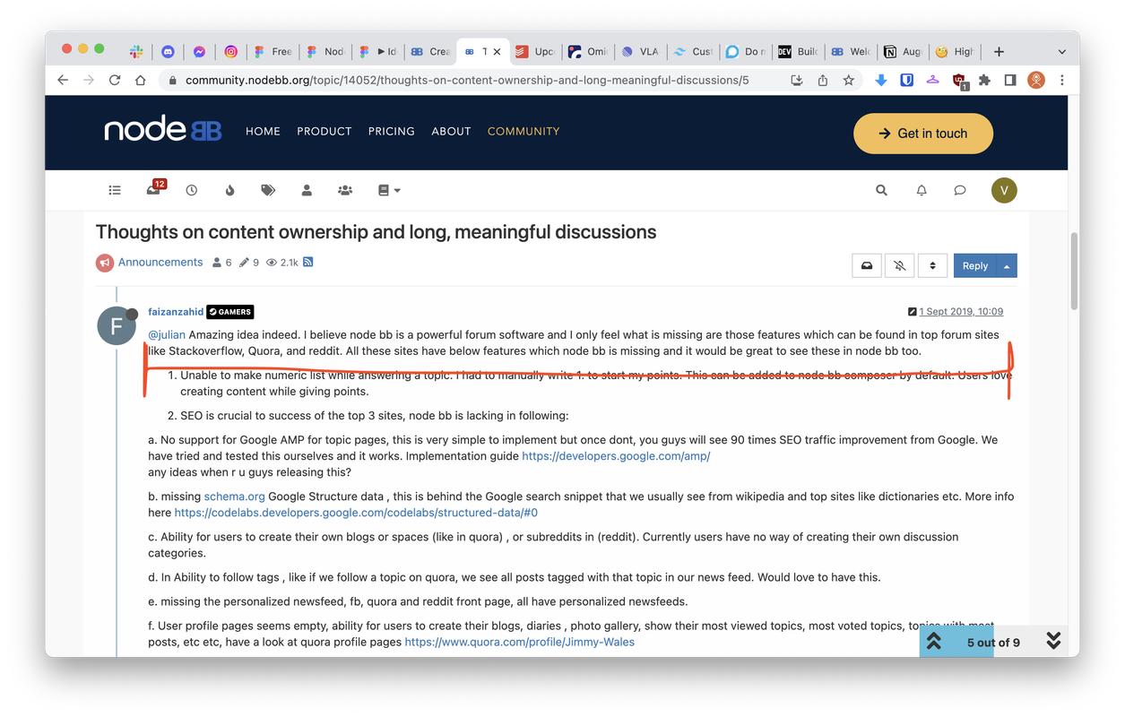
- Not as critical – but you have to learn what these icons mean before you can meaningfully use them. As a general rule, only universally-known icons (such as shopping cart) should be used without text labels.
Sidebar solves all these problems, and has already become a common UX pattern, used in Notion, Linear, Slack, Todoist, and so on.
Thanks!
-
Great job! I hope to be able to try out Nodebb 3 and the new template on a real forum soon. Now my thoughts on the 2 screenshots presented.
The first thing that caught my eye was a very empty, clean, large header. I admit that sometimes it is justified on the main page. But on the pages of topics, I would like the header to shrink vertically without taking up so much space. Also, the header would feel freer if it were not limited to two sidebars on the left and right. Perhaps for the main page it would make sense to set the stretch header to the width of the monitor.
Now for the sidebars. It's a bold decision to make two sidebars. I don't see anything wrong with that, especially on large wide monitors. But I would like the engine to be able to use these sidebars not only for the navigation menu on the left and the profile on the right. Yes, I'm talking about something like widgets. The right sidebar looks empty and all of its functions except search fit perfectly into a regular dropdown menu. If it were possible to add text or code to sidebars (or plugin widgets), as well as combine existing functionality into a single sidebar, that would satisfy most people.
-
@vladstudio thanks, when can we see the mobile version?
-
@crazycells it is partially available already, please open this link:
then squeeze the browser window to minimum width (or, open this link on a mobile device). Note - this is only a design prototype, it has almost no interactions, and there are bugs here and there.
-
@vladstudio I could not make it work unfortunately. But I can wait... no problem

-
I just now looked at the prototypes from Vlad and I understand that 2 sidebars will be sticky.
My picture is just an example of how you can unload the header. I think that unimportant elements should be reduced or put into static areas, giving the heading and text more air.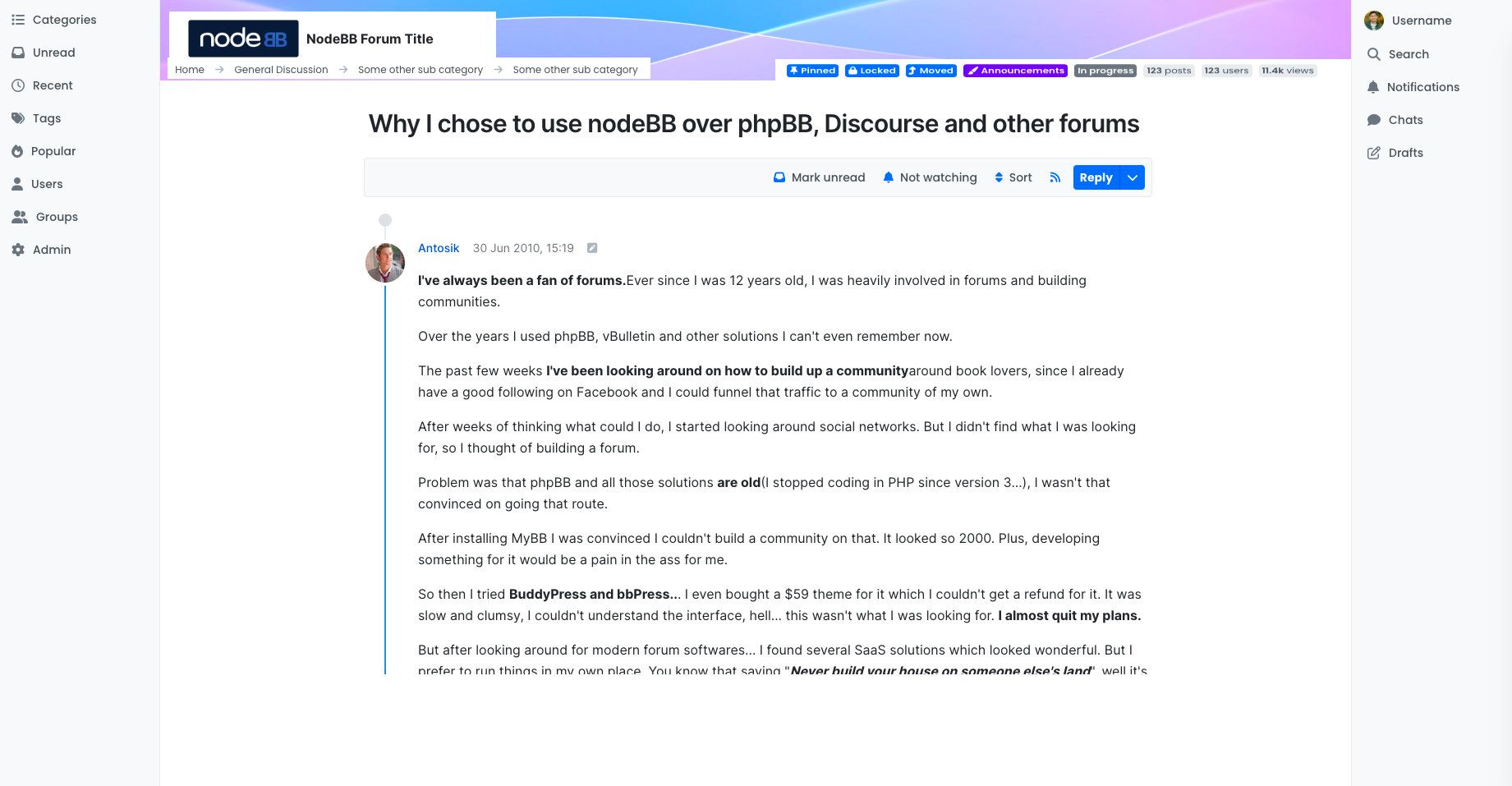
-
I loved how the chat box panel is extended to the bottom of the page. I think it definitely makes more sense to extend it rather than keep it as a small box that we have to scroll onto. This option is clicked when I want to see the chats, so I should be able to see as many chats as possible.
I wonder why it is not the case for the notification box panel as well?
@julian maybe "mark all read" and "view all" options can be put to the top of the panel, and panels can be extended depend on the screen size?
edit: I just realized there is a limitation for the chat box as well if I expand the browser size; anyways I still think it will make more sense if it is not limited to 4 chats and can be extended further depending on the screen size.
-
@Topper We're at alpha 2 now, so you can probably expect a couple more alphas, a couple betas, and we're targeting (excuse the marketdroid speak) Q2 2023.
@Kosiak et al., we have to be wary of shoving too many items into the sidebars. We ran into this issue many times over the years with the top bar. We would have sites attempting to add too many icons to the top bar (and also, the topic navigator at the time was also in the header), causing it to overflow onto two lines.
Utilisiing a sidebar also neatly sidesteps this issue. You're able to add more icons to the left-hand sidebar, and you're not constrained by the user menu and any potentially invisible elements.
With the right sidebar, we now have the user icons, as well as the topic nav.
Priorities with this theme redesign were minimalism and focus. As elements were replicated in Harmony, we evaluated each one to determine whether its existing position satisfied those concerns. For example, should we have topic tags, pinned/lock state, etc., in the sidebar? Arguably no, since they serve little purpose when you're in a topic, because you're in there to read the post, and maybe reply.
It even goes as far as the topic TITLE
 — do you need to have the topic title visible at all times (see this page on Persona)? Arguably, no...
 -
@julian said in December 2022 Design Preview (Harmony Theme):
For example, should we have topic tags, pinned/lock state, etc., in the sidebar? Arguably no, since they serve little purpose when you're in a topic, because you're in there to read the post, and maybe reply.
Of course, these are unimportant and rarely used elements. Should it then be in the most prominent place in the header or topic title? Perhaps, but then it should not take up so much space and attention. Even the website logo is not that important on the topic page.
I would hide such information behind three vertical dots or make it icons.
-
I for one really like how Harmony is shaping up

My only worry is translation of the sidebars to mobile - the current responsive demo doesn't seem to have that part implemented.
Other than that worry, I really like the sidebars and the general move to text labels whenever there is space for them. I especially like the right sidebar submenus (yay for better drafts
 ).
).I'm not entirely convinced by logo/cover location, as it makes the site look a bit like it's always trying to be a bit of a landing page, but I think I get why it ended there and it doesn't seem that bad (side note probably just for the demo, but shouldn't the logo be on top of the cover image? It being below just seems weird and takes up space).
Also, I spy a skin switcher - guessing since Harmony is now joining Peace on this, one can at least for now expect any new v3 themes to incorporate them. Any chance of older themes being updated to have one too?
@julian said in December 2022 Design Preview (Harmony Theme):
Astute readers will probably have already discovered the theme name, since we've been iterating on our theme in public

It seems it's not that public, considering the URL returns a 404 and I can't find anything with harmony in its name under NodeBB org - I'm guessing someone forgot to change the visibility from private to public

(or it was hidden before I made this reply for some reason)

