September 2022 Design Preview (New Base Theme)
-
Hi everybody!
Did you know we were working on a new theme to live alongside Persona? If not, I wrote a blog post all about it (among other things)

Pursuant to that blog post, I want to give you all a glimpse of where we are at design-wise. Our wonderful designer, @vladstudio (who we will give a belated introduction to later, I promise!), has been working closely with us these past few weeks to turn our sometimes meandering brainstorms into something beautiful.
When coming up with a theme design, we wanted to focus on a couple key concepts. These concepts heavily influence many of the design decisions, and hopefully offer a good balance between tradition and evolution. There are many UX aspects of community forum software that have settled on patterns that just work, and we definitely don't want to mess with those. At the same time, we want to explore some new design decisions that really push the envelope of what a modern forum software can do.
Classic — we want this theme to retain a lot of the concept that are familiar and common to all forums. Categories (or "forums"), topics, and posts. User profiles, signatures, you get the idea.
Minimalist — we want this theme to become the new base theme for future themes. That means there shouldn't be too many opinionated aspects of the theme. When used, it should display a sensible set of default templates, and leave much room for exposition via third-party themes.
Readable — content is king, and we want the most attention to be paid to the user-generated content that make forums the dynamic and wonderful places they are. Reading the forum should be a joy, not a chore.
There were additional criteria, but I will spare you the verbosity

Without further ado, here is our designer's Figma mockup of a single page, the topic page:
Here is the design preview!
The preview is semi-interactive. Some buttons work to show components. For example, some of the icons on the right are clickable, and the left-hand sidebar can be minimized.
The following instructions are also included here for your benefit:
- On the first screen, click the toggle button to collapse the sidebar. All other interactions are possible when the sidebar is collapsed:
- Click the toggle again to expand sidebar;
- Click icons on top-right (user, search, notifications, chats) to open their popups;
- On the search popup, click the input field to imitate typing;
- On the progress bar, click Down to scroll to the last post, then click Up to scroll back up. (It is not really possible to make progressbar work properly in Figma, unfortunately);
- hover over icons and progressbar to see tooltips;
- Click the big blue Reply button to open Composer;
- In Composer, click Hide, Discard or Submit.
- On the first screen, click the toggle button to collapse the sidebar. All other interactions are possible when the sidebar is collapsed:
-
I really like the right side bar - especially it being the place where the composer hides (I'm honestly not a fan of the current bubbles, especially for writing multiple posts at the same time, since they go up without limit and the only way to find which topic is which one is to go through them all). I'm hoping behind it will be some list to choose from if you have multiple sessions open

Also, while I do like the hiding left side bar, it seems to move icons up when you do so, because of the logo being smaller vertically than the banner. I feel like it'd be a good idea to keep at least the functional icons (the hide/reveal icon might look weird if it's not directly below the logo) at the same height both when revealed and hidden.
-
@oplik0 completely agreed about the icons shift. I'd also want them to remain at the same vertical position in order to reinforce its place.
In my mind the only acceptable time for it to shift is if the browser viewport itself were resized. Then it all goes out the window.
-
@oplik0 said in September 2022 Design Preview (New Base Theme):
especially it being the place where the composer hides (I'm honestly not a fan of the current bubbles, especially for writing multiple posts at the same time, since they go up without limit and the only way to find which topic is which one is to go through them all).
This is one of the bigger changes. I swear I talked about the taskbar in one of my blog posts, but I can't seem to find it now.
Anyway, when I added it back in the 2010s, I honestly thought it was going to be used by all sorts of plugins. I built out a couple helper methods and designed it with the intention that plugins would add their own icons to the taskbar. The API wasn't exactly well-documented, which I think contributed to its lack of usage.
That said, two parts of NodeBB used it:
- The composer, to display active composers
- The chat subsystem, to display active chats
The latter is already technically obsoleted by the chat dropdown (whether it's "active" or not is really irrelevant since they're all shown in the chat dropdown anyway.)
The former is likely better served with a dedicated dropdown next to the notifications/chats.
Another bit of "fun" dev history, is that the chats dropdown and the notifications dropdown were developed separately, and while they look the same, they're different enough that we encountered all sorts of side-effect bugs where fixing one thing on one dropdown would break the other dropdown. I personally look forward to re-designing the dropdowns (including the new composer drafts dropdown) with common reusable elements.
-
@julian said in September 2022 Design Preview (New Base Theme):
This is one of the bigger changes. I swear I talked about the taskbar in one of my blog posts, but I can't seem to find it now.
You did, I remember it in the context of what v2 was supposed to be. Quickly looking for that found me this post: https://nodebb.org/blog/slice-and-dice-bringing-nodebb-back-to-basics/
Though about
We had to think about just how many users utilised multiple composers
I use mutliple composers, so I'm glad there seems to be a plan for improving that experience. As I mentioned, I feel the taskbar style isn't ideal due to the guesswork to find the one composer you want if you have more than two, and it places a hard limit on the usable number (about 15 for my screen size at least, though I haven't reached anywhere close to it outside of testing)
-
The new design looks amazing! It looks very clean and comfortable. I would like to improve only one thing. Non-important elements of the post, such as Reply, Quote, Thumbs up/down, and maybe the date of the post (especially if it's the same as the previous post) should only appear when hovering over the post. Thus, there will be fewer distracting elements and it will be easier for the visitor to focus on the text. By hovering over a post of interest, users will get the required elements if they want to reply or vote.
-
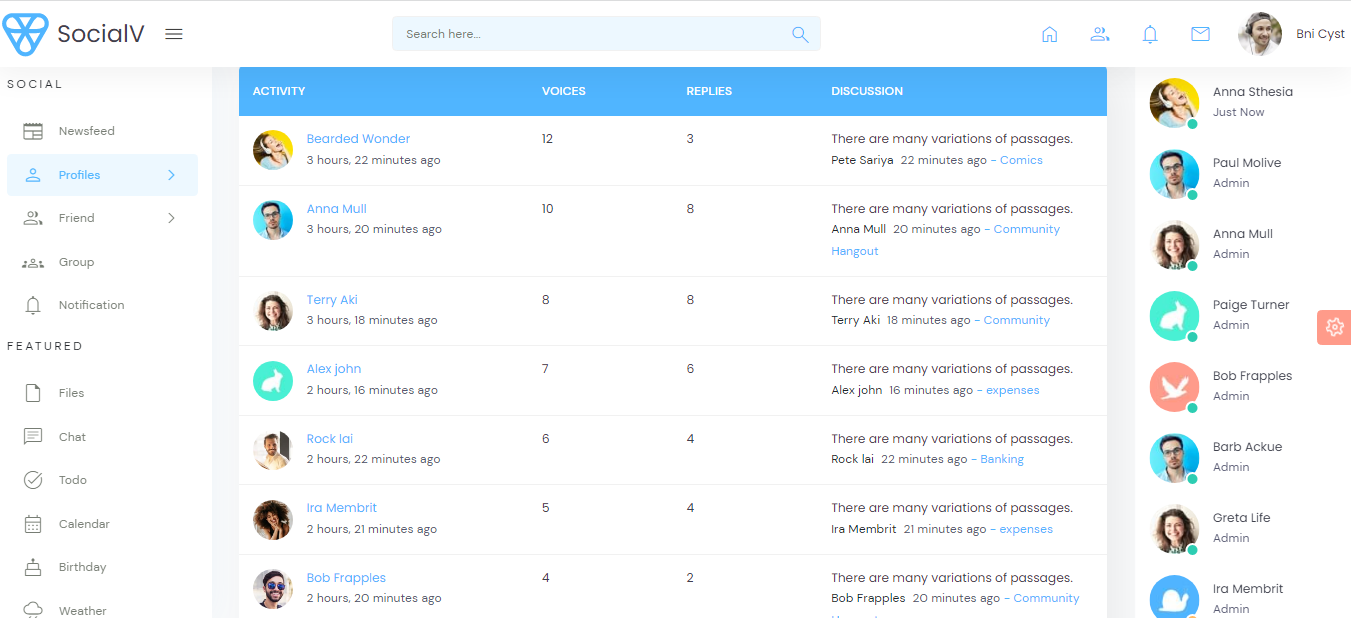
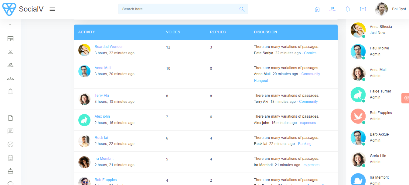
I think the ideal user-frendly design for nodebb should be like this.


https://templates.iqonic.design/socialv/bs5/html/dist/app/profile-forum.html -
-
 J julian referenced this topic on
-
 J julian referenced this topic on
-
 J julian referenced this topic on


