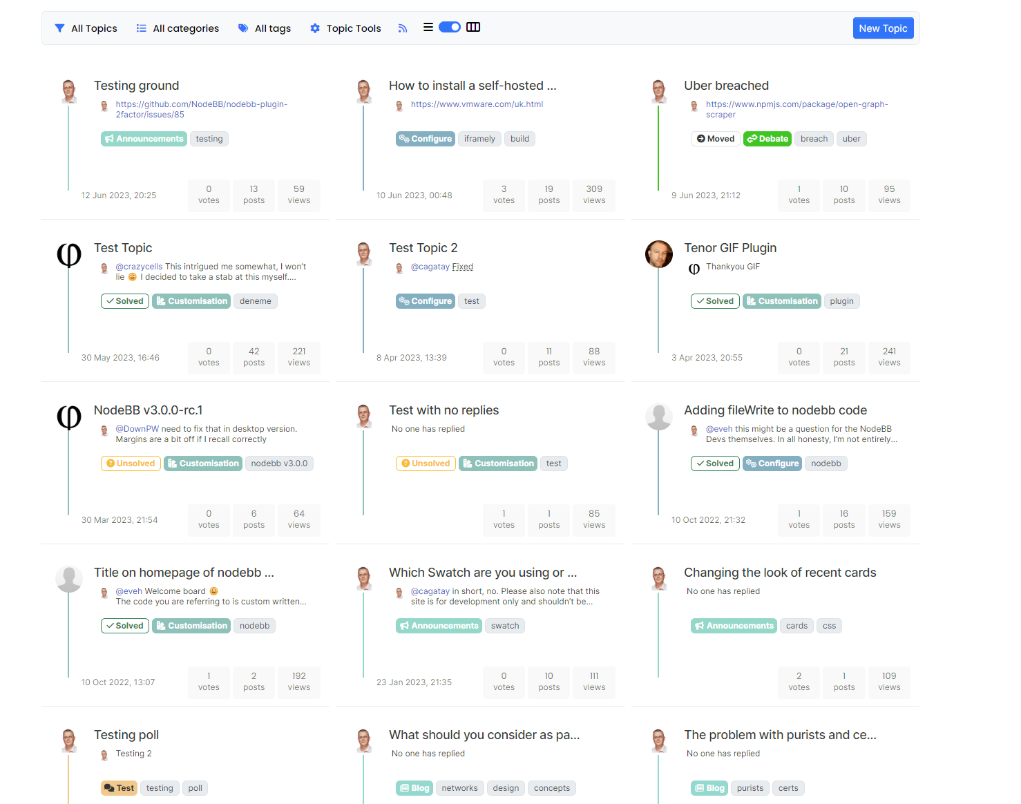
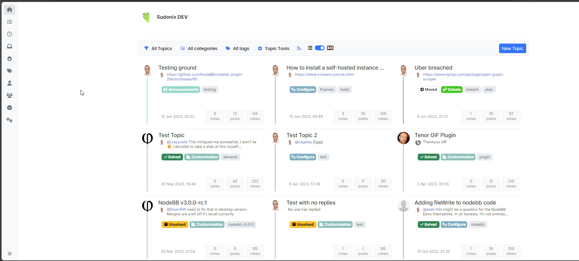
Card view with CSS and some custom JS
-
@baris one final issue I'm encountering (which is an odd one) is as follows
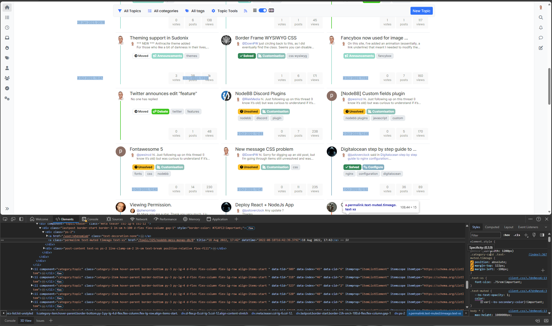
When the site is loaded in "Card View" 2 elements are misplaced as is clear from the video I'm posting below. However, when you scroll down the page, the newly added posts are perfect in format. What makes the situation even more bizarre is that if you scroll to the top of the page again, the misplaced elements are perfectly aligned? My thought here is that the original topics disappear from the viewport and are then added back in
action:topics.loadedhence the correct alignment.Demo here
Video Upload & Annotation - Gemoo
Record you and your screen to clarify your points. Get vidoes organized as mind map, calendar, or any layout. And share it with a link to boost your productivity.
(gemoo.com)
It seems odd to me that page load executes the same function as clicking the home button, although the behaviour appears to be different.
Any thoughts?
-
@baris The styles are there - the video was meant to show you this (sorry - should have explained this better) - but do not seem to be applied. My original suspicion was that these elements were placed into the DOM later than the CSS, although subsequent Ajax loads are not affected - it is only on
loadwhere I see the issue.Here's an example
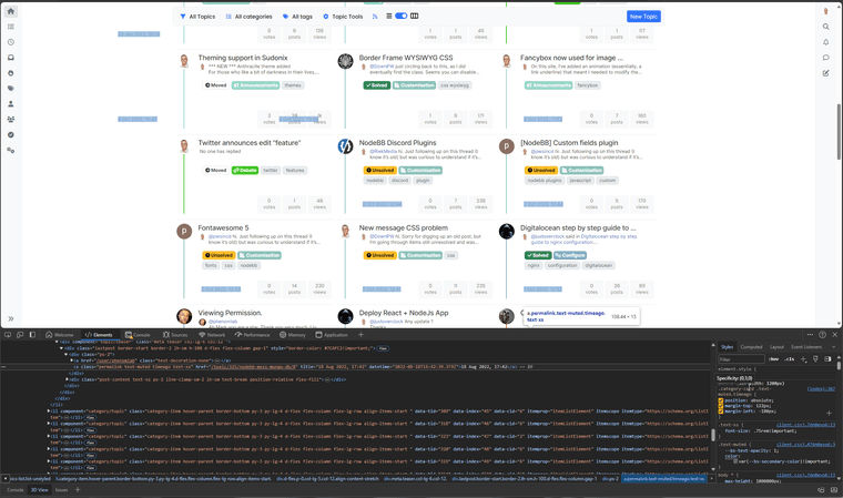
As you can see, the first set of data being returned is misplaced, whereas the second set is in the correct position - both use the same CSS!
-
@baris It's all done with CSS. However, I need to point out the issue I remarked on in the above posts. The screenshot above clearly shows that the same CSS is being used for the same elements, yet the first set of topics returned by Ajax have the alignment issue, whereas the subsequent
fetchdoes not have this issue - but it uses the same CSS.From the above post
@phenomlab said in Card view with CSS and some custom JS:
As you can see, the first set of data being returned is misplaced, whereas the second set is in the correct position - both use the same CSS
-
@baris said in Card view with CSS and some custom JS:
The screenshot only shows one element selected that has absolute positioning, which is probably a bad idea as well
The screenshot shows multiple elements selected with the same class? They are essentially all derivatives of

I'm also not keen on the
absolutepositioning either but it won't with withrelative.@baris said in Card view with CSS and some custom JS:
Is this available somewhere public so I can inspect the elements?
Yes, it's available at https://sudonix.dev which is a closed site and will require you to sign up. It's an old replica of prod (.org) and you have an account there so it should exist in dev also.
-
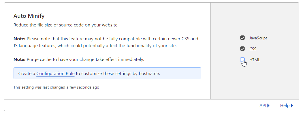
For anyone following this thread, new stable release is here. If you use Cloudflare, please also see notes around that
Switch between list and card view function
After a significant rewrite of the code plus the CSS, I’m pleased to release this stable version. There are some changes however. The external CSS file is n...
Sudonix | A one-stop-shop for all your technology questions (sudonix.org)
-
 P phenomlab referenced this topic on

