Turn off User Avatars in Topic Listings (ACP option)
-
li[component="category/topic"] .avatar { display: none; } li[component="category/topic"] .gap-lg-3 { gap: 0rem !important; } -
@brazzerstop Thanks for that and that's what I meant by "easily customised" (talking to the converted) but I often think about mass market where someone wants "super simple" i.e. a button and no surprises

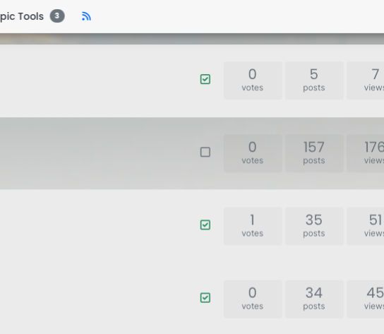
Now to surprises, we have the current "checkbox" position to deal with when going the custom CSS route.
-
I've faked this in inspector but as an example I found this position is rather more comfortable and less visually troublesome than hanging medallion like below an avatar, and when the avatar is gone as per customisation, then the checkbox doesn't cause unforeseen issues.

-
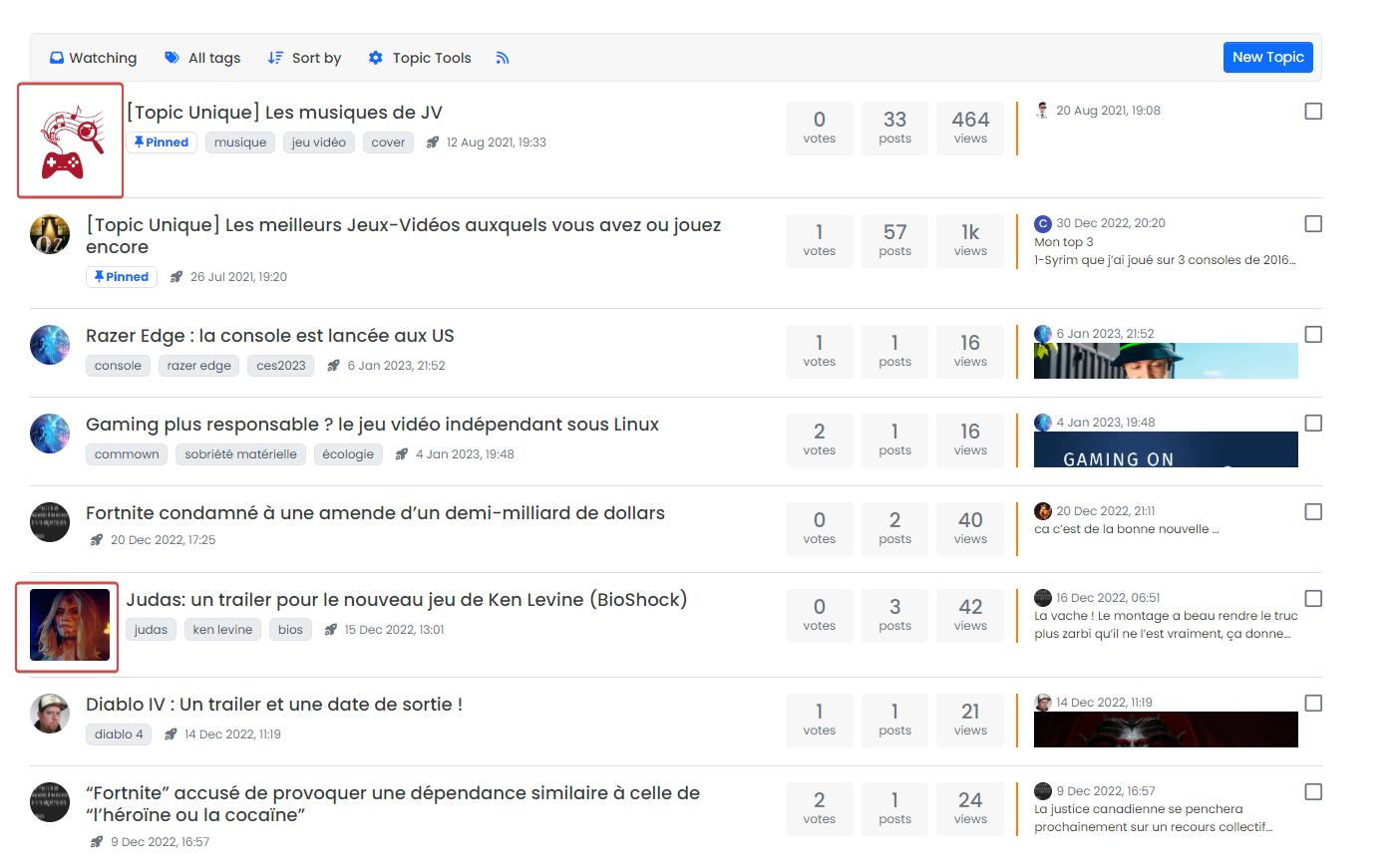
Hmm we have IMG thumbail preview at this place
-
@DownPW Oh yea, but it's so comfy there, it feels just right (alt to that is do away with need for check box, less is more, less is more, less is more)... it's a small element so could in theory sit neatly beside IMG, but the alternative that I've implemented because it's quicker and easier, is to position the the checkbox in a pseudo avatar position, now the avatar is gone, and move the topic titles a few rem to the right, and it's alright for now.
IMHO a topic thumbnail should be in the avatar position (leading positions). So removing Avatar in topic now delivered a second bonus, meaning IMG thumbnail preview can go in the former Avatar position, problem solved all round or at least a new solution has opened up, if you are willing to grasp it.
You are welcome.

-
@omega said in Turn off User Avatars in Topic Listings (ACP option):
IMHO a topic thumbnail should be in the avatar position (leading positions). So removing Avatar in topic now delivered a second bonus, meaning IMG thumbnail preview can go in the former Avatar position, problem solved all round or at least a new solution has opened up, if you are willing to grasp it.
This is a good point and one I agree with actually. If there is a post thumbnail, that should be displayed in place of the avatar. That's the overall point of the thumbnail.
-
@phenomlab Cool, I'm playing catch up is there a topic dedicated to this thumbnail feature?
-
@julian
 F'uppin Hilarious this..
Thumbnails are top level item. There is no other way about it. The image is a placeholder for everything else, even the title tbh, since we read images faster than words.
No one can change that but you can fight it.
However, what we have here is a battle brought to us by social media imposing new-norms, it's a duel of competing images.
Avatar Vs Thumbnail.
You can have either in the same position but not both. I think that's the equitable solution, as the twain shall never meet by all accounts, and also having both causes multi-mayhem form layout to user-feedback, ahem.
Make it configurable in the ACP for any and all grumpy admins can then be free to find the next grump to grump about, like me.
-
@julian Yes I think this is it here

3.0.0 Bug Report Thread
Hello @baris I had talked about bugs that was not taken into account. In fact, I use images for categories and I don't use icons on ACP : --> Here is the r...
NodeBB Community (community.nodebb.org)
... I"m starting to get the idea now, of mission creep chaos and the dance of the checkboxes!

-
@omega said in Turn off User Avatars in Topic Listings (ACP option):
However, what we have here is a battle brought to us by social media imposing new-norms, it's a duel of competing images.
Avatar Vs Thumbnail.
You can have either in the same position but not both. I think that's the equitable solution, as the twain shall never meet by all accounts, and also having both causes multi-mayhem form layout to user-feedback, ahem.
Make it configurable in the ACP for any and all grumpy admins can then be free to find the next grump to grump about, like me.
I remain firm on this outlook for now, and can expand out the remit of this OP to I think solve this issue enough for the time being in a way that is genuinely a satisfactory solution and as I wrote equitable provision by the devs.
Select Topic Listing Default Display
- no images (avatar/thumb)
- avatars only
- thumbnails only
Configurable in the ACP
-
Personally, I like to know who wrote the topic at a glance by his avatar so the current configuration suits me very well but if everything is configurable via the ACP and we could choose, why not ?


