Home button for Harmony - Yey or Nay
-
@julian said in Home button for Harmony - Yey or Nay:
If you're on desktop, then the top left link is the home page (
/categories)DO you mean the categories button or the logo-link?
See, (
/categories) like all the other core buttons is a core button, it should not double job as a home button, because it will also appear in other locations, so now we have a core button with an ambiguous function - if that is what you mean, this is bad design.Further, the situation creates user specified homepage logic follow through as dysfunctional, it's broken the idea.
For e.g. my preference is always for (
/recent).I like the home button to take me to recents posts from where ever I have navigated.
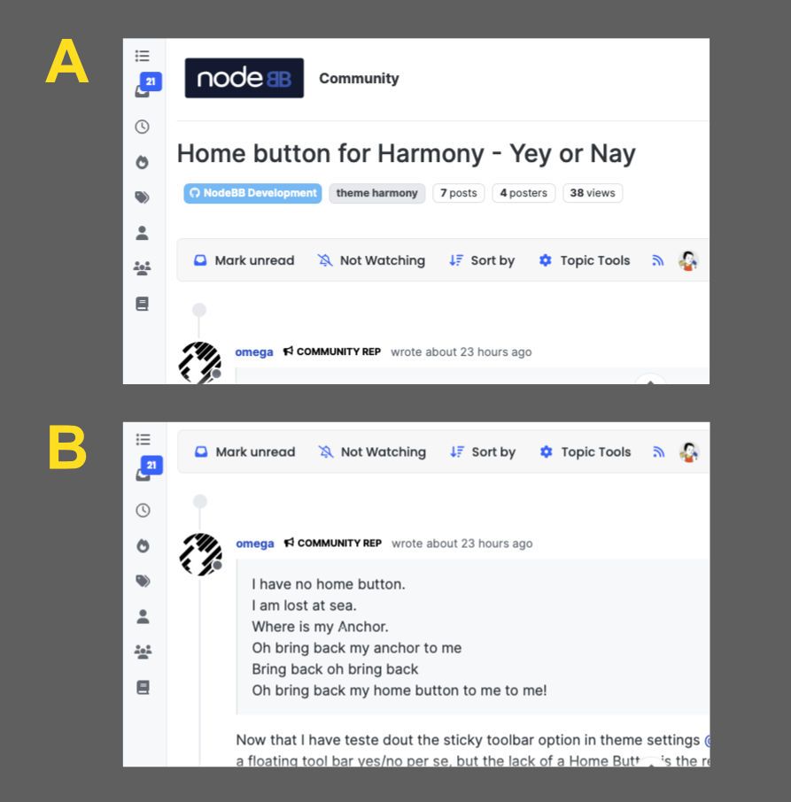
Presently, it's shown at the top in a off set position, that disappears with the slightest of scroll. Yes, frustrating. Very.

That settings has no real purpose, because within hardly a few clicks, the home button / logo / link is gone!
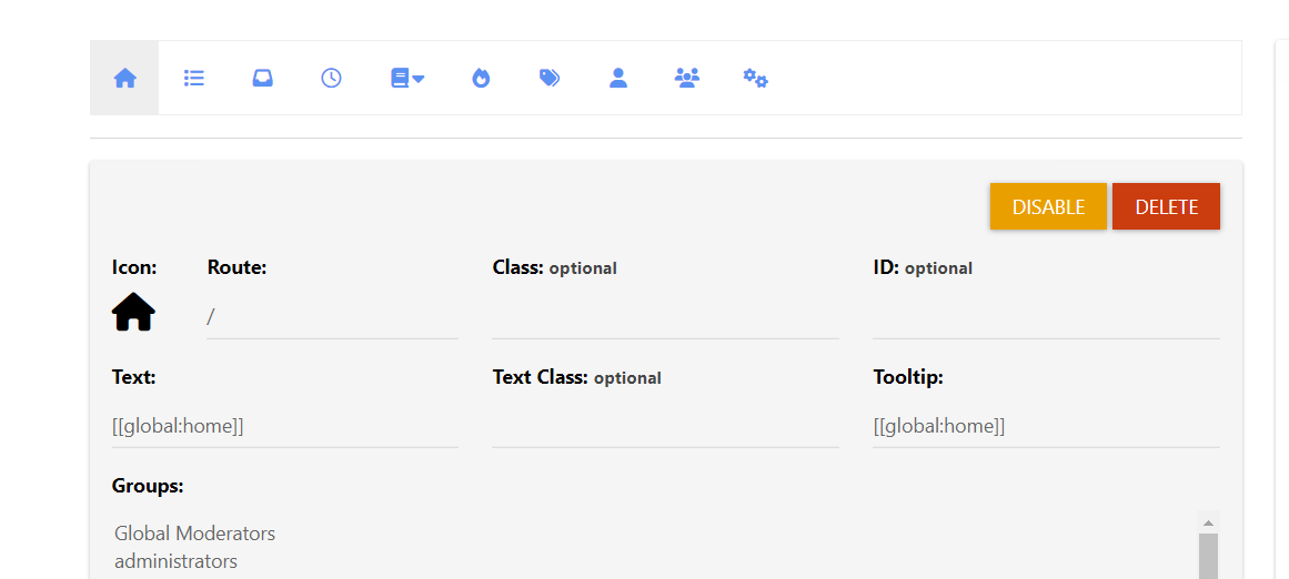
Image B is not anchored. It's need either a cap or the simple solution od a logo home button above categories.
This virtually timeless convention is good:
- because it's highly frictionless
- Is a deeply ingrained muscle memory/ user reflex.
-
Home page is configurable, but it is set to the category listing on this site. It is also the default.
We could add a home button but it'd be a bit superfluous since you'd then have complaints about two buttons that go to the same place (by default)
-
Yes, so there is a solution, but let's not repurpose core UI buttons or ask the user to reach, for many reasonable reasons, becasue this might require a bit more value added in:
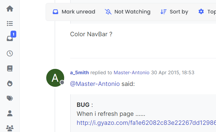
Create a new dedicated "core" button called HOME Button
Give it a little more feature piazza (like categories iucons)
- allow image upload
- allow collapsed size + expanded size spec.
- whatever else might be required
I like modularity a lot, but... can you see how none of the other existing users-posts thought about "custom", I know I didn't, and we should know their backend and yet, it's one of those things that should be default out of the box, but it has caused cognitive dissonance and that also means community needs it too but I don't have ACP access... we all have hang up and learned things form Persona (and established web navigation) and the site title in the top menu bar provided this function, and it's a net loss on first impression and then further use, and users can't rectify only the admin, so it's "frustrating" form a UI/UX POV.
It's always important to remember IMHO You are not your customer and what "literally take 2 seconds" to you, is simply not apparent or accessible to there rest of the dopey world out there hitting your site etc. for the first and many times.
Nowt queer as folk as the English say, but there is no place like home either.
-
We could add a home button but it'd be a bit superfluous since you'd then have complaints about two buttons that go to the same place (by default)
This, adding a home and categories results in two buttons that do that same thing. It applies to all the items if you set your home page to recent then you will have 2 buttons that take you to recent etc.
-
There are two competing settings is there not:
- What an Admin specifies as home page (site wide)
- What a user specifies as home page
With respect to my user experience here:
admin: /categories
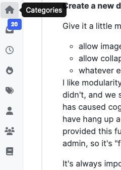
user: /recentsThe Home icon button and categories button are no longer doing the same thing.
Thus my suggestion to add in a dedicated HOME button (with bells and whistles) to carrying out the same duty as the
brand/anchorand give it more features.Another why is because again the harmony theme brand/anchor get's disappeared too fast and the user loses their home button based on their preference, btw I've only looked up the element name in inspector, so maybe anchors my point better!

Anchor / Home button... we're almost there!

This nav has needed more rigorous consideration, and so this topic!

The navigation experience has IMHO moved in a more positive direction.
-
 J julian moved this topic from NodeBB Development on


