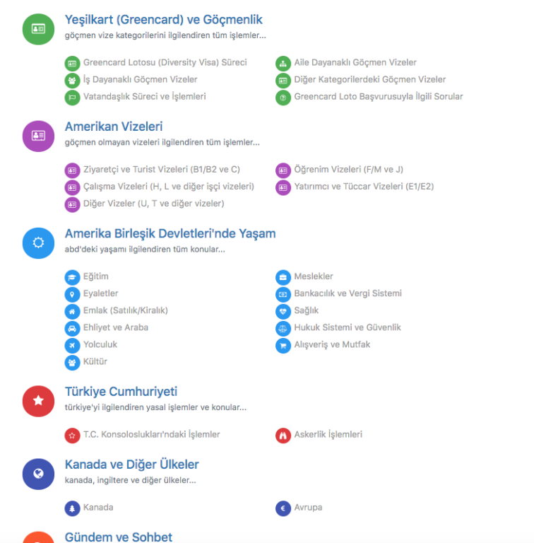
Persona Theme - Subcategory view on main page
-
I've done some work playing around with this because it's too chaotic, in fact visually it's bad, very bad but I digress - I found it tricky to achieve but I got it to a point that it was workable, almost to my spec of 3 column, I managed 2 column that appear to be stable enough in an responsive context.
For example:

This is the CSS I used to achieve the above result 2 column layout:
.category-children .pull-left {
    column-width: 15em;
}
I'd like to post the entire custom CSS as I'd like to make it a theme for everyone but I'm not at a theme dev and upload to GitHub level yet, so if anyone would like to help me out, please message me.

I may post entire CSS set sometime, to catch any tips for tidy up - it would be nice to see it reviewed by the pro-pros

-
@omega Thanks, somehow your code was always flexing the icon only... But I managed to get two column view with this CSS addition on persona theme: (on 1.12.2)
.category-children .category-children-item {
    float: left ;
    width: 20em ;
}
Thanks a lot, I got the
emidea from you until then I was unsuccessfully trying with
 %here is how it looks:

-
@crazycells said in Persona Theme - Subcategory view on main page:
@omega Thanks, somehow your code was always flexing the icon only... But I managed to get two column view with this CSS addition on persona theme: (on 1.12.2)
.category-children .category-children-item {
    float: left ;
    width: 20em ;
}
Thanks a lot, I got the
emidea from you until then I was unsuccessfully trying with
 %here is how it looks:

That looks great and cool to see if a heavily sub-category setup!
I picked up the
emfrom somewhere leek overstock not specifically relating ot node. I can't remember exactly but it was the thing that worked.I'll try your variation to see how it works. Maybe more stable.
I'd be very happy to see this adopted by community nodeBB hey @julian? Well, hmm hmm???

Further note: I would like to pin down a stable 3 column option too - maybe less used but still applicable ot some deployments and case uses.
I couldn't pull it off, very strange thing were happing with the icons, not just the positioning stability. I didn't spend any more time once I got 2 columns, it was the HUGE improvement I was looking for.
-
@omega this was working when I hide last post in each category but it failed when I turn it on. I tried little bit, but could not do it... I will work on it more when I have time, if I figure out a way to make them in better look I will post it here...
I tried with different size of screen, but it did not work; here is the code I was using in case someone wants to fix or add more on top
@media (min-width: 480px) {
.category>ul>li .category-children .category-children-item  {
    width: 45%;
    margin-right: 5%;
}}

@media (min-width: 992px) {
.category-children .category-children-item {
    width: 30%;
    margin-right: 3%;
}}
Here are some website examples:
- http://forum.veloufa.ru/
- https://bastage.net/categories
- https://foro.hardlimit.com/
- https://narfell.us/forum/
- https://forum.qt.io/
I think this makes everything in one column... it still looks ok, but in our case since the titles are short in blue category, two column works better for that.
.categories .category-children {
    display: flex;
    flex-direction: column;
}
( @julian @baris )
I am not sure if it is going against your ideas but I think this can be added in the future so we can make one column or two column orders for sub-categories, if possible... It does not look good if we have a lot of sub-categories...Additionally, it would be cool to reveal only some of the sub-categories on the homepage. Because adding everything makes it look complicated but we like the simple appearance of nodebb. Also some sub-categories are more important and heavily used than others, we could use that option for sure.
-
@julian said in Persona Theme - Subcategory view on main page:
From a design point of view it makes sense to have the subcategories aligned in columns instead of inline like they are now.
Would be a project that is up to @psychobunny to take on

Hey! @psychobunny

-
If you want two columns try this:
.categories .category-children {
  display: flex;
  flex-wrap: wrap;
  flex-direction: row;
}
.categories .category-children-item {
  flex: 1 1 45%;
  margin-top: 1vh;
}
You can increase the number of columns by changing that 45% to some lower number (it actually can be a little higher, but it seemed to go to 1 column on above 48% for me. 45% was just more "round" number close by

That margin-top is there because otherwise the items were touching at the top and bottom and it didn't look good for me
The only problem here is with longer subcategories - especially with mobile devices. I think if I wanted to do something like this I would try to change it to just one column if the screen width is too small.
-
@oplik0 said in Persona Theme - Subcategory view on main page:
If you want two columns try this:
.categories .category-children {
  display: flex;
  flex-wrap: wrap;
  flex-direction: row;
}
.categories .category-children-item {
  flex: 1 1 45%;
  margin-top: 1vh;
}
You can increase the number of columns by changing that 45% to some lower number (it actually can be a little higher, but it seemed to go to 1 column on above 48% for me. 45% was just more "round" number close by

That margin-top is there because otherwise the items were touching at the top and bottom and it didn't look good for me
The only problem here is with longer subcategories - especially with mobile devices. I think if I wanted to do something like this I would try to change it to just one column if the screen width is too small.
thanks, this worked for me. As you said, only problem is long subcategory names, but I guess I should try to make them shorter.
Do you know a way to implement this only for certain categories? (for example with category id?)
So, for some categories it will be a straight one-column line, for some categories straight two-column line.
-
@crazycells
Responding from a phone, so I can't make a full solution right now, but I think the best way would be to select it from correct<li>element using cid. Like this:.categories li[data-cid=x] .category-children { ... } .categories li[data-cid=x] .category-children-item { ... }Where x should be replaced with the cid of the category you want to style.
I didn't check this, but it should work

You could also use
:nth-child, but I think that's worse because reordering categories or adding subcategories to one that didn't have them might break it. -
We are hoping this will be added to the NodeBB soon

Currently, we have temporary fix with CSS codes...
I would like to learn if there is an easy way to create a collapsible, responsive subcategory view for each category... maybe something like a plus sign under each category, where user can decide to see those subcategories of that category... and choice is remembered for each user when they log in again...
