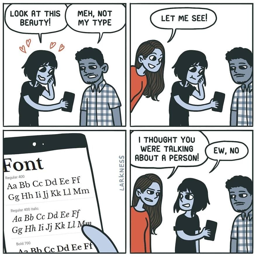
Meh, not my type
-
[email protected]replied to [email protected] last edited by
Verdana is my fucking jam. Good spacing and very legible at different font sizes. My only two gripes: Lower case "l" (L) being a straight line and the number 0 has no cross through it. Not major though, cause they're still pretty distinct from similar characters.

-
[email protected]replied to ElectricMachman last edited by
They're good, but I find both to be marginally less legible than Source Code Pro where the i and j are clearer, particularly when next to each other. The a is less clear in Source Code Pro though, so I'm still looking for the perfect font.
-
[email protected]replied to [email protected] last edited by
The "ew" saved it.
-
[email protected]replied to [email protected] last edited by
When you pick topmost font for ricing ur terminal
-
[email protected]replied to [email protected] last edited by
It's just that beautiful.
-
[email protected]replied to [email protected] last edited by
Text looks good, but man the Number hight looks cursed and kinda random.
-
[email protected]replied to [email protected] last edited by
Their shape is beautiful (from 3 to 9) but why were they not written on the same line?
-
This has an art nouveau feeling.
-
[email protected]replied to ElectricMachman last edited by
Very nice! What is the difference btw small caps and petite capitals?
-
Wasn't there a subreddit about improving comics? Usually just removing the panel that rams the punch line down your throat.
-
[email protected]replied to [email protected] last edited by
It will look good in a children story-book. Not in a professional email.
-
CarrotsHaveEarsreplied to [email protected] last edited by
It appears that the middle line crosses the centre of mass.
-
-
[email protected]replied to [email protected] last edited by
verdana is great for small sizes on screen. it was designed specifically for that purpose so it would look good with pixellation. it's probably the most successfully designed Microsoft font to date. if you want to type anything in like 5-6pt font verdana is a great choice. but that also makes it bulky and inelegant at larger font sizes.
if you want a sans serif default ms font to use in larger sizes the segoe font family is pretty good.
-
[email protected]replied to [email protected] last edited by
they're called lowercase numbers and they're designed to look good in paragraph text. for example if you're reading this comment, mentioning the year 1997 suddenly puts four full height characters as if I typed one word in all caps, while in lowercase numbers it would look more like if I typed the word iggy (1 is x height while 9 and 7 have descenders like g and y).
they're not designed to be used in math or for longer number sequences. for that you have the full height (uppercase) numbers that most typeface should still have.
-
[email protected]replied to [email protected] last edited by
lowercase numbers, check my comment above if you're interested
-
[email protected]replied to [email protected] last edited by
you don't need 2 either. 1 is the setup, 3 is the punchline.
-
[email protected]replied to [email protected] last edited by
The biggest factor for me with fonts is readability (I have my notepad++ default to verdana at 16pt font on a 1080p monitor which is my ideal). It's probably worth mentioning that my eyesight isn't great and I think I have some kind of brain related trouble with print.
Segoe is okay, but the font is really thin and the spacing is too narrow for me.
-
[email protected]replied to [email protected] last edited by
yeah I said for big sizes. 16 is more mid, and not perfect for segoe's thin lines. i think verdana is still a bit too bulky for 16 but for any kind of vision impairment it should be great.
-
[email protected]replied to [email protected] last edited by
Oh that makes sense, thanks for the information. Still would not want to use something thats not universal.

