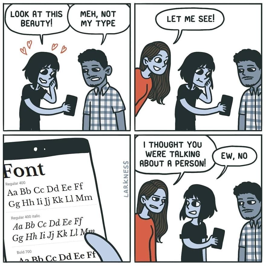
Meh, not my type
-
This has an art nouveau feeling.
-
[email protected]replied to ElectricMachman last edited by
Very nice! What is the difference btw small caps and petite capitals?
-
Wasn't there a subreddit about improving comics? Usually just removing the panel that rams the punch line down your throat.
-
[email protected]replied to [email protected] last edited by
It will look good in a children story-book. Not in a professional email.
-
CarrotsHaveEarsreplied to [email protected] last edited by
It appears that the middle line crosses the centre of mass.
-
-
[email protected]replied to [email protected] last edited by
verdana is great for small sizes on screen. it was designed specifically for that purpose so it would look good with pixellation. it's probably the most successfully designed Microsoft font to date. if you want to type anything in like 5-6pt font verdana is a great choice. but that also makes it bulky and inelegant at larger font sizes.
if you want a sans serif default ms font to use in larger sizes the segoe font family is pretty good.
-
[email protected]replied to [email protected] last edited by
they're called lowercase numbers and they're designed to look good in paragraph text. for example if you're reading this comment, mentioning the year 1997 suddenly puts four full height characters as if I typed one word in all caps, while in lowercase numbers it would look more like if I typed the word iggy (1 is x height while 9 and 7 have descenders like g and y).
they're not designed to be used in math or for longer number sequences. for that you have the full height (uppercase) numbers that most typeface should still have.
-
[email protected]replied to [email protected] last edited by
lowercase numbers, check my comment above if you're interested
-
[email protected]replied to [email protected] last edited by
you don't need 2 either. 1 is the setup, 3 is the punchline.
-
[email protected]replied to [email protected] last edited by
The biggest factor for me with fonts is readability (I have my notepad++ default to verdana at 16pt font on a 1080p monitor which is my ideal). It's probably worth mentioning that my eyesight isn't great and I think I have some kind of brain related trouble with print.
Segoe is okay, but the font is really thin and the spacing is too narrow for me.
-
[email protected]replied to [email protected] last edited by
yeah I said for big sizes. 16 is more mid, and not perfect for segoe's thin lines. i think verdana is still a bit too bulky for 16 but for any kind of vision impairment it should be great.
-
[email protected]replied to [email protected] last edited by
Oh that makes sense, thanks for the information. Still would not want to use something thats not universal.
-
I'd say Art Deco, Art Nouveau's successor, but obviously there aren't fine lines between them.
When I think Art Nouveau, I think wavy, curvy script; everything was just a little psychedelic in Art Nouveau.
1920's, in any case.
-
What're you looking at?? His gut?? He's working on it!
-
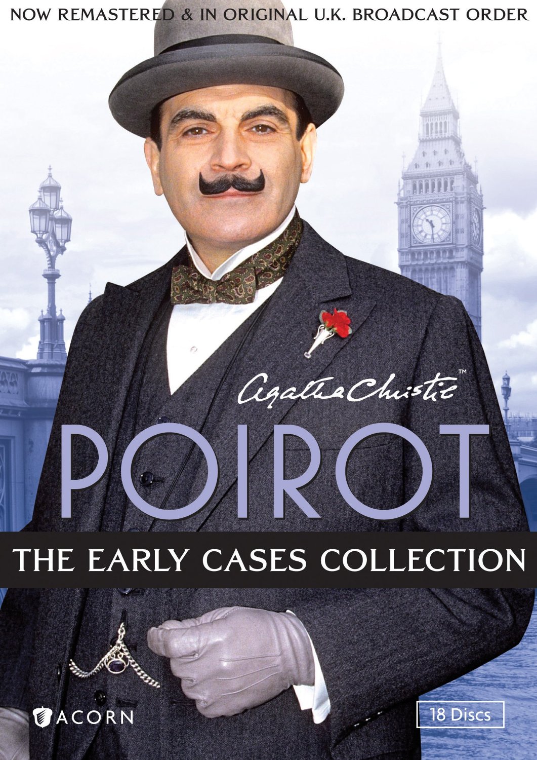
And Jeeves & Wooster, and Poirot.


Poirot is obviously the inspiration here, in style and name.
-
I really love the numbers, though.
I've discovered that it's a horrible screen font, though: far too spindly to be easily readable. I still use it, but I have to make it larger than usual and bold, and it's still a little hard to make out sometimes.
Oh, what we sacrifice for aesthetics.
-
[email protected]replied to [email protected] last edited by
idk what you mean by universal; this is a typographical choice. the only reason you see more uppercase numbers everywhere is because of typewriters and by extension computers. I don't think people make a point of lining numbers up with cap height in handwriting.
-
[email protected]replied to [email protected] last edited by
You might enjoy Futura, the ITC Avant Garde Gothic family, or Century Gothic...
-
[email protected]replied to [email protected] last edited by
FWIW, these are "old style" numerals, and there are also versions of Fira Sans with "tabular" numerals that are all the same height (e.g., in LaTeX, you can pick either one).

