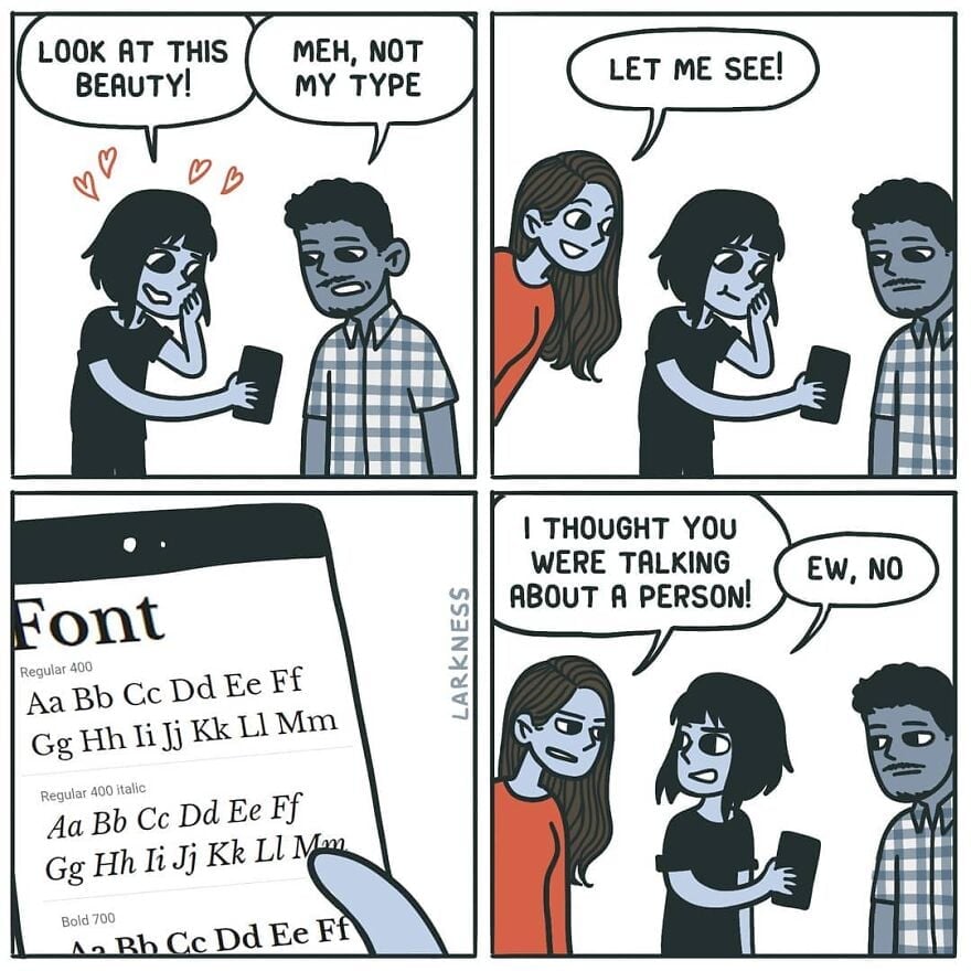
Meh, not my type
-
[email protected]replied to [email protected] last edited by
See that's funny. My boss using comic sans light blue for emails explaining highly technical shit to non-technical users? Funny in theory, absolutely not in action.
-
ElectricMachmanreplied to [email protected] last edited by
You may enjoy these:
Comic Mono https://dtinth.github.io/comic-mono-font/
Fantasque Sans Mono https://belluzj.github.io/fantasque-sans/
-
ElectricMachmanreplied to [email protected] last edited by
Came across Junicode 2 recently, and wow, what a typeface!
-
[email protected]replied to [email protected] last edited by
Maybe a bit basic but I'm fond of Helvetica myself
-
[email protected]replied to [email protected] last edited by
No. I like the "ew".
-
[email protected]replied to [email protected] last edited by
If your font type was a person:
GIMME AN A


-
[email protected]replied to [email protected] last edited by
that's how you teach them to highlight and copy/paste text
-
[email protected]replied to [email protected] last edited by
0xProto nerd font.
-
[email protected]replied to [email protected] last edited by
Verdana is my fucking jam. Good spacing and very legible at different font sizes. My only two gripes: Lower case "l" (L) being a straight line and the number 0 has no cross through it. Not major though, cause they're still pretty distinct from similar characters.

-
[email protected]replied to ElectricMachman last edited by
They're good, but I find both to be marginally less legible than Source Code Pro where the i and j are clearer, particularly when next to each other. The a is less clear in Source Code Pro though, so I'm still looking for the perfect font.
-
[email protected]replied to [email protected] last edited by
The "ew" saved it.
-
[email protected]replied to [email protected] last edited by
When you pick topmost font for ricing ur terminal
-
[email protected]replied to [email protected] last edited by
It's just that beautiful.
-
[email protected]replied to [email protected] last edited by
Text looks good, but man the Number hight looks cursed and kinda random.
-
[email protected]replied to [email protected] last edited by
Their shape is beautiful (from 3 to 9) but why were they not written on the same line?
-
This has an art nouveau feeling.
-
[email protected]replied to ElectricMachman last edited by
Very nice! What is the difference btw small caps and petite capitals?
-
Wasn't there a subreddit about improving comics? Usually just removing the panel that rams the punch line down your throat.
-
[email protected]replied to [email protected] last edited by
It will look good in a children story-book. Not in a professional email.
-
CarrotsHaveEarsreplied to [email protected] last edited by
It appears that the middle line crosses the centre of mass.

