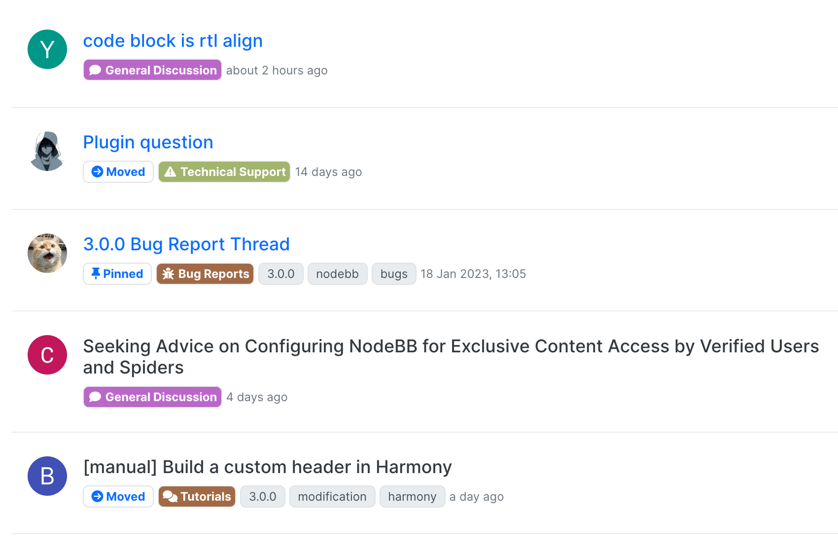
Proposed unread message indicator
-
Hi All,
I noticed over the weekend that the read message font weight has been set to (possibly 400 or even 300) and a tiny "dot" added to represent an unread message / thread. Forgive my bluntness here, but this makes it almost impossible to determine if a topic is unread without looking properly - it's actually worse on a mobile device.

For around 3 weeks, I have custom code and CSS that sets an unread topic in my dev environment to the below

To me, this looks much clearer, and it's obvious there is new content. The "posts" count to the right is also animated
webm.red - Untitled
Webm.red is a simple service for uploading, hosting, and sharing webm videos

webm.red (webm.red)
-
@phenomlab good feedback

This week we've been working with @vladstudio to fine-tune many aspects of the theme. Lots of whitespace fixes and small changes that are far too numerous to elaborate on.
One of those changes is the unread indicator. I believe the row still has the
unreadclass, so that shouldn't interfere with your existing customizations, though.I'll defer to him to respond back re: rationale for the change.
-
@phenomlab - hey, I'm Vlad, I'm working with NodeBB team on Harmony theme design. So you can blame me for most design change while we polish the details and experiment with various options!
Adding color to a post counter when the topic's unread is a great idea - thanks for it!
In your screenshot the unread dot looks particularly small! It might a bug. Will look into it.
I must admit I was the one who promoted consistent topic title text color. It's quite probable that, while striving for the page to look good, I broke your user flows accidentally. My apologies! Let's bring the blue color back for unread titles.
I will, however, stay strong on keeping the font weight. I did reduce it from 700 to 500 (not 400 or 300 actually). Can you spend some time with this font weight and let us know your opinion after you get used to it a bit?
Thanks.
-
@vladstudio said in Proposed unread message indicator:
In your screenshot the unread dot looks particularly small! It might a bug. Will look into it.
Yeah, that dot in @phenomlab's screenshot is definitely a lot smaller than the one I see:

-
I, too, appreciate more clear change.
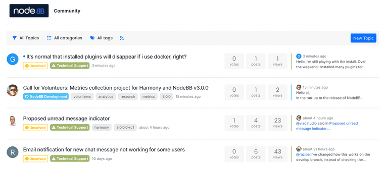
My elf eyes cannot see which titles are not read without looking at the page very carefully. It should be more clear...

-
@crazycells it seems I may have underestimated the popularity of the blue colouration for unread topics
-
-
@brazzerstop looks good. I'm doing something similar expect with the posts div.
-
@brazzerstop I think the icon was enlarged (uses icon instead of
·now).The animation I am not sure about, as it may be better to have as few animations as possible in a base theme.
Will leave that determination up to @vladstudio
-
much better

