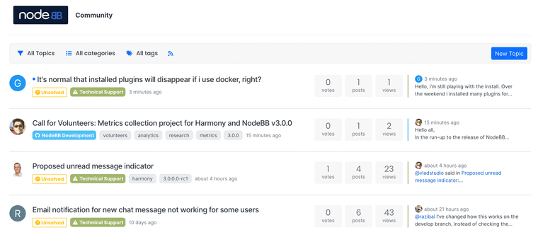
Proposed unread message indicator
-
@vladstudio said in Proposed unread message indicator:
In your screenshot the unread dot looks particularly small! It might a bug. Will look into it.
Yeah, that dot in @phenomlab's screenshot is definitely a lot smaller than the one I see:

-
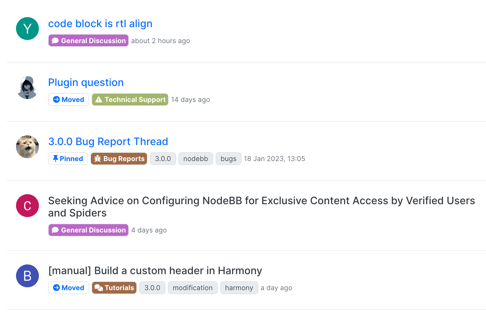
I, too, appreciate more clear change.

My elf eyes cannot see which titles are not read without looking at the page very carefully. It should be more clear...

-
@crazycells it seems I may have underestimated the popularity of the blue colouration for unread topics
-
-
@brazzerstop looks good. I'm doing something similar expect with the posts div.
-
@brazzerstop I think the icon was enlarged (uses icon instead of
·now).The animation I am not sure about, as it may be better to have as few animations as possible in a base theme.
Will leave that determination up to @vladstudio
-
much better


