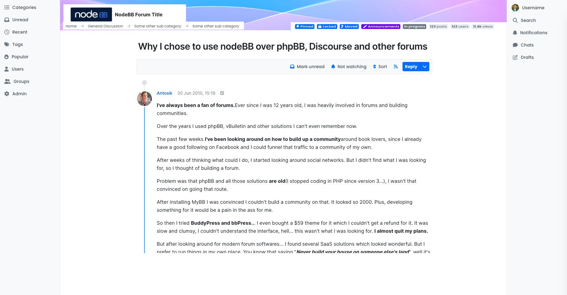
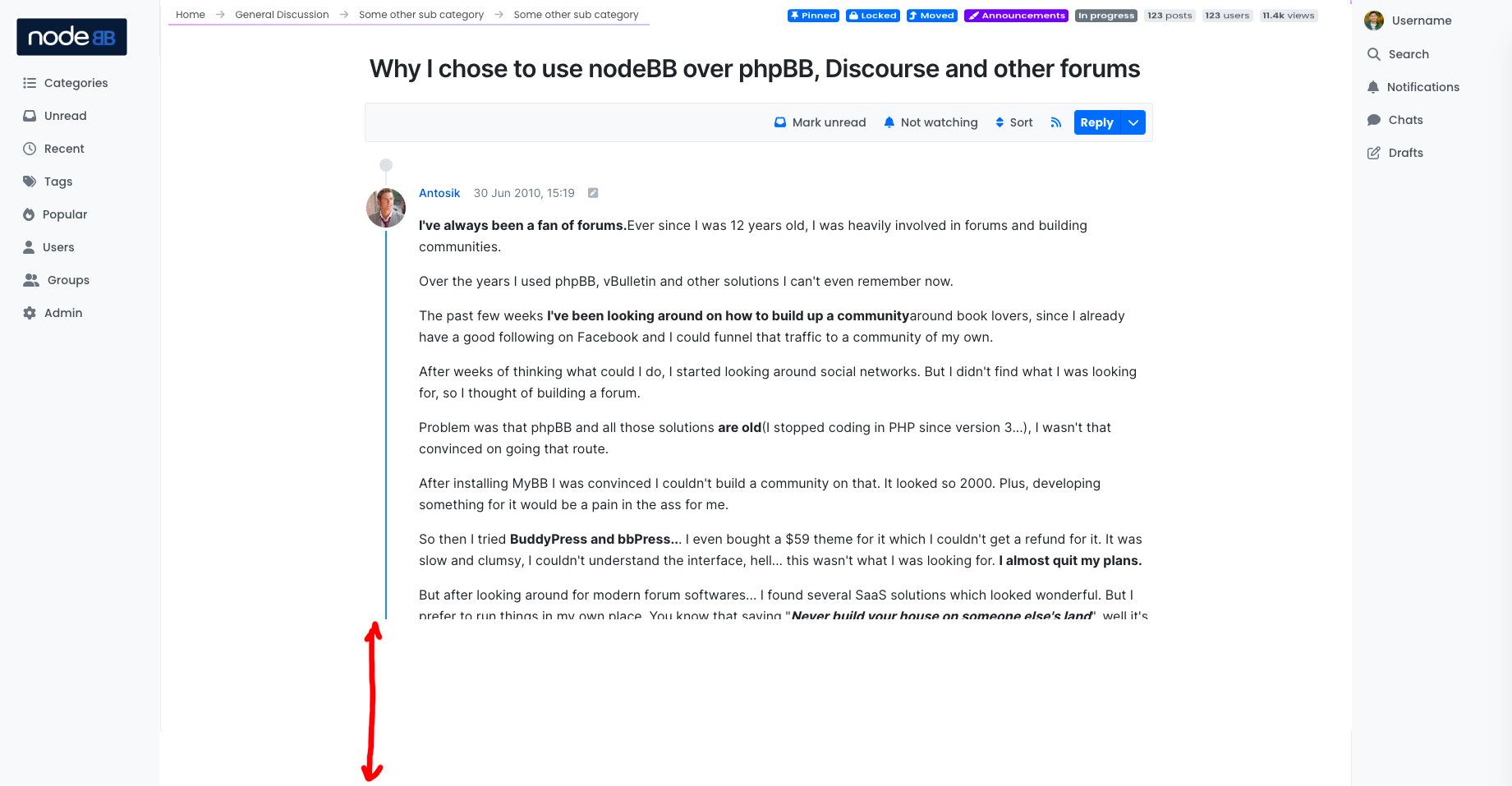
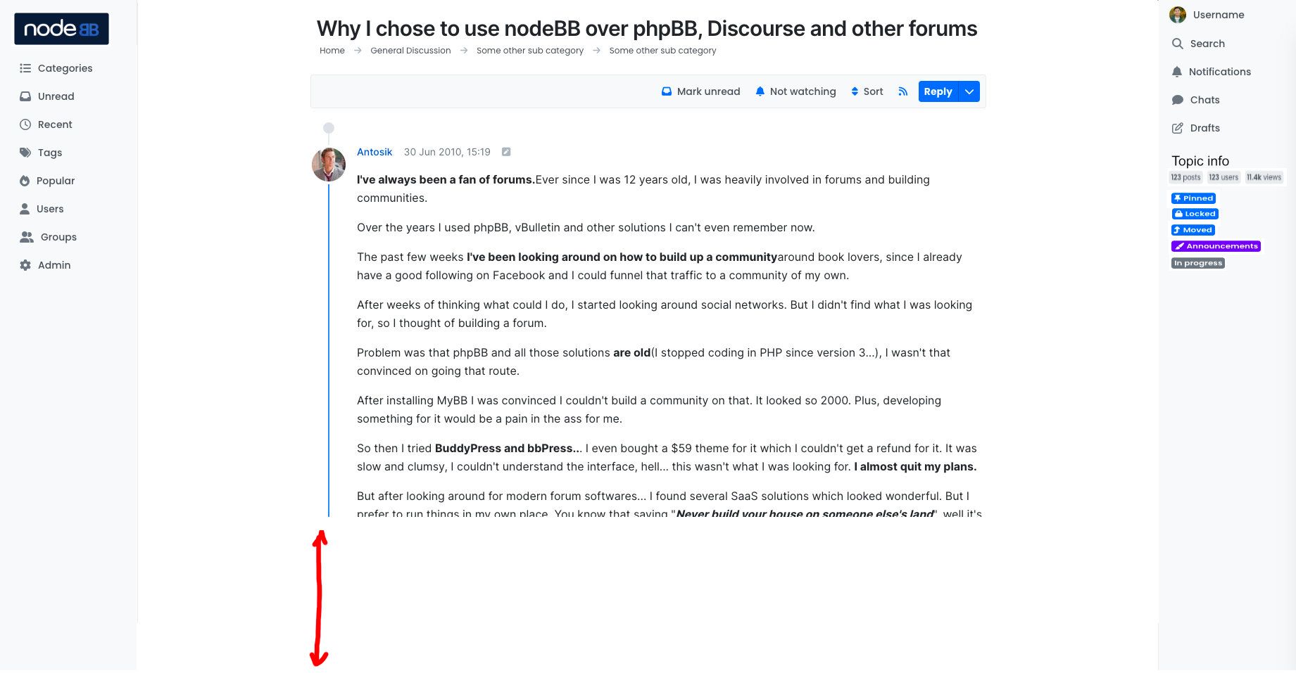
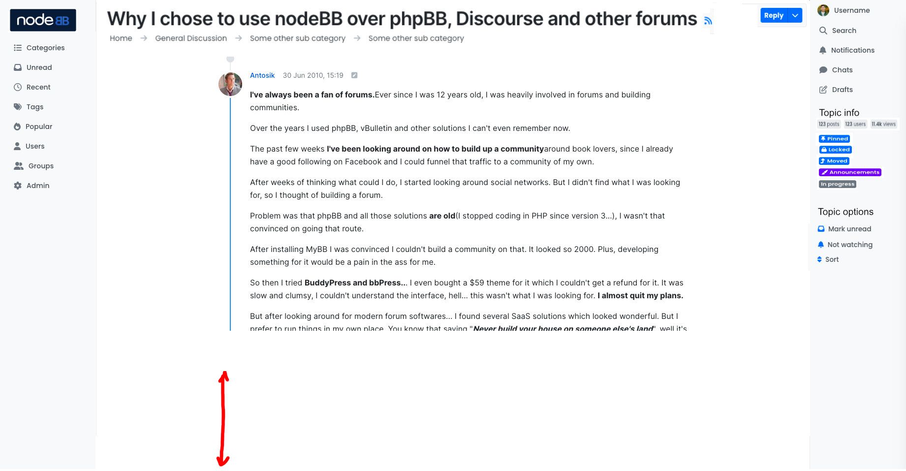
December 2022 Design Preview (Harmony Theme)
-
@vladstudio thanks, when can we see the mobile version?
-
@crazycells it is partially available already, please open this link:
then squeeze the browser window to minimum width (or, open this link on a mobile device). Note - this is only a design prototype, it has almost no interactions, and there are bugs here and there.
-
@vladstudio I could not make it work unfortunately. But I can wait... no problem

-
I just now looked at the prototypes from Vlad and I understand that 2 sidebars will be sticky.
My picture is just an example of how you can unload the header. I think that unimportant elements should be reduced or put into static areas, giving the heading and text more air.
-
I loved how the chat box panel is extended to the bottom of the page. I think it definitely makes more sense to extend it rather than keep it as a small box that we have to scroll onto. This option is clicked when I want to see the chats, so I should be able to see as many chats as possible.
I wonder why it is not the case for the notification box panel as well?
@julian maybe "mark all read" and "view all" options can be put to the top of the panel, and panels can be extended depend on the screen size?
edit: I just realized there is a limitation for the chat box as well if I expand the browser size; anyways I still think it will make more sense if it is not limited to 4 chats and can be extended further depending on the screen size.
-
@Topper We're at alpha 2 now, so you can probably expect a couple more alphas, a couple betas, and we're targeting (excuse the marketdroid speak) Q2 2023.
@Kosiak et al., we have to be wary of shoving too many items into the sidebars. We ran into this issue many times over the years with the top bar. We would have sites attempting to add too many icons to the top bar (and also, the topic navigator at the time was also in the header), causing it to overflow onto two lines.
Utilisiing a sidebar also neatly sidesteps this issue. You're able to add more icons to the left-hand sidebar, and you're not constrained by the user menu and any potentially invisible elements.
With the right sidebar, we now have the user icons, as well as the topic nav.
Priorities with this theme redesign were minimalism and focus. As elements were replicated in Harmony, we evaluated each one to determine whether its existing position satisfied those concerns. For example, should we have topic tags, pinned/lock state, etc., in the sidebar? Arguably no, since they serve little purpose when you're in a topic, because you're in there to read the post, and maybe reply.
It even goes as far as the topic TITLE
 — do you need to have the topic title visible at all times (see this page on Persona)? Arguably, no...
 -
@julian said in December 2022 Design Preview (Harmony Theme):
For example, should we have topic tags, pinned/lock state, etc., in the sidebar? Arguably no, since they serve little purpose when you're in a topic, because you're in there to read the post, and maybe reply.
Of course, these are unimportant and rarely used elements. Should it then be in the most prominent place in the header or topic title? Perhaps, but then it should not take up so much space and attention. Even the website logo is not that important on the topic page.
I would hide such information behind three vertical dots or make it icons.
-
I for one really like how Harmony is shaping up

My only worry is translation of the sidebars to mobile - the current responsive demo doesn't seem to have that part implemented.
Other than that worry, I really like the sidebars and the general move to text labels whenever there is space for them. I especially like the right sidebar submenus (yay for better drafts
 ).
).I'm not entirely convinced by logo/cover location, as it makes the site look a bit like it's always trying to be a bit of a landing page, but I think I get why it ended there and it doesn't seem that bad (side note probably just for the demo, but shouldn't the logo be on top of the cover image? It being below just seems weird and takes up space).
Also, I spy a skin switcher - guessing since Harmony is now joining Peace on this, one can at least for now expect any new v3 themes to incorporate them. Any chance of older themes being updated to have one too?
@julian said in December 2022 Design Preview (Harmony Theme):
Astute readers will probably have already discovered the theme name, since we've been iterating on our theme in public

It seems it's not that public, considering the URL returns a 404 and I can't find anything with harmony in its name under NodeBB org - I'm guessing someone forgot to change the visibility from private to public

(or it was hidden before I made this reply for some reason) -
@oplik0 Uhm... yes, that would be the case. Let me make it public now
 (Edit: this is done)
@Kosiak Whilr you are certainly correct that the topic metadata is not so important, this is exactly why it is at the top (but explicitly not sticky/floated)... its usefulness is limited to the beginning of the topic, and then it scrolls out of the way

-
@julian said in December 2022 Design Preview (Harmony Theme):
@Kosiak Whilr you are certainly correct that the topic metadata is not so important, this is exactly why it is at the top (but explicitly not sticky/floated)... its usefulness is limited to the beginning of the topic, and then it scrolls out of the way
@julian I meant anywhere, but not in the headline, which looks overloaded and there is too much unnecessary for normal reading.
Ideally it should be (not a dying classic):HEADING
textWhen you open the book, the metadata is on the last page, and all secondary or circumstantial information is in the footnotes at the bottom. The book is about reading, and not about finding out the size number, publisher, number of copies, etc. If we want to concentrate on the main thing, then we need to remove or hide the secondary. 95% of the visitor to a regular forum only read it, about 5% respond or create their own topics. How many people need metadata to post in the title of each topic, and what does it bring to the community? I think that such meta-information should either be moved to places where the eye is not looking for text (and this is not the top of the screen), or hidden in 1 click behind a drop-down menu or active icons.
I've been in the forums for over 20 years as a member and administrator. I have never used the "Mark Unread" button in my life. Maybe something is wrong with me, but in my picture of the world there are no situations for which such a function would become a solution.
PS I don't know how to do it right, I just threw my thoughts. And I know how wrong: all the classic forums with tables and a bunch of meta-information that no one needs. This is one of the reasons why they lost to social media and died.
-
I have never used the "Mark Unread" button in my life.
Just my two cents about this one, I have it in daily use and don't want to miss it. It just helps me to keep track of my 'to do list'. Basically for things which are happening atm and I should not forget about but writing them down elsewhere or saving a bookmark is simply killing my flow as it's not working on the go. For me this is a time saving key feature and fast accessability is a thing.
Moreover I am considered that post metainformation is relevant, especially in forums with technical discussions where I do want to know who is writing what and when. However I am not so deep into that discussion here so I might not get the full picture. Just wanted to express my point of view.
-
@schajuli said in December 2022 Design Preview (Harmony Theme):
I have it in daily use and don't want to miss it.
The same stance applies to me. I also use it daily - please don't remove it
-
@phenomlab said in December 2022 Design Preview (Harmony Theme):
The same stance applies to me. I also use it daily - please don't remove it
Its really weird for me. what is your use case?
-
@Kosiak so I can keep track of posts that I open where a detailed response is required. I'll mark the post as unread as a reminder that I need to respond.
I run a technical consultancy and have users scattered all around the globe in different time zones, so it's often late evening when I check on my phone and I often need to explain something with screenshots which doesn't lend itself to mobile very well.
-
@Kosiak said in December 2022 Design Preview (Harmony Theme):
@phenomlab said in December 2022 Design Preview (Harmony Theme):
The same stance applies to me. I also use it daily - please don't remove it
Its really weird for me. what is your use case?
I , too, use it daily. I open a thread, and if a question needs a long answer and if I do not have enough time, then I mark it as unread in order not to miss it later. Otherwise, it is impossible for me to remember all the topics that I have visited and not answered yet.


