Mobile Composer | Placement of Menus > Bottom
-
I think there was some a more recent topic on updates to the mobile composer but I can't find it.
In the context of the established Harmony vernacular.
On mobile, the composer menu bars should actually be placed at the bottom.
I haven't looked at the latest 3.5.0 ACP and don't know if it's a configurable option (without resorting custom code), or if there was a previous discussion on this and I've missed something but for consistency and therefore by default, all those bits n'pieces should be anchored the bottom.
-
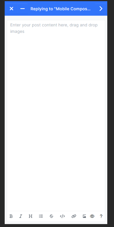
@omega Like this?

@media (max-width: 767px) {
.d-flex.justify-content-between.gap-2.align-items-center.formatting-bar.m-0 {
    position: fixed;
    bottom: 10px;
    left: 0px;
    right: 0px;
    z-index: 2;
    background: #ffffff;
    border-top: 1px solid #eeeeee;
    margin-right: 10px !important;
    margin-left: 10px !important;
    }
}
I have to agree though, it does look much nicer.
-
@phenomlab Yes
 ...and if you were able to relocate also the blue bar, below the new bottom position of composer buttons, then methinks we will have established consistent UX expectation on mobile of the UI.
 -
@omega said in Mobile Composer | Placement of Menus > Bottom:
Yes ...and if you were able to relocate also the blue bar, below the new bottom position of composer buttons, then methinks we will have established consistent UX expectation on mobile of the UI.
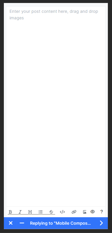
Like this?

@media (max-width: 767px) { .d-flex.justify-content-between.gap-2.align-items-center.formatting-bar.m-0 { position: fixed; bottom: 42px; left: 0px; right: 0px; z-index: 2; background: var(--bs-body-bg); border-top: 1px solid var(--bs-border-color); margin-right: 10px !important; margin-left: 10px !important; } .fixed-top { position: fixed!important; bottom: 0 !important; right: 0; left: 0; z-index: 1030; top: unset; } } -
That's the idea! Well done and thanks.

-
@dave1904 I haven't tested @phenomlab code yet but iirc for example on iOS the UI will frame the web content. The keyboard being UI level and not on the web page.
-
@dave1904 said in Mobile Composer | Placement of Menus > Bottom:
Isn't the mobile keyboard overlapping the composer buttons with this solution so that you have to minimize the keyboard everytime?
That's a good point. Let me test that.
-
@phenomlab I dropped in the custom code but it only moved the buttons, and not the the blue menu, it remains at the top (Safari 17) - I even upgraded to 3.5.0 to test it.
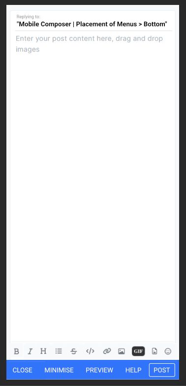
More importantly, the concept iterated. I quickly reworked the concept from your GFX to illustrate the potential here, this is only a mockup:

I was in a rush so used text buttons to illustrate the button for the blue menu bar.
-
@omega @dave1904 this isn't as simple as it seems. Sure, you can re-position the elements, but then you'd need conditions. For example, if the post is a reply to a thread, there won't be any tag input meaning the position of the toolbar would have a space underneath it where the tags should be, and if you changed the position to accommodate that, the toolbar would be too low.
Also, to echo concerns from @dave1904 - I have tried the keyboard, and whilst you can minimise, it's not the best experience in my view and makes posting even harder. You can set conditions using jQuery and a hook to listen on, but it's a lot of work for little yield in my view.
-
@phenomlab tbh I was pitching this rhetorically to dev, but it's interesting see how far you can push it with some quick custom code.
I hadn't used NodeBB in such a while, and then I was on mobile and it struck, ah these menus, they're in the wrong place for Harmony. They should for consistency be at the bottom, even stacked with the other elements, it opens up a new way of looking at mobile composer, plus improving the UX and I think gives room to solve some problems that ya didn't realise where there staring you in the face!

-
@phenomlab Yea so tested that fixed code, yep the keyboard does indeed shoot up over the relocated menu elements.
Maybe this is why it's all at the top, it's not unique to NodeBB neither!

I'm sure it's all fixable at the deeper code level, but what would I know

-
@omega said in Mobile Composer | Placement of Menus > Bottom:
it's not unique to NodeBB neither!
No. That same thing happens on all websites and in all honesty, it's a PITA.
-
-
@phenomlab There is a good argument to use modal menu to access formatting buttons, and maybe more thus increasing on screen typing space and avoiding such problems.
The bottom line is the controls when writing a post should be at the bottom naturally within Harmony theme (Browsers and mobile OS be dammed!) and initially reactions were positive toward this layout, a good start, maybe this topic is a good indicator and even proof of the value of the proposition.
-
I believe it is possible but would require a restructure of the composer window. When the mobile browser resizes to accommodate the keyboard, the viewport merely shifts up, but in the case of the composer, there is an established height, and that might be part of the issue.
NodeBB is not notified when a viewport resizes due to keyboard opening/closing.
-
@phenomlab said in Mobile Composer | Placement of Menus > Bottom:
makes posting even harder
You say it right @phenomlab, posting on mobile is already hard if you don't post only plain text.
While the editor is still quite easy to use on the desktop, it can be really cumbersome on the smartphone to just insert a link with text, especially for older, non-code-savvy people. I can't say it any other way - I'm sure many of my users are overwhelmed with the editor:
Very often in my forum a link is posted with the link text "Link Text" because that's what the composer generates when you want to post a link. I'm glad if they at least understand that you have to replace "Link Address" with the actual URL. I also often see broken links, because it is prone to errors if you have to replace some text within brackets for example.
Recently a user wrote that it's a shame that you can't post pictures from the internet or your own gallery from your smartphone. I just thought "Wtf?!". The user simply couldn't find the relevant buttons. I really had to told him that you can swipe the tool bar on mobile.
I have to say that I myself think it's a real fiddly job to do anything more than plain text on a smartphone. I know the Quill Composer exists but I really don't want to risk ending up with 13k posts in the original markup format.
Going back to the link example, it should be clear and unambiguous to everyone.
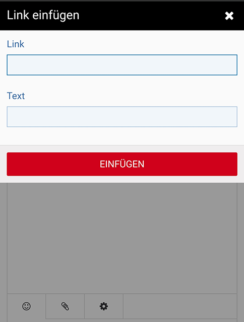
Here's an example from Woltlab how to insert a link on mobile, you really can't do anything wrong (and I hate Woltlab so much but damn, anyone can use this editor):

Sorry for off-topic, it just came to my mind and I really share @julian's love for markup


