[RFC] Announcements box in ACP dashboard
-
Just floating an idea out there — I did ask @baris first but I'm interested in all your thoughts too.
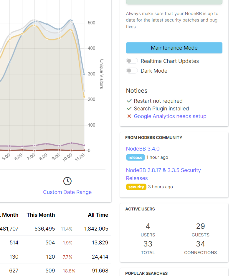
As forum admins, a lot of you come here to keep up to date on NodeBB development. Would it be helpful for you if there were a small box in the ACP dashboard that listed the relevant topics from the NodeBB team?
Some potential topics:
- New feature write-ups (what we normally do in the NodeBB Development category)
- Security announcements (
/tags/security) - New version release notes
A side effect may be we get more traffic here, which I suppose is good too, but is completely self-serving

-
On principle. It’s a good idea but consider keeping it focused and task narrow. Who wants yet another alert inbox to ignore! Nor is having a nested window to spy on NodeBB comms exactly the right thing methinks. Soon enough after, the request to be able to post replies form the ACP come and… then new topics and then…

Thinking about it as an ACP admin bulletins window. Tags could really help here.
Do we have tag groups yet?
-
Only with option to disable this feature. We have alert about new version and that's all what need admin. I don't understand, why you trying to create your a blog in users community (whats about mastodon, github release page, or maybe telegram channel?) and why my server need send api requests to nodebb, to check new topics on youre blog.
Youre forum use CloudFlare, I'm don't want get mark my server IP like a spammer, because everytime he send API requests on your blog. Hello, Ddos.
Maybe add blog url "Whats new" in alert about new version?
-
@brazzerstop we'd want to keep it to important announcements, and not litter the list with superfluous blog posts about stuff admins might be interested in.
That said, it's a slippery slope, and it'd probably be a good idea to allow an off-switch.
-
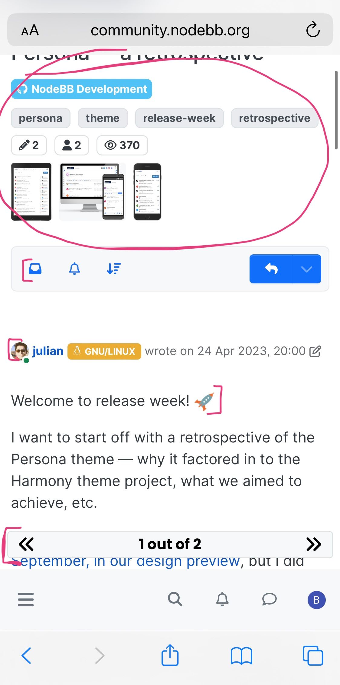
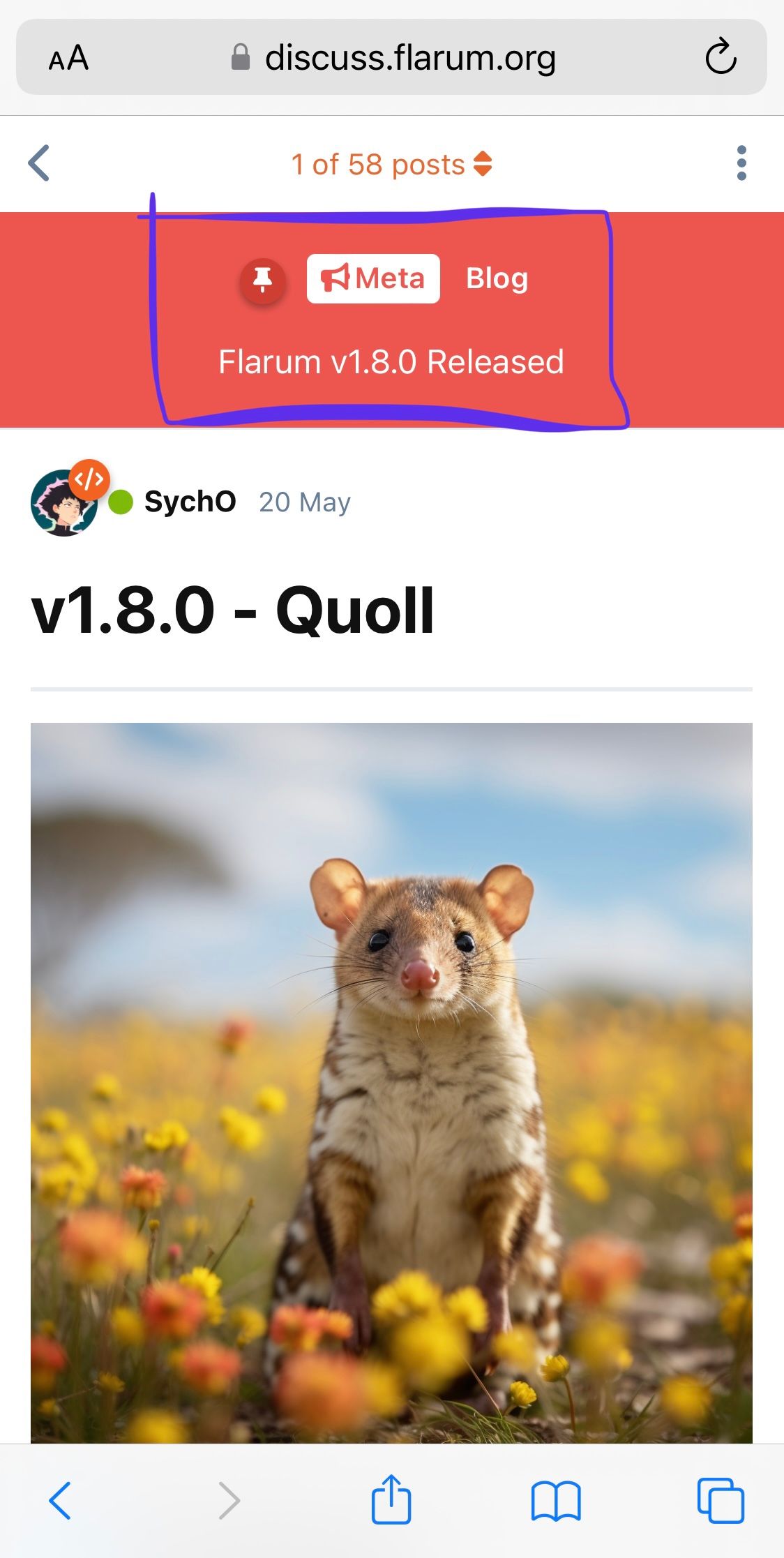
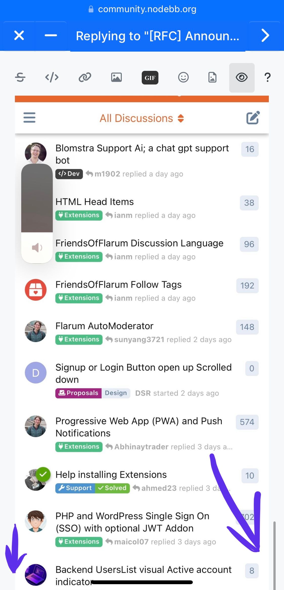
Plus longer articles should be interesting to read, the design of the topic is of great importance. The forum design is designed for short posts (a few paragraphs), more suitable for the support community, but the large and colorful articles lack aesthetics. This is what you need to focus on before pushing the blog to the masses and obliging administrators of all communities to come here and read about what’s new.
Is it aesthetic?
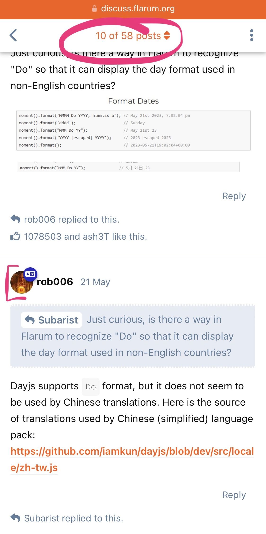
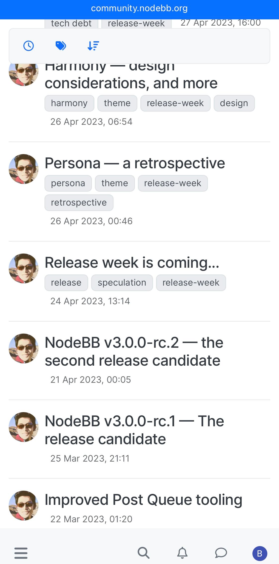
Is the page with a list of topics informative enough?
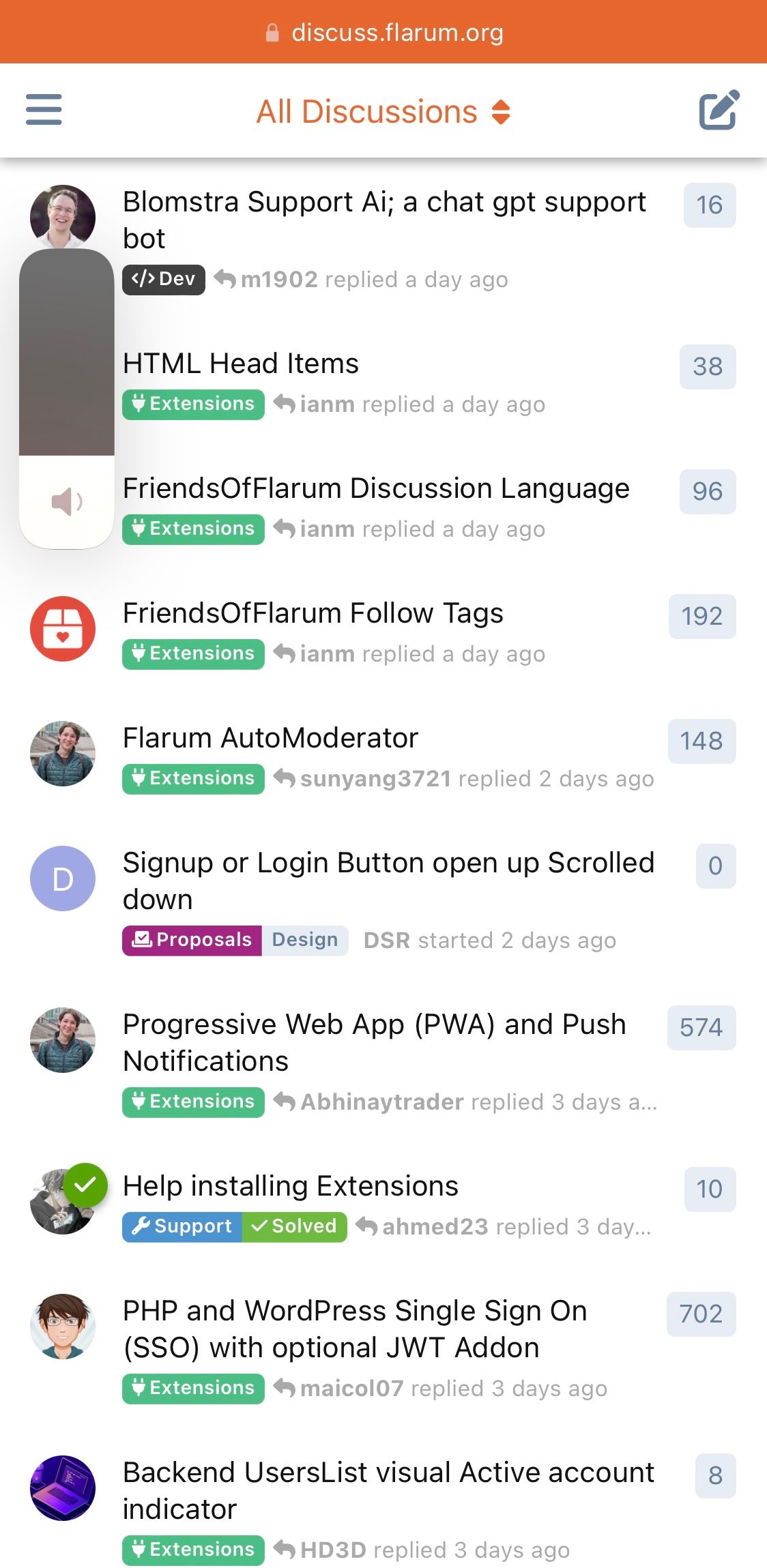
-
I couldn't write more and I washed away the thought because I don't see the text entry field, scrolling to the bottom doesn't help.
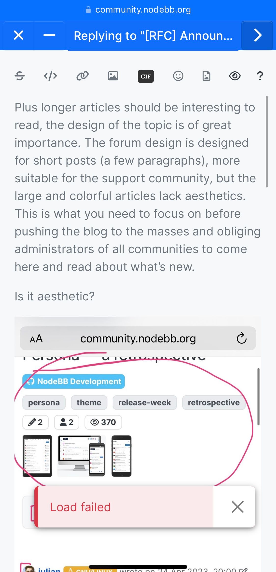
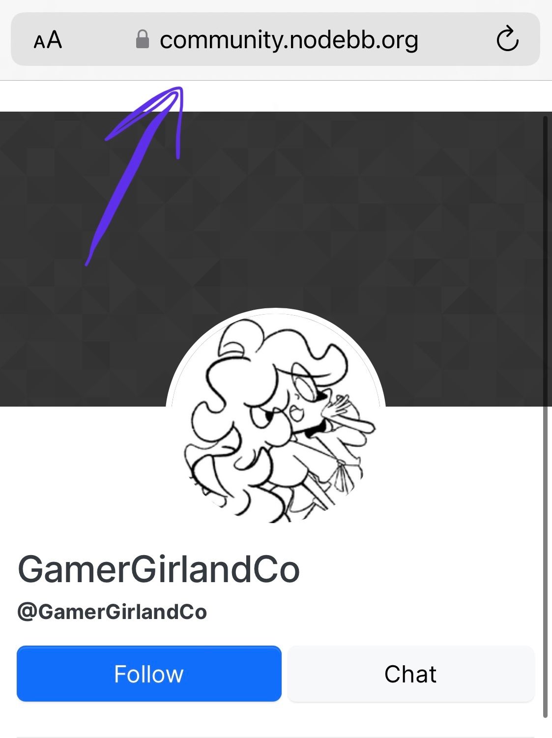
Where is forum header on user page?
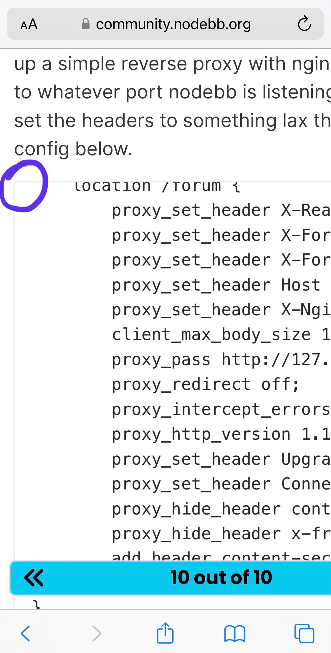
Why code block don't have border radius?
Why png with bad quality and not svg?
