Timeline Navigator - "Fruit Machine" Concept
-
The Fruit Machine

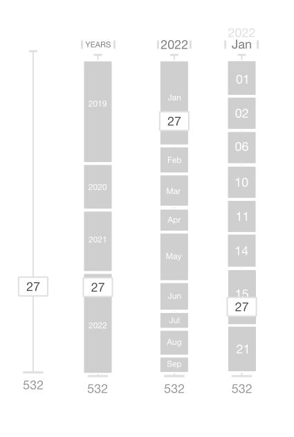
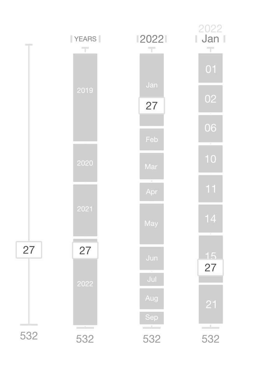
I call it the fruit machine, it's a conceptual iteration of the timeline navigator I came up with during harmony themes development and release somewhat out of frustration of unrealised potential but has remained unseen.
I believe it should be self-evident, if it's a good design, how it works, but I'll let that simmer with you all, to test that premise a little (the image depicts 4 potential states of the timeline navigator) and can answer any questions based on the image and outline how it works as I see it (a synergy to bring something new) if it is not fully apparent.
I post the idea here first, because;
a) it was always inspired by and meant for NodeBB
b) there is a good earnest dev behind nodeBB and a community of dev-usersIf one or more see the value in this concept and want to run with it, to code it where I can not, please do, and that's better than letting it sit on my cognitive shelf gathering dust and using up CPU cycles. If you do want to take up the torch please credit and consult-involve in the iterative process and use this topic to interact on the subject, because I would like to see this innovated as a UI navigation element, tried and tests and tried again, and so I'm happy to continue to lead on the design ui/ux front

-
 O omega referenced this topic on
-
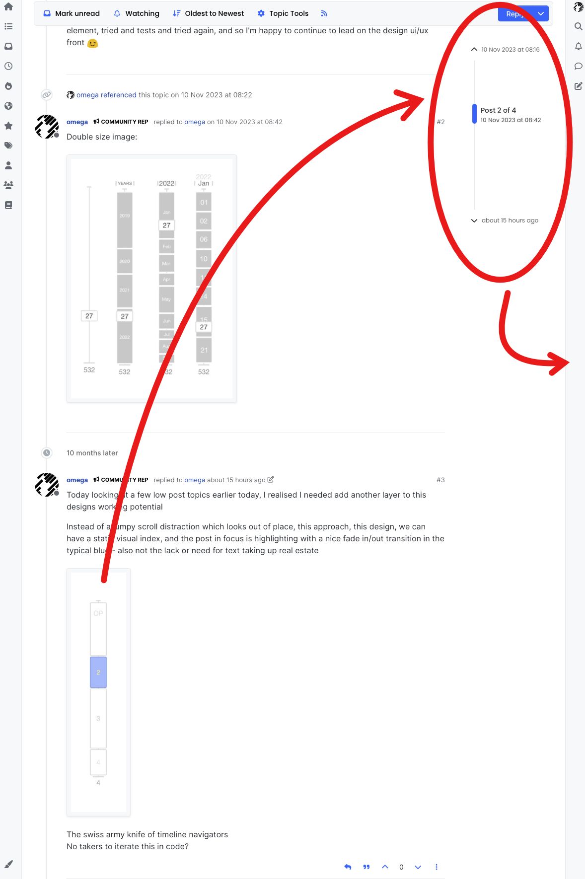
Today looking at a few low post topics earlier today, I realised I needed add another layer to this designs working potential
Instead of a jumpy scroll distraction which looks out of place, this approach, this design, we can have a static visual index, and the post in focus is highlighting with a nice fade in/out transition in the typical blue - also not the lack or need for text taking up real estate

The swiss army knife of timeline navigators
No takers to iterate this in code? -
Also want to note here for now as I can not find the example, substack introduced a similar concept and it might only be very recently.
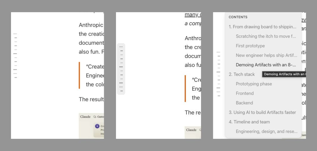
I saw it as a left side bar of lines, like ruler notches sans numbers. I stumbled upon it two weeks ago somewhat randomly - it gives a quick visual cue and click space to let the reader navigate quickly up and down the section of a very long substack post, cycling through the H tags, and is very similar in approach to my original idea posted here.
I use substack from time to time but missed this feature myself and when it was implemented, does anyone know what I am referring to and when it was deployed by substack?
-
Yesterday I had what was probably the experience of encountering un-propagated fediverse posts in an already fully read topic run (here), I came across some important but confusingly new posts, only discovered when scrolling up and down for another reason.
After posting yesterday iteration on the concept.
I realised the fruit machine timeline nav approach could visually solve the problem I think I encountered via this UI element to avoid confusion when dealing with schrodinger's posts in the fediverse

A user should clearly see 2 unread posts (for whatever fediverse reason) are waiting as "new-unread-post" in the topic post time line nav structure instantly
I would make it a hard rule that a click on the timeline navigator to navigate to the unread-post being the only way to clear the unread-status, not a scroll by
-
Another way to perceive this design, is as a "map of posts" in a given topic, and what better way to navigate the journey of a topic than with a dynamic map!
-
Ok I found the thing I was yappin' on about in previous post, the substack article contents navigation solution/approach that reminded me so much of the fruit machine concept / map of posts nav bar and how it appeared post-facto of this topic, and to think the idea lay hidden on my HD for longer still.

I found it after a quick poking around on this substack if you want to look at it in the flesh https://newsletter.pragmaticengineer.com/p/how-anthropic-built-artifacts
An idea will eventually get implemented somewhere sometime.
It is almost a year later I wonder, maybe no one thinks this is a good idea, or did not get the presentation. Or did not "grok" it as they say.

Maybe someone in substack picked up on this idea from here and saw value in it. I don't know, but stranger things have happened and this substack nav feature was not there the last time I looked which wasn't that long ago.
What would be nice if someone was brave enough to want to code up the topic navigation map of posts aka fruit machine so NodeBB can benefit rom the utility.
-
'Course I think it calls for as an approach, the harmonisation of the topic post navigator for mobile devices with the bottom progress bar and pop-up post cycle preview cycle into the fruit machine way, right now it's like a mini version of the topic itself but with desktop timeline scroll, ultimately so many different things kinda doing the same thing differently if ya dig?


