User Modes - Starting with READ Mode
-
User Modes
Is design thinking for user group behaviour or market segment patterns, inspired by mobile.
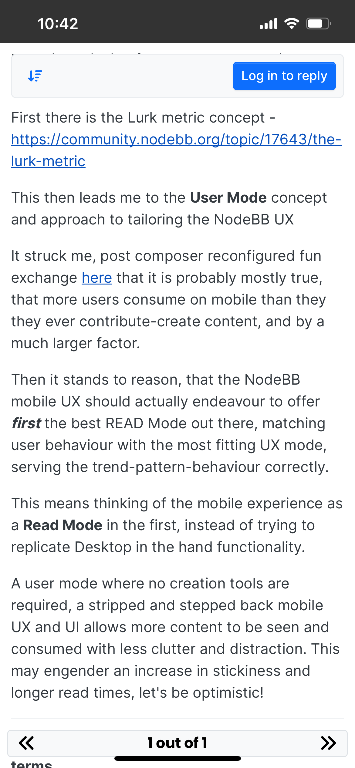
First there is the Lurk metric concept - https://community.nodebb.org/topic/17643/the-lurk-metric
This then leads me to the User Mode concept and approach to tailoring the NodeBB UX
It struck me, post composer reconfigured fun exchange here that it is probably mostly true, that more users consume on mobile than they they ever contribute-create content, and by a much larger factor.
Then it stands to reason, that the NodeBB mobile UX should actually endeavour to offer first the best READ Mode out there, matching user behaviour with the most fitting UX mode, serving the trend-pattern-behaviour correctly.
This means thinking of the mobile experience as a Read Mode in the first, instead of trying to replicate Desktop in the hand functionality.
A user mode where no creation tools are required, a stripped and stepped back mobile UX and UI allows more content to be seen and consumed with less clutter and distraction. This may engender an increase in stickiness and longer read times, let's be optimistic!
What does that mean in NodeBB Harmony terms.
READ MODE looks like:
- Top menu BAR is gone.
- Login to post is on the bottom bar.
All a READ Mode user really needs is access to read content and ability to navigate. No reply, no watching, no sorting, etc. etc.
READ mode in terms of UI needs only
- Home Button
- Login / To post
"Nothing else! Not even timeline. No timeline? No Navigator?! Are you mad Omega?"
Yes.
This then leads me to mention another older concept, that I didn't articulate very well some years back to the devs, but in this context make IMHO more profound sense.
READ Next Post Mode
Pagination is on a post by post basis. Scrolling is reduced to a minimum (only posts longer than viewport would require scrolling to read more)
A post is treated like next-page on mobile, so instead of scrolling you simply next post to read, well the next post!
Since then, it just so happens to have been developed circuitously, for another element, being the timeline navigator and so this capability is located in the timeline navigator (on mobile at least), for searching on a post by post basis.
If we elevate that style with some modifications of next-post reading as a default in READ Mode, then we might solve things like scrolling-fatigue or doom-scrolling-fatigue, or at least can offer either scroll or next-post as a UXUI in the best READ mode on the market!

In the hierarchy of Modes, I'm only thinking of two right now, who knows, but think of a Mode equalling an aggregate user behaviour, there could be more, maybe one more.
- READ Mode (new, different, engaging)
- USER Mode (existing experience and UI)
In conclusion, throwing all the USER mode functions at people who only want to exist in a READ Mode, may solve a bounce for-whatever-reason problem and help to increase engagement.
So stepping things right back and looking at the MVP for a READ Mode, as a universal default for all unlogged in users, may solve unrealised issues, as written, improve engagement, maybe countering general "sign-up" fatigue or reticence and so on.
-
hi @omega , what do you think about the harmony theme and the "read mode" you mention? I believe it does a very good job when you are logged out, since naturally people scroll down while reading, not much button is visible while reading, and options only appears when you start scrolling up...

and although I liked "read next post" mode, it has some crucial weaknesses... well, it is like reading a book, but first of all, you would not be able to read before switching the next page completely (but you can achieve this while scrolling down), and additionally sometimes posts are not filling the page, and they even can be a few words, in this case, putting the next post on the next page seems waste of good amount of space? what do you think?
