Mobile Composer | Placement of Menus > Bottom
-
@julian said in Mobile Composer | Placement of Menus > Bottom:
Isn't the woltlab guy working on Flarum now?
I don't know. I thought it's a whole company.
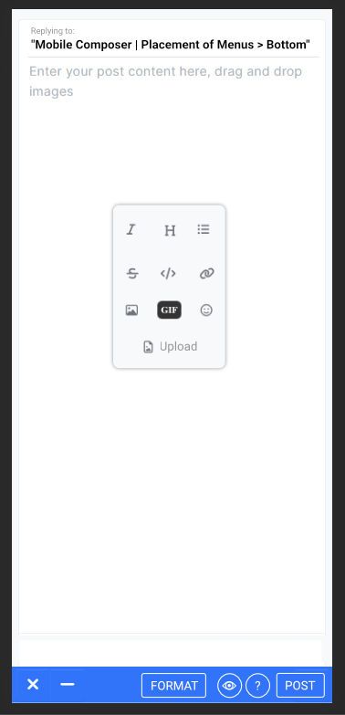
A little helper window for link addition would be a good improvement I think.
Helper windows would be a great improvement in usability in my opinion.
-
@julian Modals!?
Modal visual note. Not exactly a design but using a modal makes features more visible and you can include even more informative feature clarifying text. I don't think any mobile composer out there uses modals, well not that I've encountered. Nice UI things could happen here to.

If we have a trigger to pop up a modal we can avoid the keyboard shift, or can we... I can't remember, but nothing will move other than a modal appearing right?
- Select text
- click format
- format option menu modal pops up
- select button-option
- commit
- back to main view.
But to select text you are in the keyboard shift up view, at least in iOS as is.
-
@julian said in Mobile Composer | Placement of Menus > Bottom:
NodeBB is not notified when a viewport resizes due to keyboard opening/closing.
Is that a mobile OS thing or is NodeBB not set to watch for it?
-
@dave1904 Not off topic at all, some excellent insights, very important ones again and with the absolute wedge of users on mobile, and mobile being hardest and most difficult to post and engage in deeper and meaningful ways is it any wonder that engagement has dropped off so much over the years.
The death of long format posts for the sake of a million identical one liners or emoji reactions.
-
-
 O omega referenced this topic on
