3.0.0 Bug Report Thread
-
-
@julian Yea, I'm not lamenting that loss but I liked it, cause I'm odd that way, but conventions eh.
However now that you said that, I was thinking most normal users or the rally 99.9% of a userbase, would never be selecting posts in the first instance (usually) only Mods or Admins would have to encounter the outside-convention approach of the past.
I still like / prefer the idea of being in a active mod role or not. Such a clear UI delineation of being in active mod role with mod powers versus just browsing is a nice feedback touch, when things are busy.
As an idea-example, when in a mods-tools-activated-mode, the post listing (or post) might get a obvious grey outline (or overlay to make it dull but legible, monochrome even) and when selected this might change to a brighten up to normal or get a stronger colour outline, red or bright blue, yellow.
So scrolling up and down all the sleeted post are visually clear and strong to the mod/admin.
Each listing is like selecting as if it's an entire card.
Modding in the past on other platforms was always a precarious endeavour, and when ti went wrong, oh dear, as much as checkbox is old school thinking in terms of UI, i may work but consider the above if it's deemed useful.
-
Right I can see some of the UI behaviour I suggested is how it works in terms of visual feedback when selecting, fine, I hadn't looked at it deeply, so ignore all that I wrote on those points.
Ultimately, something if feasible other than the checkbox would be visually less troublesome meaning the same visual styling can be consistent for all users, as I assume normal users don't see these checkboxes as they have no need or access to "topic tools" or do they?
-
Ok, hmmm, well then it's even more an issue since the always-on checkbox is killing the layout n'look.
It's either stick with the checkbox as is or consider select listings as cards option instead, but have a a toggle on/off state, so no matter whatever the selection method is it's hidden for general browsing, and only appears when activated (needed).
If sticking with checkbox, consider aligning it to the left of the avatar not below, first in row, which is the logical or conventional place to put it IMHO, and because it's also adding to the height of each listing afaict, it's kinda wedged in there as is tbh.
It behaves similar in discourse like this, and funnily enough it took me some time to find that button to turn on the column, so I'd say in a toggle on/ff scenario, have that topic tool button display an on/off state in the nav bar, i.e. but no buttons anywhere else. Combine the function into what is already un the UI.
I like the topic tools counter, it's a nice visual feed back to have, however one thing I'm not seeing is a "select all" option, have I missed this?
-
Enable Live Reload (3.1.4)
I've detect the "Enabled Live Reload" is not behaving correctly, while it refreshes the page after an update (or appears to), it doesn't actually take affect last changes, and a forced browser page reload is required to see the latest results, it's like the reload is one change behind.
-
Navbar - fit and finish, bug.
Yea visual bug is a bug, to borrow some common coding parlance. So if something is visually buggin' me, it's a bug!

Since I was playing around with this in the live editor it caused me to notice the below here on community:

Perhaps you're testing something out but when I came across on my own deployment, I moved to "close the gap" or at least some of the gaps, among other things.
You can test with this quickly with the live custom code, which also applies some increased contrast with some drop shadow TLC and I think this works universally:
.sticky-tools {
     background-color: rgba(0, 0, 0, 0.0);
     padding: 0rem 0;
}

.navbar {
    background-color: white;
    box-shadow: 0 4px 8px 0 rgba(0, 0, 0, 0.2), 0 6px 20px 0 rgba(0, 0, 0, 0.19);
}
I'm on a mission to "close the gap" on desktop and mobile, that gap is a bug, a fit and finish bug! Don't be fooled!

-
One comment on the Data-line-number box looking very nice indeed with a Copy & Paste button perfect click and response feedback

-
Screen goes entirely black:
Reply -> Zen Mode -> Hide
(Type Esc to exit the black screen)
I reproduced this in Chrome, Firefox, and Brave. I am using v3.1.4, but it is also reproducible on this forum.
-
I found today that if in admin>settings>reputation you try and change any of the values, it doesnt let them save because it objects to other values being less than 0.
For example this was an existing setting
Minimum reputation to send chat messages
-100
It flags that up (cant be less than 0) when I try to save the other value I changed
I dont want to make that zero, otherwise someone who is at -1 will be stopped from sending a chat message.
it was ok at negative before, so I think its a bug that it doesnt allow it now? -
I am getting these error in console log, could this be related?
[deprecated] Accessing bootbox globally is deprecated.
Userequire(["bootbox"], function (bootbox) { ... })instead
error loading admin/settings/reputation
Error: Cannot find module './settings/reputation' -
@brazzerstop cannot reproduce, please submit client-side error logging in linked issue.
-
UPD
@julian I tested it now and this is not bug. I was can't generate backup codes because I don't enabled 2FA. Now I enabled 2FA and can generate backup codes... Sorry for the stupid

UPD
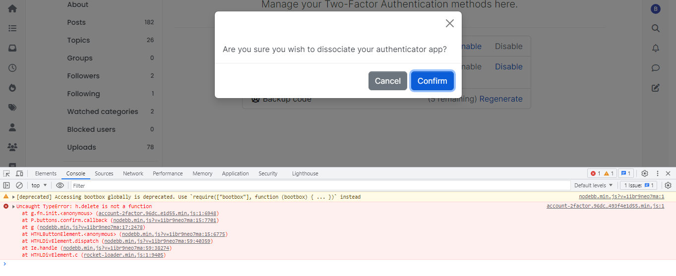
I can't disable 2FA, I get this in console when click Confirm.

-
Are we suppose to see ALL the unread notifications while having to scroll and find the couple of unread ones?
Perhaps a "filter" button to bump or only display "unread" notifications is required?
-
@brazzerstop Fixed in [email protected]
-
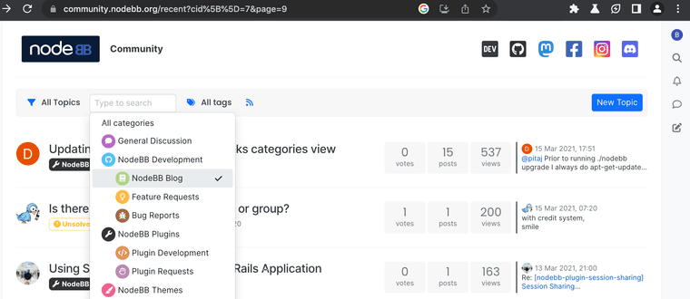
I get a strange result in filtration of categories on sticky tools.
To reproduce this we need enable page pagination.We set NodeBB Plugins (for example) - everything is OK.
https://community.nodebb.org/recent?cid[]=7Go to next page (page 9 for example)

https://community.nodebb.org/recent?cid[]=7&page=9Now we want to change filter of categories and view topics from NodeBB Blog

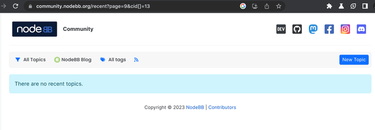
and we get incorrect result, because category NodeBB Blog don't have 9 page: https://community.nodebb.org/recent?page=9&cid[]=13

When we change a category, the filter not reset a page number.

