3.0.0 Bug Report Thread
-
hi @baris , when I quote @phenomlab 's post with a topic link here , it is referencing the topic twice although I am not referencing the topic... I am just quoting his post to answer him rather than "referencing" a topic...
I believe it should be considered a bug? what do you think?


-
@crazycells yeah looks like a bug, links in quotes shouldn't create backlinks https://github.com/NodeBB/NodeBB/issues/11664
-
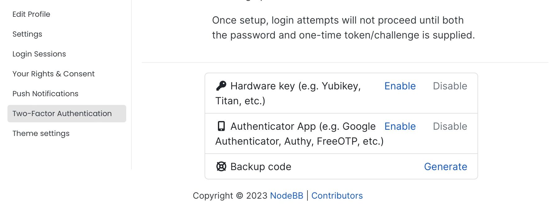
Generate button for backup code not work.
-
@brazzerstop said in 3.0.0 Bug Report Thread:
Generate button for backup code not work.
Which page is this on?
-
-
Problems with connection have been noticed, at some point the loading of the forum freezes.
-
This post is deleted!
-
V3.1.4 using Persona
- chat notification remains despite reading the last PM (this has been an issue since V3.x)
Deeper problems
Replies/Composer:
-
dropdown-toggle is not displaying so cannot access options
-
cannot launch composer when hitting reply on user post or clicking floating post draft icon
-
need to refresh the page to see a reply or "quick reply" appear in topic
-
neither @user-name ":" emoji menu pop-up is appearing when in quick-reply box
ACP:
- Appearance > Themes : Hangs on "Checking for installed themes..."
Browser: Safari 16.6
-
@baris Yea loads. I will check cloud flare I've probably screwed something up, but no changes have been made other than the update and then these problems started in earnest, i.e. no configuration changes were made, that's not to say the configuration is not great either!
One example of many errors when I click on the toggle-dropdown post menu
[Error] Failed to load resource: the server responded with a status of 403 (Forbidden) (socket.io, line 0)...https://www/socket.io/?EIO=4&transport=polling&t=OYBO720During the upgrade there was an error, that appeared at the end but I'v lost a copy of that, it didn't seem fatal to the overall installation, as nodeBB restarted.
I'm seeing this thread and it looks very similar, so I'll check that out too https://community.nodebb.org/topic/17284/err-of-update-from-2-8-11-to-3-1-4/11
-
@baris This is what fixed ma' problem https://community.nodebb.org/post/93738
I ran the upgrade again and everything is as it should be as far as I can see.
-
@baris ...ah, "by design" can it be un-designed

I can see what you are doing here, or it looks like you are trying to make something very clear to avoid confusion, "how does one select posts" to apply topic tools action to etc. etc.
The old click the avatar confusion of the past (which I found rather a neat approach once you knew it) iirc there might have been some topic on that recently I vaguely saw, anyhooo... usually the approach is to toggle those visible when say "topic tools" is selected i.e. activated, the posts are then selected and then the desired action selected next and applied.
I thought I was in the "activated" stage of that procedure, not in passive browsing mode.
Is I the only one to think this is outside normal convention in general?
-
-
@julian Yea, I'm not lamenting that loss but I liked it, cause I'm odd that way, but conventions eh.
However now that you said that, I was thinking most normal users or the rally 99.9% of a userbase, would never be selecting posts in the first instance (usually) only Mods or Admins would have to encounter the outside-convention approach of the past.
I still like / prefer the idea of being in a active mod role or not. Such a clear UI delineation of being in active mod role with mod powers versus just browsing is a nice feedback touch, when things are busy.
As an idea-example, when in a mods-tools-activated-mode, the post listing (or post) might get a obvious grey outline (or overlay to make it dull but legible, monochrome even) and when selected this might change to a brighten up to normal or get a stronger colour outline, red or bright blue, yellow.
So scrolling up and down all the sleeted post are visually clear and strong to the mod/admin.
Each listing is like selecting as if it's an entire card.
Modding in the past on other platforms was always a precarious endeavour, and when ti went wrong, oh dear, as much as checkbox is old school thinking in terms of UI, i may work but consider the above if it's deemed useful.
-
Right I can see some of the UI behaviour I suggested is how it works in terms of visual feedback when selecting, fine, I hadn't looked at it deeply, so ignore all that I wrote on those points.
Ultimately, something if feasible other than the checkbox would be visually less troublesome meaning the same visual styling can be consistent for all users, as I assume normal users don't see these checkboxes as they have no need or access to "topic tools" or do they?


 in every listed post as an admin or moderator, i.e. is always on in the UI for these users types?