Minor improvements to the mobile menu for a significant improvement in user experience
-
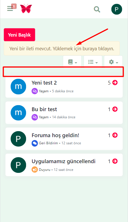
The new right menu on Smartphone is good but there isn't not enough space for the site logo and title

See the screen shot on OnePlus 8T :
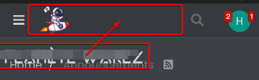
Any idea to handle this problem? @baris @phenomlab
-
@DownPW said in Minor improvements to the mobile menu for a significant improvement in user experience:
Any idea to handle this problem?
Use short logo
-
It's not just a logo, is a logo and site name (no logo, just police)
I will test to play with CSS because I want to keep logo and name site.
Not just logo or just name.
Maybe disable research function.it would be great to move the search icon which is very little used and put it back in a menu as before.
It's really a pity. what we gain in functionality, we lose in identity.
-
@DownPW said in Minor improvements to the mobile menu for a significant improvement in user experience:
It's not just a logo, is a logo and site name (no logo, just police)
I will test to play with CSS because I want to keep logo and name site.
Not just logo or just name.
Maybe disable research function.it would be great to move the search icon which is very little used and put it back in a menu as before.
It's really a pity. what we gain in functionality, we lose in identity.
I have a logo with a picture and a name. I created a logo in AAA logo and I'm happy. I advise you to make one logo and not use the name and image separately. That's what all good websites do.
-
@volanar said in Minor improvements to the mobile menu for a significant improvement in user experience:
That's what all good websites do.
Not sure I share that view

I have a logo and text. On mobile, I just hide the text and leave the logo showing
-
@volanar said in Minor improvements to the mobile menu for a significant improvement in user experience:
I advise you to make one logo and not use the name and image separately
That's what I do before. And what's good for you isn't necessarily good for everyone.
Now I have several theme with several CSS and I play with the logo font color on CSS for each theme. Technicaly, it's better simple !
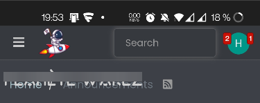
In fact, actually when you do a search via the icon, it eats up all the space.
EDIT: Example:
As it stands, without CSS modification, I conclude that the site name should not be used on Smarthone. Just the logo.
For me it's clearly a regression. I think lot of people use the name site on ACP and we lose this functionality on mobile or did I miss something
@phenomlab I haven't that view too
")
I think the best option for me it's to move the search icon on the right or left menu.possible to move the search icon on the right or left menu with CSS or not ?
-
hmm this code just not display forum title.
I searchEDIT:
For delete search icon :
@media (max-width: 767px) {
.navbar-header .navbar-search {
    display: none !important;
}
}
But I prefer move it rather than delete it
-
I appreciate the changes made to the mobile theme. Much more useful now. I have one more suggestion to the team.
When any topic is updated on mobile, the notification section at the top causes a slide. Maybe it would be a good idea to get this to the bottom part.