3.0.0 Bug Report Thread
-
Maybe it makes sense to add support for emoji from the emoji plugin in tags and topic titles?
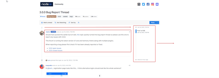
Design for this page... the category is very big and maybe need hide a long posts and add a button or link Read More...


-
@baris need switch to
vladbranch?
https://github.com/NodeBB/nodebb-theme-harmony/commits/vlad -
A few suggestions for the Harmony theme.
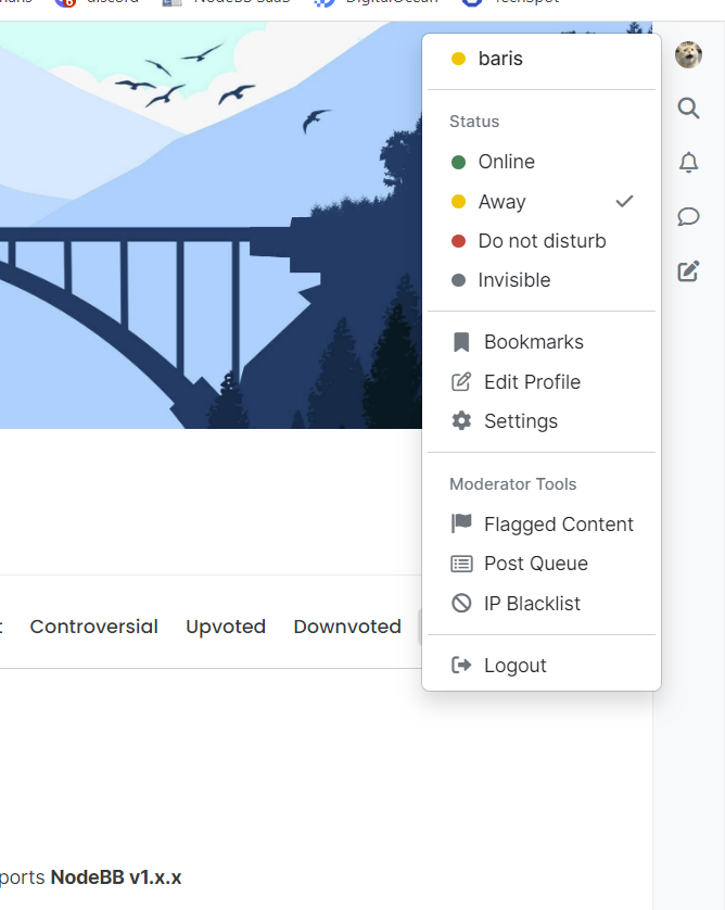
- Finding a bookmarked post is a pain in the ass right now. The logged in user should be able to see this in the right menu or among the options when clicking on his avatar in the right menu.
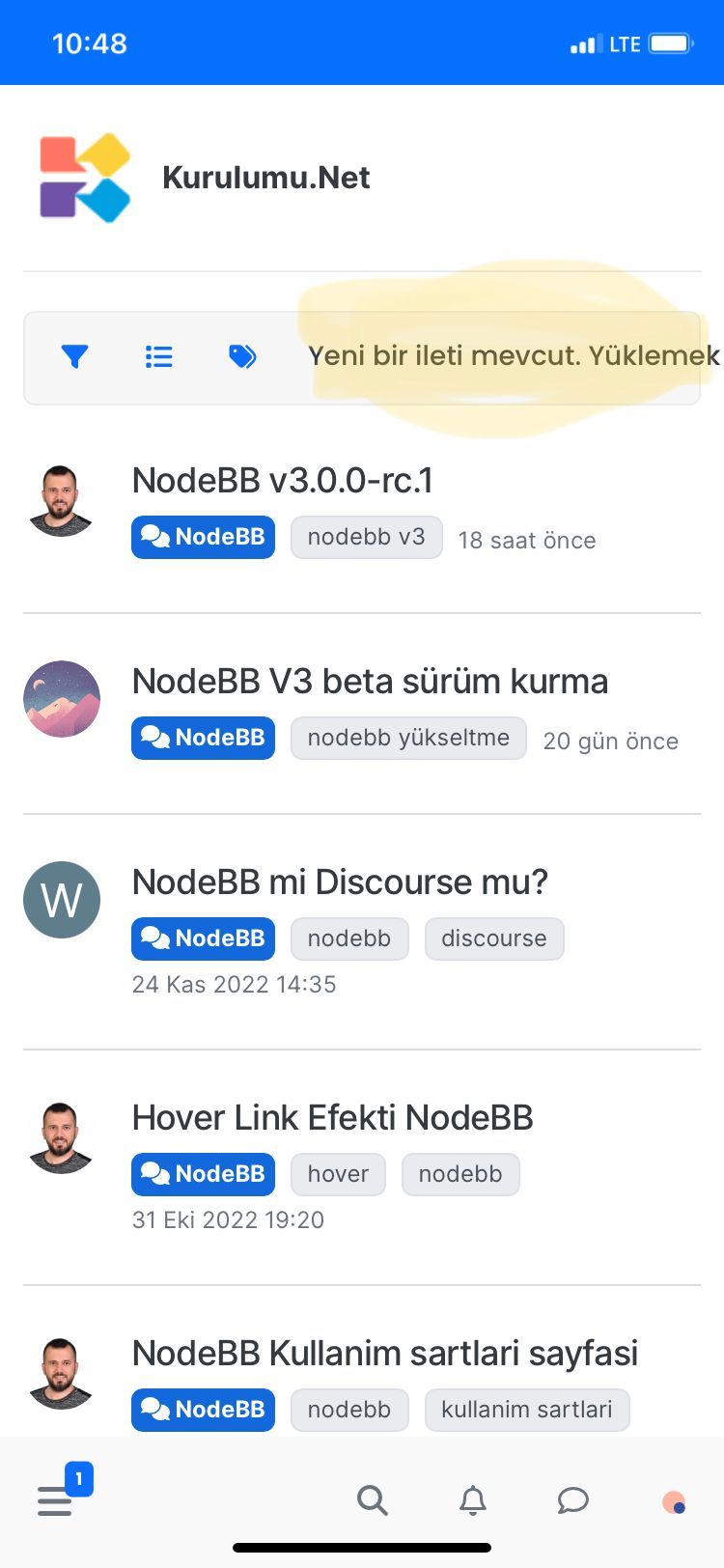
- When there is a new topic update, the problem seen in the picture below appears.
-
Hello @baris

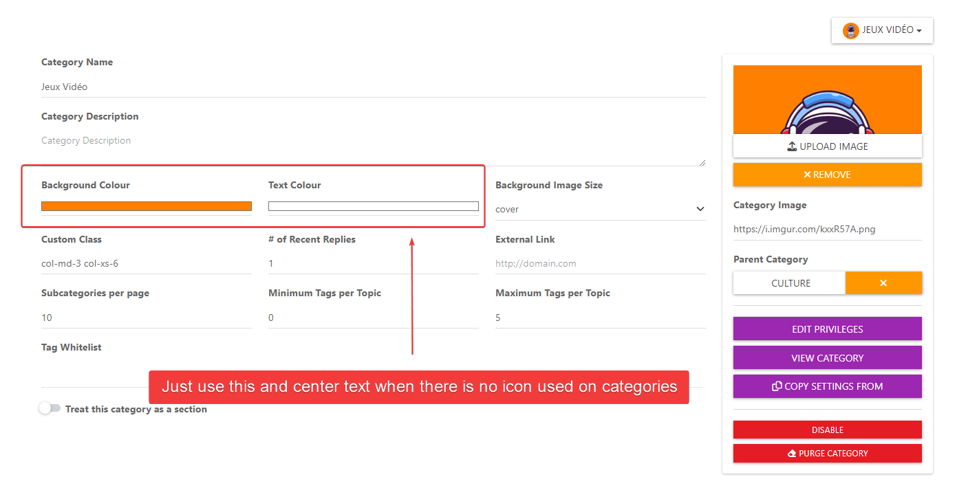
I had talked about bugs that was not taken into account. In fact, I use images for categories and I don't use icons on ACP :
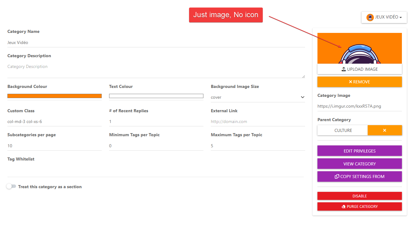
--> Here is the result :

Since I don't use an icon, the text is shifted to the right and not centered. And since I use an image, it can interfere with the readability of the text.
The ideal would be to simply use the color of the background and text when there is no icon used while centering the text
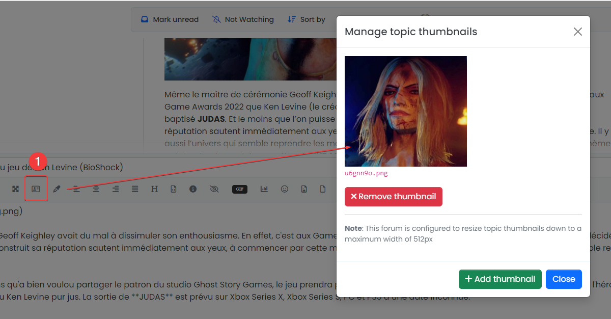
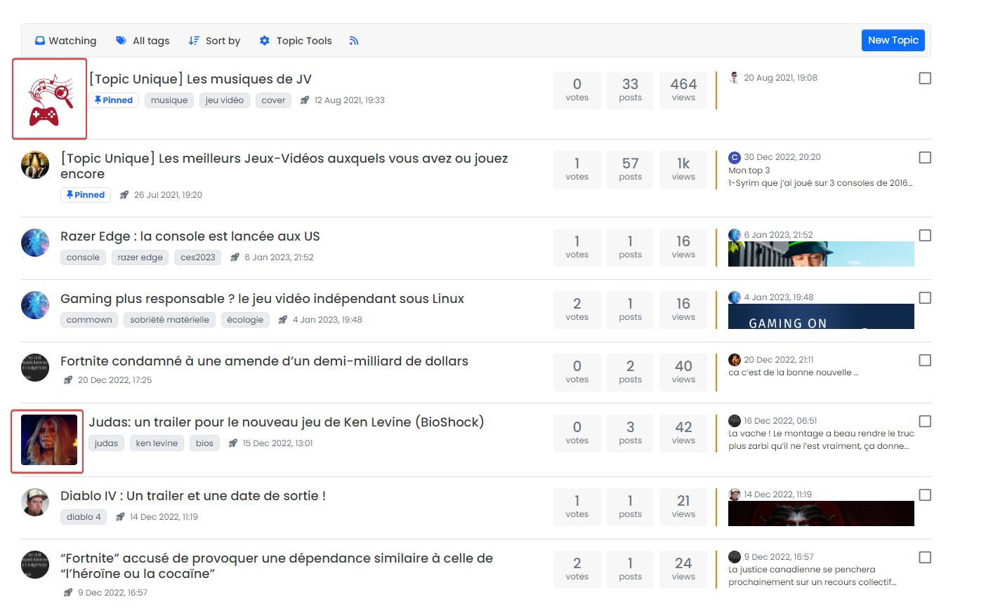
-- The other thing I notice is when a label/thumbnail (img, gif) is used for a topic, it's display appears very large and isn't the same size as topics that don't have one.
That's a pretty rough result I think.
-- And the last things I see, that there are no icons for subcategories on the home page as on 2.X
2.X :

VS 3.X :

--> It may be a deliberate choice that is personally unfortunate. If that's the case, I know we can't please everyone, but maybe there's a code to keep them coming back? Or maybe add an option to display them or not ?
-
@DownPW the issue with the category label is fixed in https://github.com/NodeBB/NodeBB/commit/28ed6c923c8839171fa25749a9f39680586b70d6, you can git pull on the
developbranch to get the fix.The topic thumbs are the same width as avatars on latest harmony too but you will have to switch to the
vladbranch or just wait until we merge those changes intomain. You can see it on this forum if you scroll down on https://community.nodebb.org/category/3/nodebb-developmentNo category icons is just a design decision for harmony.
-
Thanks about the bugs resolved.
There is a code for category icons to be back ?
-
@baris add or replace ?

<div class="category-children row row-cols-2 g-2"> {{{ each ./children }}} {{{ if !./isSection }}} <span class="category-children-item small"> {{{ if ./link }}}{buildCategoryIcon(@value, "24px", "rounded-circle")} <a href="{./link}">{./name}</a> {{{ else }}} <a href="{config.relative_path}/category/{./slug}">{./name}</a> {{{ end }}} </span> {{{ end }}} {{{ end }}} </div> -
Ok thanks my friend, I test it
-
Hello @baris
I just upgraded this morning and I see that. When a topic has a label it's no longer displayed on the left but on the right.
Instead we have the avatar of the creator of the topic.The topic selector is now below the topic icon
--> I don't know if it's normal...

-
-- Other bugs with Recent Card Widget and Font Awesome Pro loaded on custom header ACP, if you use a Pro version of Font Awesome that you use via the ACP/Custom Header like this :
<!-- Font Awesome 6 Pro -->
<link href="/assets/customfonts/FontAwesome-Pro-6.3/css/all.css" rel="stylesheet" />
--> The arrows in the Recend Card are not displayed correctly :

-
-- There is something that bothers me a little in the topics @baris , in particular on the scroller container and the screen width used for reading.
In fact, very little space (screen width) is used for reading.
It would be a good idea to widen this space and shift the slider to gain a little bit.We finally lose a considerable amount of reading space
