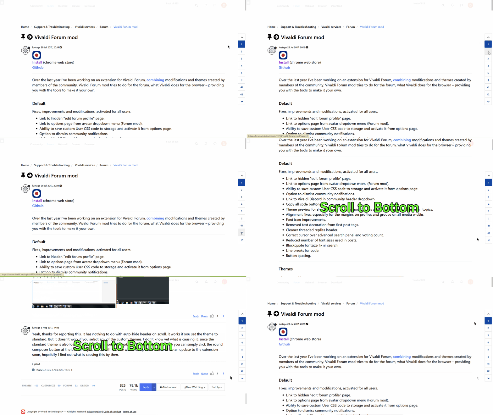
Please add vertical pagination
-
Original topic: https://forum.vivaldi.net/post/450949

Basically, we won't need 2 paginations on top & bottom of the page IF we have one fixed position pagination at the left/right side. This will allow us to access the forum's pagination at all time, with ease.
-
Perhaps the up/down chevrons lower right in screen shot below are the droids ye' be lookin' for...??

Just in case you missed it?
Yes, I grok that is not the same as pagination for paginated threads.
P.S.; Cool that Vivaldi is using NodeBB. I was early adopter of Opera bitd when it fit on a floppy.


-
@bugmenot It is an intersting idea.
The initial issue I have is it appears the proposition is swap next page button for top/bottom scroll, which breaks the logic of pagination navigation.
Perhaps another equally noble approach is merely a tweak on the current implementation, that would be to put the pagination nav bar on it's own floating menu that is always on top at the bottom of the screen.
In fact there is a very compelling argument which I have been thinking about a lot the last couple of weeks, that suggestion the bottom of the screen, especially for mobile devices, could be better utilised, rather than clustering everything to the top.
Typically our hand held devices finds more often our hands at the bottom area of the device, not usually the top.
So our fingers are already positional close to that area, meaning single hand operation/interaction with the UI is more comfortable.
Also anytime elements want to push the primary content off-side in real pixel terms or purely visual balance ratios, should be very carefully considered.
