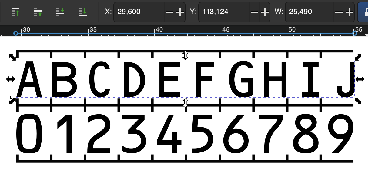
It seems to be impossible to find a version of OCR-B, the typeface, that actually is reliably monospaced, meaning that 10 characters, regardless of which characters, always take up the exact same space.
-
Arbyreplied to Jan Wildeboer 😷:krulorange: last edited by
@jwildeboer Ich bin nicht sicher, ob die Messung korrekt ist. Monospace bedeutet ja erstmal nur, dass der Abstand vom linken Rand eines Buchstaben zum linken Rand des nächsten Buchstabens ("Dickte") immer gleich ist. Die Zeichen selbst können theoretisch in der Breite abweichen.
Wie man ja auch in deinem Beispiel sehen kann: Das B ist definitiv breiter als das I oder das J. Was man auch sehen kann: Der Abstand ist nicht 2,54, die Zeichen wandern in ihrem "Rahmen" immer weiter nach rechts. -
Jan Wildeboer 😷:krulorange:replied to Arby last edited byThis post is deleted!
-
Jan Wildeboer 😷:krulorange:replied to Jan Wildeboer 😷:krulorange: last edited byThis post is deleted!
-
MarjorieRreplied to Jan Wildeboer 😷:krulorange: last edited by
@jwildeboer whenever is see 2.54mm mentioned in a spec. I know it was written by idiots (probably American).
-
Petr Tesarikreplied to Jan Wildeboer 😷:krulorange: last edited by
@jwildeboer But you know how this is usually solved in practice, don't you?
Break up your text into individual glyphs and then align each glyph separately on a 2.54mm boundary… -
The Bellmanreplied to Jan Wildeboer 😷:krulorange: last edited by
@jwildeboer I am interested to see how you solve this. My initial thoughts were all wrong and it’s an interesting problem that probably did not exist when the standard was created. The phrasing smells of a time before laser printers.
-
Jan Wildeboer 😷:krulorange:replied to The Bellman last edited by [email protected]This post is deleted!
-
Jan Wildeboer 😷:krulorange:replied to Petr Tesarik last edited byThis post is deleted!
-
Jan Wildeboer 😷:krulorange:replied to MarjorieR last edited by [email protected]This post is deleted!
-
Jan Wildeboer 😷:krulorange:replied to Jan Wildeboer 😷:krulorange: last edited byThis post is deleted!
-
Gareth Kitchenreplied to Jan Wildeboer 😷:krulorange: last edited by@jwildeboer I sense that the spec was devised in the era of daisy wheels, golfballs and line printers.

-
Jan Wildeboer 😷:krulorange:replied to Gareth Kitchen last edited by [email protected]This post is deleted!
-
Jan Wildeboer 😷:krulorange:replied to Jan Wildeboer 😷:krulorange: last edited byThis post is deleted!
-
Jan Wildeboer 😷:krulorange:replied to Jan Wildeboer 😷:krulorange: last edited by [email protected]
For the TD2 sized documents do the same dance but with 2 lines of 36 characters each and a size of 93,3mm. For TD3 (passport) 2 lines with 44 characters and a size of 114mm. It's a pragmatic solution that delivers acceptable results for the MRZ scanners I can test with, so I consider this solved for now.
-
Xavier «X» Santolaria :verified_paw: :donor:replied to Jan Wildeboer 😷:krulorange: last edited by
@jwildeboer Working on your passports counterfeiting skills?

-
Jan Wildeboer 😷:krulorange:replied to Xavier «X» Santolaria :verified_paw: :donor: last edited by
@0x58 I design and create my own documents based on the ICAO9303 standards for my own organisation, which is not a country, so it is no counterfeiting

-
Xavier «X» Santolaria :verified_paw: :donor:replied to Jan Wildeboer 😷:krulorange: last edited by
@jwildeboer Practice makes perfect.
-
Jan Wildeboer 😷:krulorange:replied to Xavier «X» Santolaria :verified_paw: :donor: last edited by
@0x58 10 years of that already under my belt. But now I want to have the complete production process as Open Source.
-
Matija Šukljereplied to Jan Wildeboer 😷:krulorange: last edited by
@jwildeboer, if you come up with a whole tutorial, I would be quite interested.
-
Jan Wildeboer 😷:krulorange:replied to Matija Šuklje last edited by
@hook @0x58 my last two blog posts already dive deep into the topic. Including a link to a MRZ (Machine Readable Zone) generator I made: https://jan.wildeboer.net

