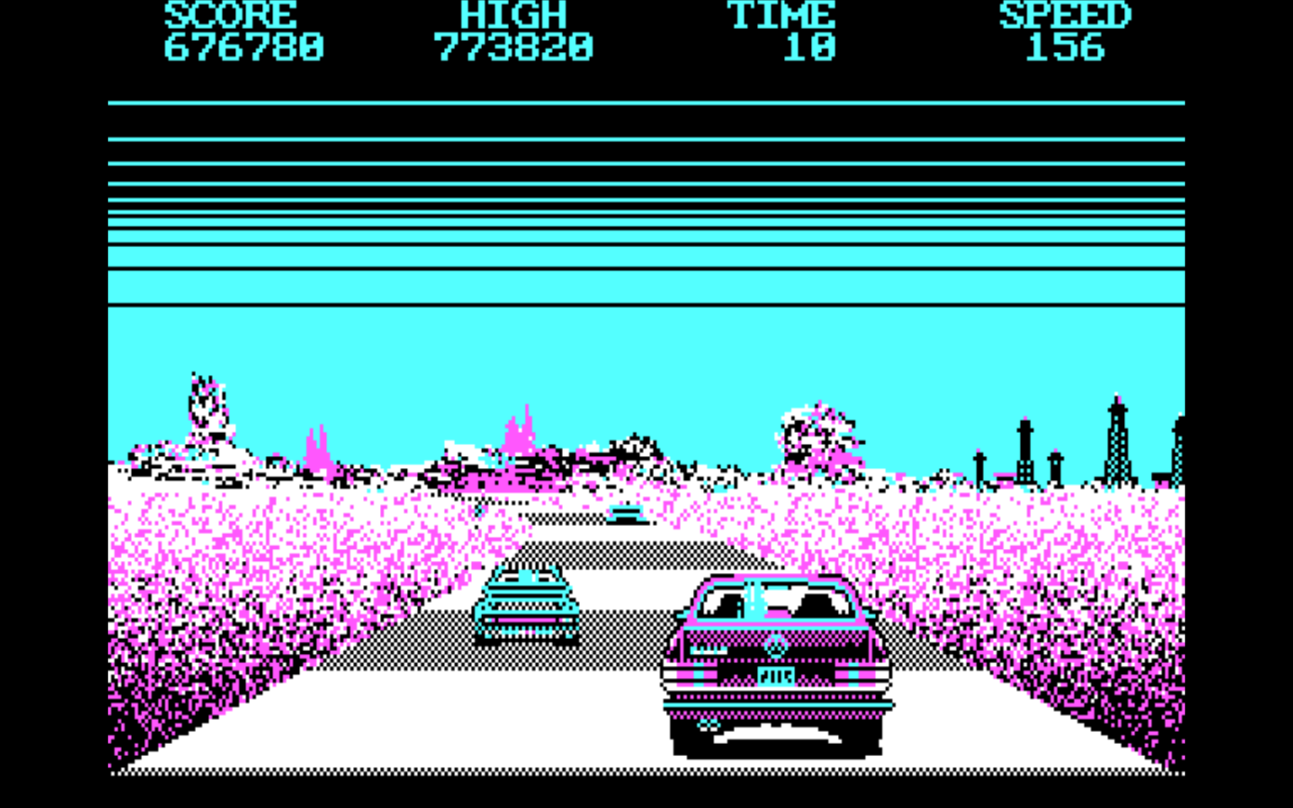
Released in 1987, Crazy Cars for DOS has exactly one redeeming feature: its graphics.
-
Released in 1987, Crazy Cars for DOS has exactly one redeeming feature: its graphics. Specifically, the DOS version.
Let’s be honest. Who remembers the Amiga, Atari ST, or Spectrum versions? It doesn’t stand out on other platforms. Those were fine, I guess, but they didn’t give us the true Crazy Cars experience: that eye-searing fever dream of DOS CGA.
The devs leaned hard into the four colour glory. That’s a whole aesthetic. Or as the kids say nowadays A E S T H E T I C.
The sprites are big. The background is minimalist. It borders on existentialism. Look at that use of colour. Is there anything more 80s than that electric blue and magenta palette? It’s practically a Miami nightclub in your monitor.
Certainly, in 1987, EGA was possible. But who needs 16 colours when you can make a statement with 4? The devs decided to keep things simple, and as a result we got something that looks pre-vaporwave album cover. That is, if that album also happened to simulate the frustration of driving a too-big car down a too-small road.
Most people remember 80s racing games for their looks—not their handling. It’s certainly not because of gameplay. Stuff like Pole Position is too basic and unsophisticated for modern tastes.
OutRun might be one of the few exceptions. The driving is nice. Yet would we be half as interested in OutRun if not for the red Ferrari, the blonde girlfriend in the passenger seat, and the fancy sprite-scaling?
Which brings us back to Crazy Cars. Man, is it crazy to control. Handling this car is a nightmare – like trying to wrestle a feral pig covered in grease. Everything moves too fast, and when your car launches into the air, you’re doomed to crash into something. Plus, your car is huge and the road is too narrow – it certainly shouldn’t allow two lanes of traffic.
If this were just another racing game, I’d probably quite in two minutes. But then… those colours!
Yet, as much as I want to tear my hair out, Crazy Cars’ unique style keeps pulling me back in. I want to hate it, but it’s got so much charm.
Sometimes, less really is more. At least, more fun for a laugh.

