Problems new users commonly report
-
As Admins, we get used to how the interface works, but its worth mentioning there are 3 areas which users commonly say are not intuitive.
The first issue already mentioned is the email verification not coming through, an on-going issue.
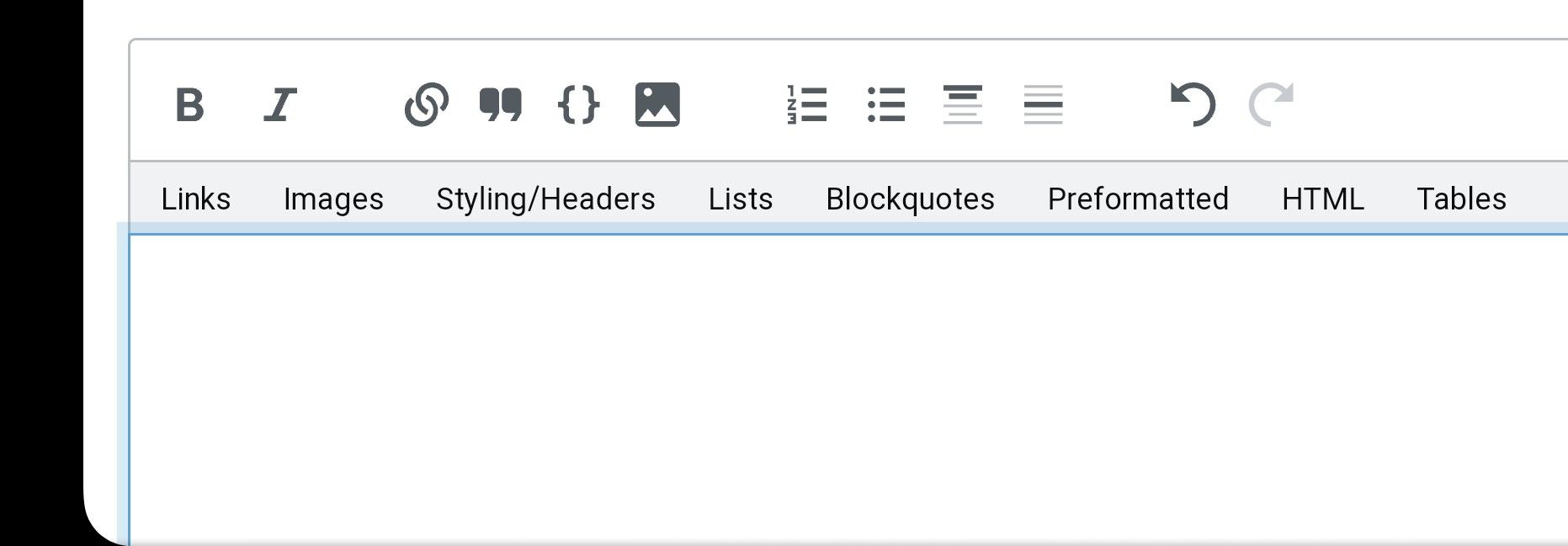
The 2nd I want to ask about now, the Composer.
Some less techy people struggle to upload images.
There are a similar looking icons for this, pic by url, image, and file.
The worst thing is the actual image upload icon is off the screen on mobile, so user has to know to scroll to get it
Is it possible to remove the pic by url from the composer, and rearrange the icons? -
My post didnt get any response but kindly @phenomlab advised how to hide some of the composer icons using CSS.
However I really think this is one of the top 3 issues that deserves some attention.
If the code could be changed so that the load image icon comes up first in the list, so is visible on mobile by default, then it would be a huge improvement.
Lets face it people rarely load images by url, or by file. And some of the other icons such as thumbnail arent frequently used either.
Image load is something most users use, and should be intuitative

