Revised search page design
-
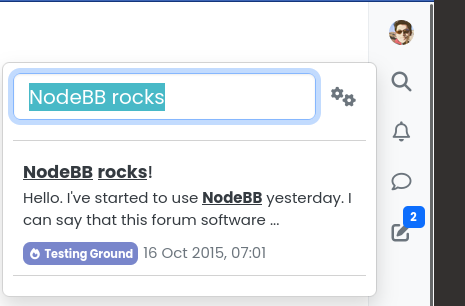
You might have noticed the search bar integration in the Harmony theme. Similar to Persona, the search bar is omni-present, although it is in a sidebar configuration unlike Persona's top bar (there is no top bar in Harmony as per design spec)


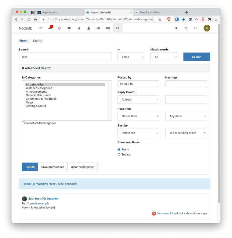
@vladstudio and @baris recently turned their attention to the search page as another potential improvement. The main complaint was that it was difficult to use effectively, as we had a large form hidden via an expanding drawer. The ability to filter through search results was functionally complete, but the user experience was lacking.

Per @vladstudio:
The main interface issue I wanted to fix in Search page is that:
- the advanced controls are hidden by default;
- when opened, they jump at me all at once and occupy the entire screen.
I wanted to make the following changes:
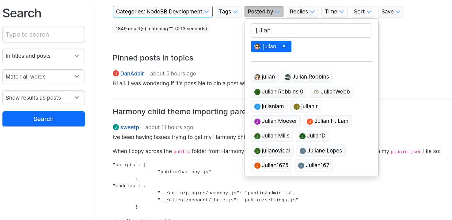
- make all controls visible by default;
- make them more “gradual”, so that each individual filter takes as little space as possible.
My assumptions were that:
- majority of users will glance through the controls and discover them, but not use;
- those who do use advanced controls, will not use all of them, only a couple.
So I tried to optimize for these assumptions.
Harmony was updated with a completely re-designed search results page, that puts the content front-and-center while ensuring that you can see each filter applied, at-a-glance.

While the content creation and consumption aspects of forums are our primary aims with NodeBB (and the Harmony theme as well), archival is an oft-overlooked benefit as well.
The ability to retain and later find relevant content is paramount to the continued existence of forum-based communities, and it is one that is minimized or outright hidden from the end user on social media.
Do a web search on any topic under the sun, and more often than not, you'll find a forum topic with a detailed discussion about it — not a Facebook post, not a Twitter thread, not an Instagram reel.
Social media is ephemeral, forums are not. Let's keep it that way

-
 J julian referenced this topic on

