-
🧵
 Let’s talk about optical centering and visual balance in UI design.
🧵 Let’s talk about optical centering and visual balance in UI design.
-
🧵
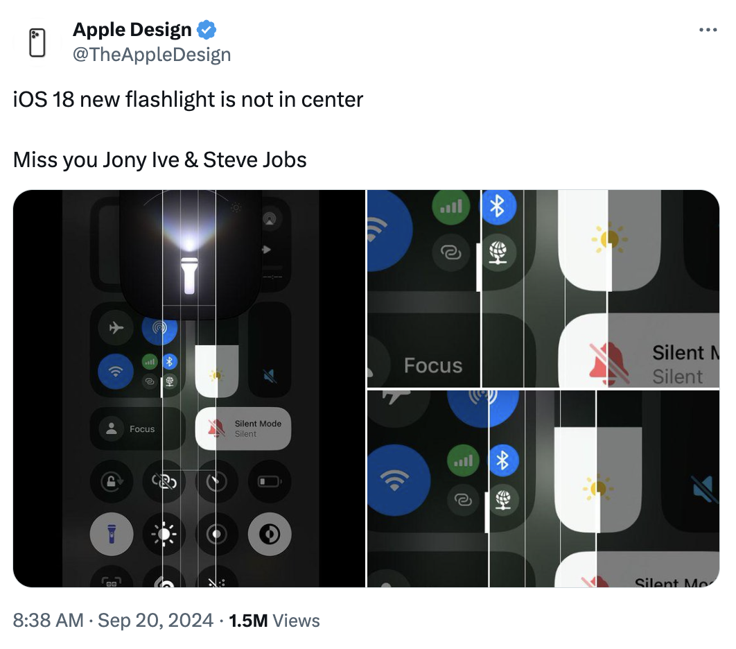
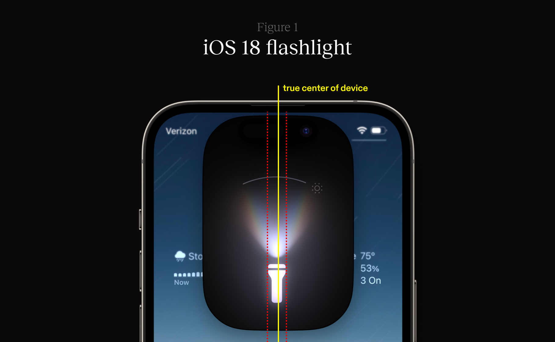
Let’s talk about optical centering and visual balance in UI design. This post has been making the rounds about iOS 18’s flashlight Live Activity, and it’s probably time we have The Talk. About precision vs perception in interface design, that is.
-
Some users have pointed out that the flashlight icon in the Live Activity isn’t mathematically centered. At first glance, this might seem like an oversight. But this is a deliberate choice, rooted in centuries-old design principles.
-
Optical centering (or optical alignment) is the practice of adjusting elements to appear centered or balanced to the human eye, even if they’re not mathematically precise. This technique has been used in art and architecture for millennia, well before iOS 18.
-
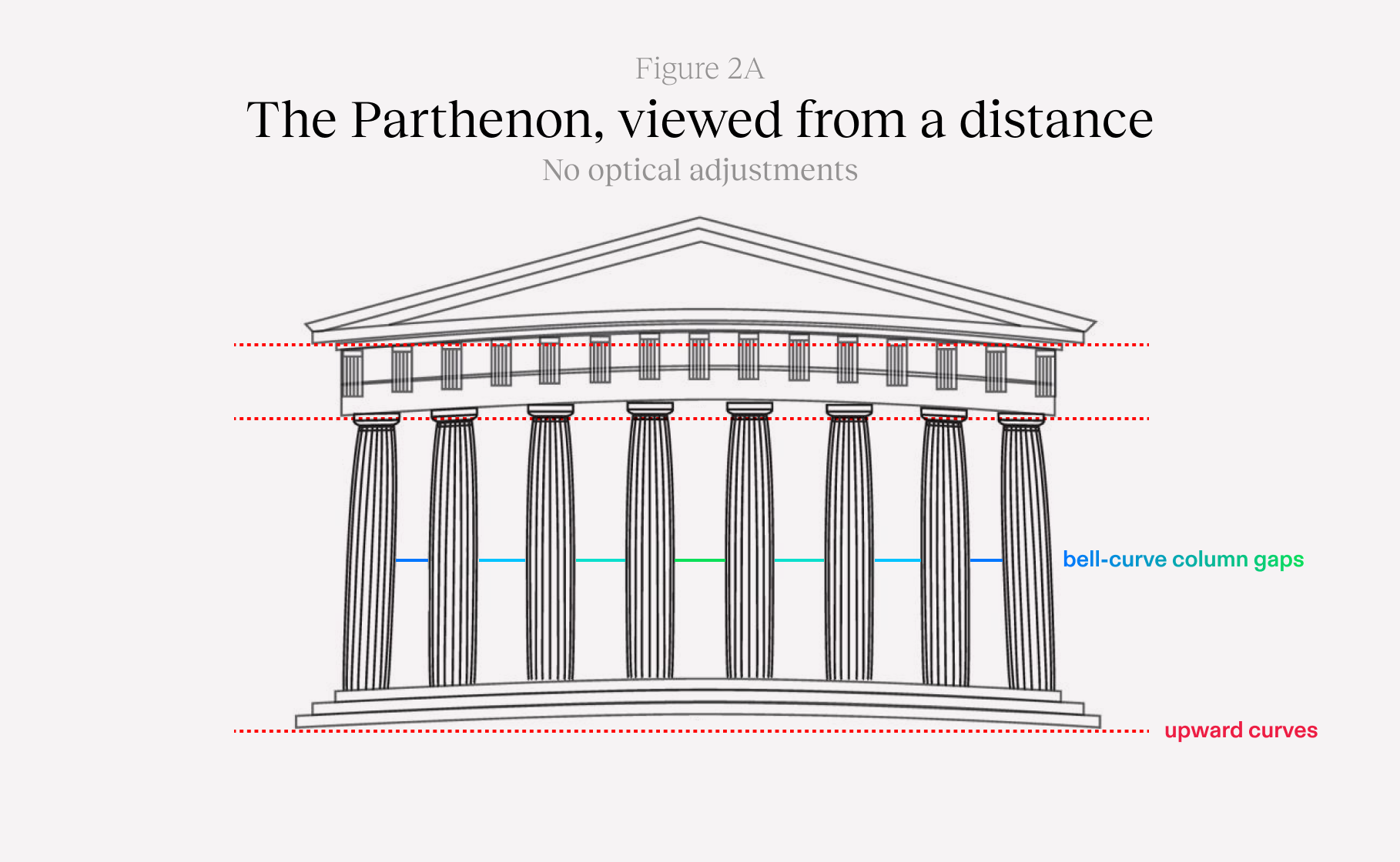
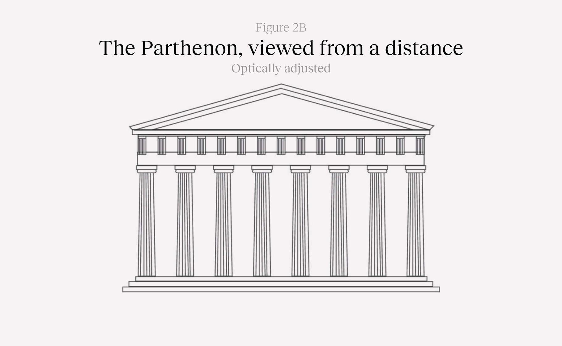
(The designer is breaking out Greek architecture diagrams, we’re getting serious.)
Consider the Parthenon in Athens. Its columns aren’t perfectly straight — they have a slight curve. This subtle adjustment, known as entasis (from Greek, ‘to stretch tight’), creates the illusion of perfectly straight lines when viewed from a distance.
Even 2,500 years ago, our ancestors had to sigh and metaphorically detach an instance since mathematical precision doesn’t always translate to visual harmony.
-
Fast forward to today and we see these principles everywhere: iconography, logos, typesetting.
The Google “G” logo, for instance, isn’t geometrically perfect. Its designers adjusted it away from a perfect circle to appear balanced. If you contort the logo to undo these adjustments, it just looks weird.
As does the play button when mathematically centered, or a leading-aligned paragraph when you align the glyphs by their actual shape.
-
Apple has a long history of prioritizing visual perception over mathematical precision in their interfaces.
Even as far back as the 90s, Apple’s font rendering methodology has been “make this text look as similar as possible to a printed page at the cost of some blurriness.”
Meanwhile, Microsoft’s has been “cram the glyph into the nearest pixel at the cost of staying true to the font’s design,” which caused type to look thinner than it actually would appear when printed.
-
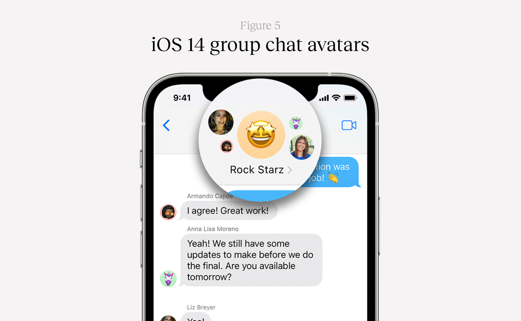
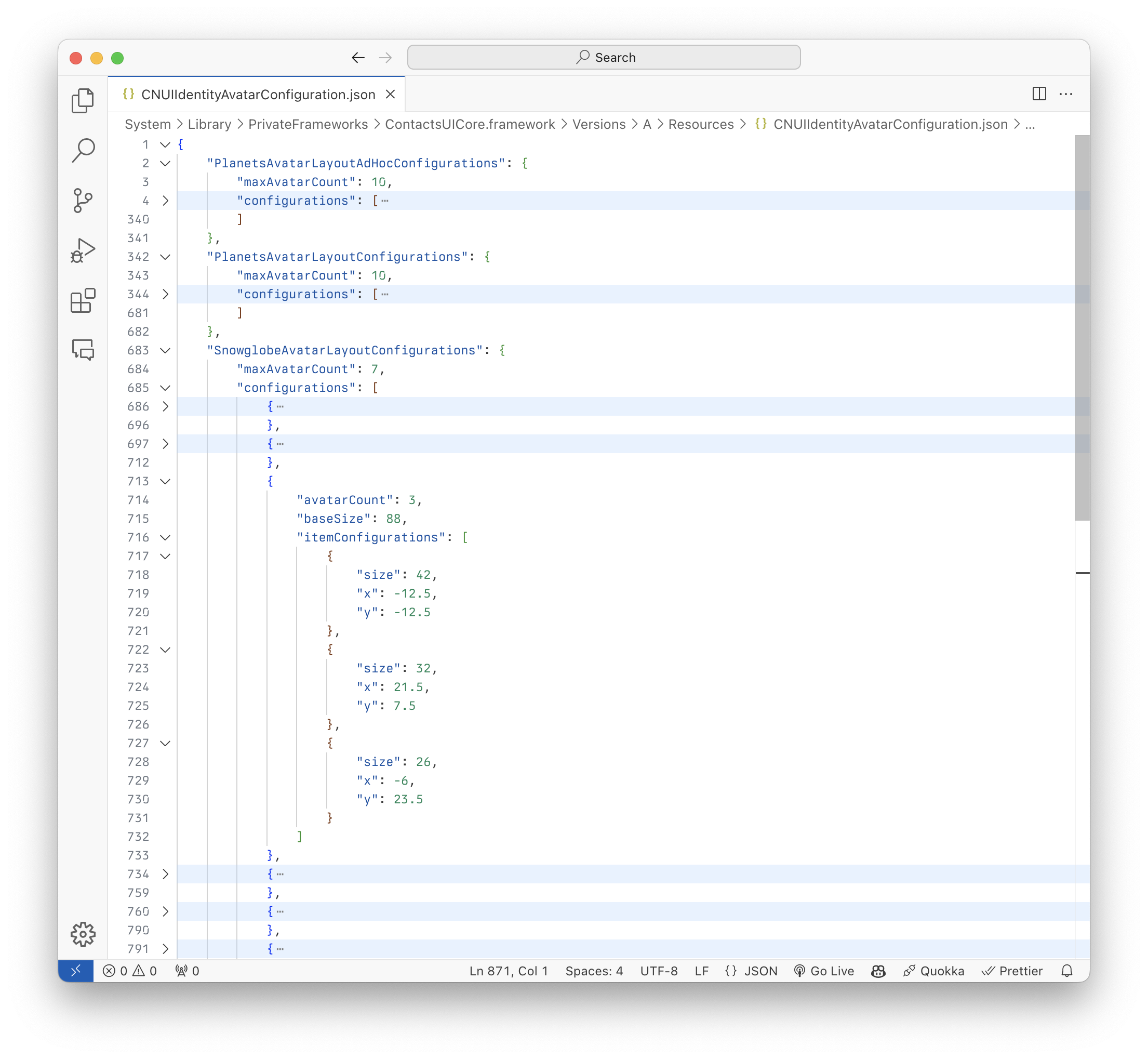
But let’s bring it back to iOS and the post that set off this discourse. The flashlight icon is just the tip of the iceberg. We would like to call a surprise witness to the stand: a reverse-engineered iMessage group chat avatar layout.
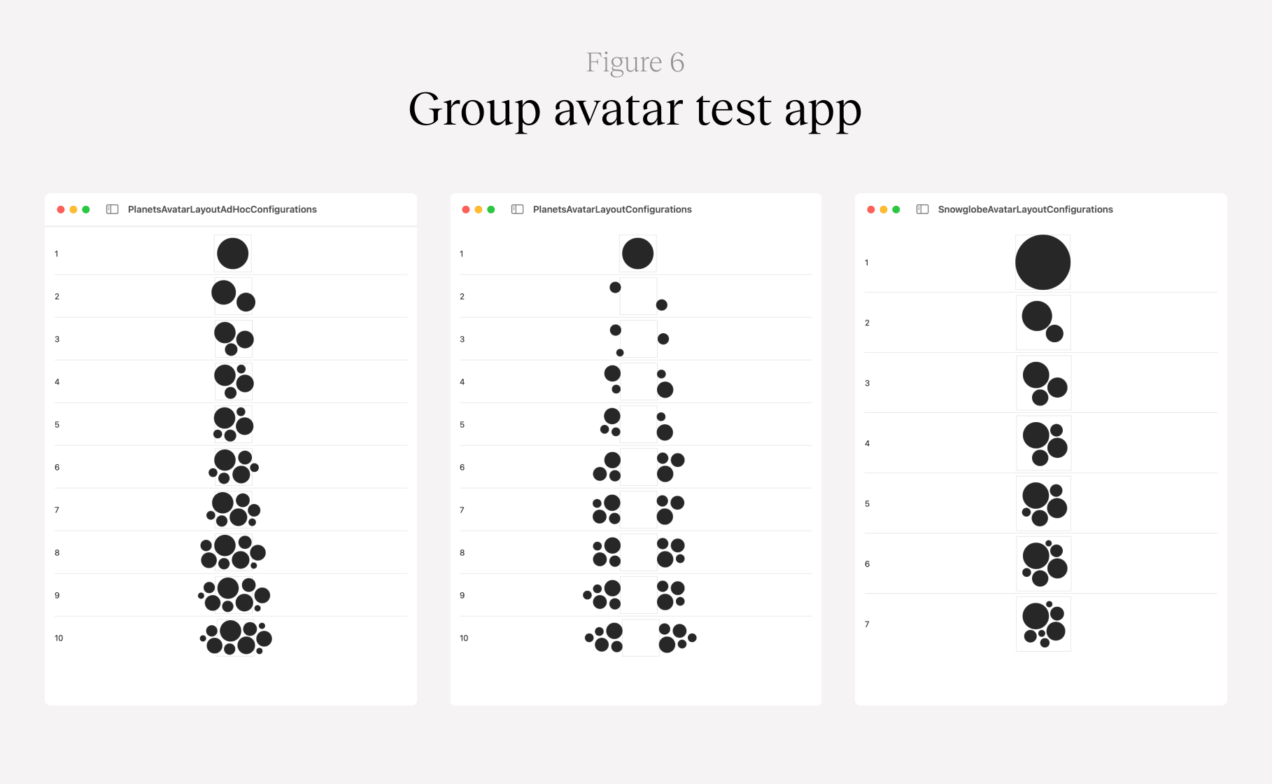
It’s a really beautiful piece of design — it mimics nature with either this planet solar system layout or a snow globe–style layout in your conversation list.
-
Our designer @samhenrigold was curious about how this view was created and investigated.
You might think, like he did, that this is the result of some clever algorithm. Some design system with tokens for this, maybe something crazy like a circle packing algorithm.
-
Sam went on a wild goose chase, ripping open framework binaries to see where this layout was happening. It turns out, it’s not even remotely that deep. On your Mac, right now, go look at this file:
/System/Library/PrivateFrameworks/ContactsUICore.framework/Versions/A/Resources/CNUIIdentityAvatarConfiguration.json
-
That’s it. That’s the genius algorithm. It’s a JSON file that precisely defines the size and position of these avatars.
This probably isn’t generated programmatically – it’s likely a designer somewhere at Apple, meticulously moving circles around on a canvas, nudging them pixel by pixel until they strike the right visual balance. The file is filled with truly hideous numbers that have no place in a design system — 23.5, 7.5, -6 — but it all works.
-
We even wrote a test app that parses this JSON file, just so we could confirm our suspicions.
-
These micro-adjustments are part of what makes great design. And they require an understanding of how our brains perceive visual information. It’s not something you can automate, write a test for, or cram into a design system.
Design systems are conceptually against a token like `PlayButtonIconOffset` or `AvatarTopLeftScaleMultiplier` or `OnboardingCompleteCheckmarkDrawAnimationSpringDamping`.
Sometimes you just need to go off-roading.