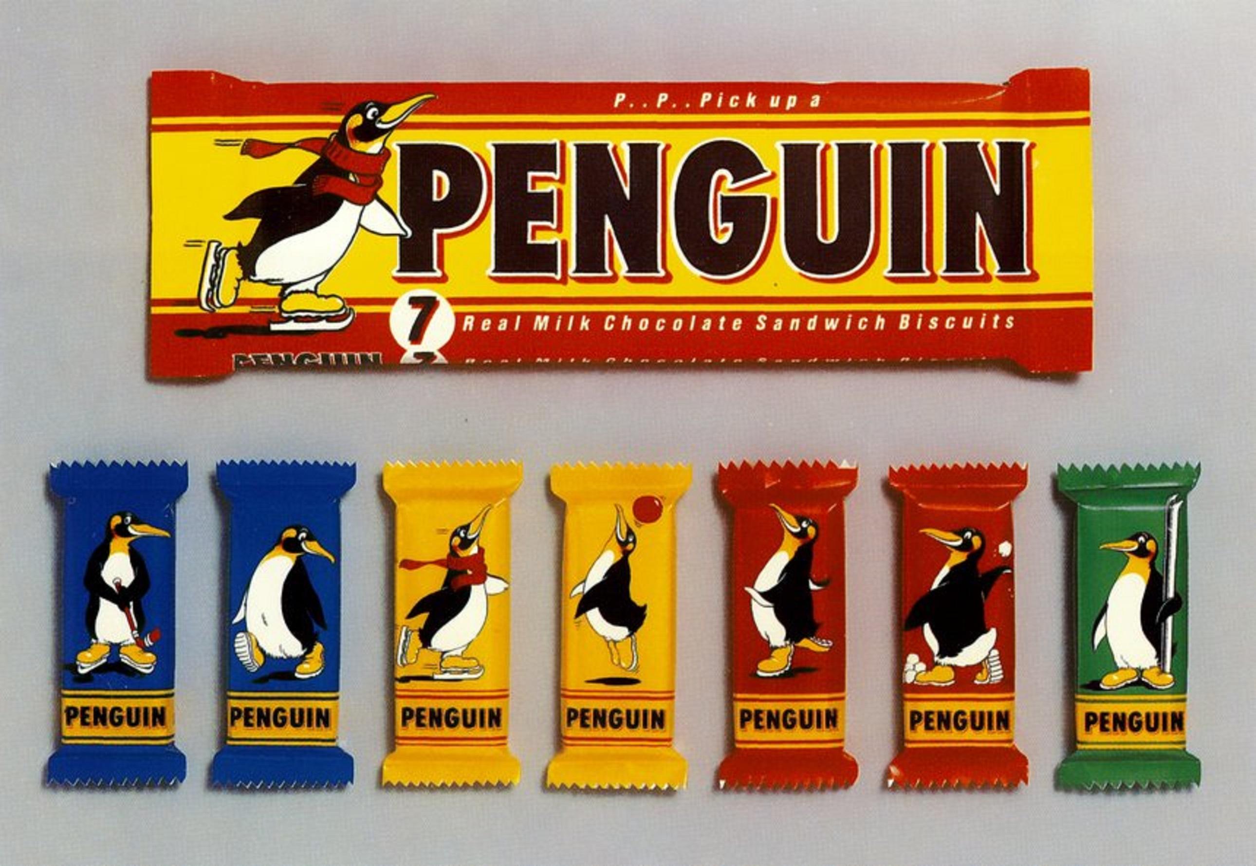
these have so much more character than the modern packaging designs
-
these have so much more character than the modern packaging designs
-
i swear something happened to colours that were used in product design from before the 90s-00s to afterward. barely anyone uses those really rich, deep reds or warm yellows or subdued greens anymore, even people that are trying to invoke a retro feel. that's one of the things you notice when they make a reproduction of a vintage product: the colours are wrong? like they'll come in the same selection of colours but they won't be the right ones or something
-
Alex@rtnVFRmedia Suffolk UKreplied to josef last edited by
@jk the colours of everything have got duller since the late 80s/early 90s - I'd assumed that "everything was brighter in 1970s/80s" was just me being a kid/teen and my eyesight changing, but I've looked at modern photos of items from that era and there definitely were more bright colours everywhere..
-
Jason Lefkowitzreplied to Alex@rtnVFRmedia Suffolk UK last edited by
@vfrmedia @jk Some of that is just changing fashion. Here in the US, for instance, the '70s were the age of earth tones -- browns and greens. Then when that became unfashionable in the '80s people went for screaming neon, as a way of emphasizing that the old trends were over. Then by the early oughts that mellowed into featureless "minimalist" chic. And now the earth tones are coming back.
I suspect part of the story comes from the production side -- different materials and processes lend themselves to different colors. But part of it was also just tastes evolving.
https://www.vogue.com/article/why-1970s-interior-design-is-trending-again