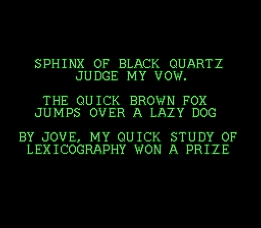
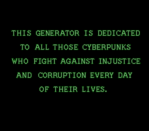
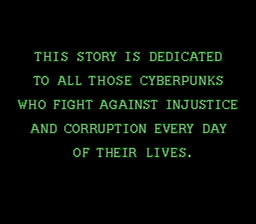
I checked, and annoyingly this class scene from Snatcher is implemented as just some BG tiles of these exact words, there's no font here to generatorize.
-
THERE'S TWO DIFFERENT VERSIONS OF THE "S" IN THIS SCREEN
-
I can now generate the word "THIS" entirely correctly.
You will note this is the first word of the text.
-
Nuclear Oatmeal :verified:replied to Foone🏳️⚧️ last edited by
Are you sure that's not CYBERPL'NKS? I'm guessing this is a Klingon thing, yeah?
-
Foone🏳️⚧️replied to Nuclear Oatmeal :verified: last edited by
@uss_oatmeal I've not yet had to generatorize a game which uses tlhIngan Hol but it's only a matter of time
-
I'm up to "CYBERPUNKS" now.
The "E" in "CYBERPUNKS" is different than both the ones in "DEDICATED" so I'm just gonna mark that down as "they made a mistake" -
I wonder if there's a letter-pair pangram.
Like I've already got it doing a pangram so I can see all the letters in context and adjust the kerning, but there's all kinda of letter combos not used in them.
-
Foone🏳️⚧️replied to Foone🏳️⚧️ last edited by [email protected]
the "T" is available in two variations as well. BOOO
-
@foone this stork
-
Finally got the kerning into a halfway decent form, and just had to give up on some pixel-accuracy because THEY'RE NOT ACCURATE EITHER

-
 P [email protected] shared this topic
-
@foone Have you accidentally double-spaced before CORRUPTION?
-
@foone I have *no* idea about kerning whatsoever so from that absolute ignorance I ask: isn't that “i” a bit spacey?
-
@nirro it is, but that's consistent with how Konami did it.
-
@growf Nope, that's my trying to match the original Konami spacing
-
-
@foone I have the feeling this would have been easier with the MSX version of the game, although the font has less “character” (at least the one in the fan translation, pun intended).

-
@aperezdc yeah, I specifically wanted this version because it's such a cool font

