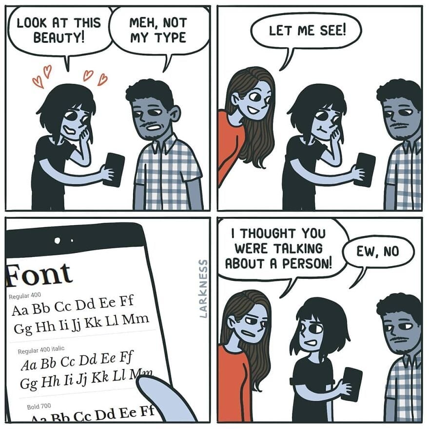
Meh, not my type
-
And Jeeves & Wooster, and Poirot.


Poirot is obviously the inspiration here, in style and name.
-
I really love the numbers, though.
I've discovered that it's a horrible screen font, though: far too spindly to be easily readable. I still use it, but I have to make it larger than usual and bold, and it's still a little hard to make out sometimes.
Oh, what we sacrifice for aesthetics.
-
[email protected]replied to [email protected] last edited by
idk what you mean by universal; this is a typographical choice. the only reason you see more uppercase numbers everywhere is because of typewriters and by extension computers. I don't think people make a point of lining numbers up with cap height in handwriting.
-
[email protected]replied to [email protected] last edited by
You might enjoy Futura, the ITC Avant Garde Gothic family, or Century Gothic...
-
[email protected]replied to [email protected] last edited by
FWIW, these are "old style" numerals, and there are also versions of Fira Sans with "tabular" numerals that are all the same height (e.g., in LaTeX, you can pick either one).
-
[email protected]replied to [email protected] last edited by
Sure, but we use Papyrus, not Comic Sans.
-
Grotesque.
-
I like Ubuntu Mono but I’ll admit it’s a bit flashy for a code font.
-
[email protected]replied to [email protected] last edited by
Yes, it's grotesque.
-
[email protected]replied to [email protected] last edited by
Eh, just a cheap Helvetica clone.
-
[email protected]replied to ElectricMachman last edited by
Nice find, thanks!
-
0 seems a bit too indistinguishable from O, but otherwise I'm also a big fan of the numbers.
-
[email protected]replied to [email protected] last edited by
?

-
[email protected]replied to [email protected] last edited by
I love Century Gothic and most of Futura, though I'm not sure how I feel about Futura's lowercase j.
-
[email protected]replied to [email protected] last edited by
I didn't say it was a well made cheap Helvetica clone.

 ️
️ -
[email protected]replied to [email protected] last edited by
Any Inter fans?

-
[email protected]replied to [email protected] last edited by
I'm not sure how I feel about Futura's lowercase j
Gets the job done, with minimal effort.
-
[email protected]replied to [email protected] last edited by
They did, in fact, nail it.
-
[email protected]replied to [email protected] last edited by
But we are speaking about a Computer Font right now, idk what that has to do with handwriting and who cares about handwriting in 2024. With universal i mean that any kind of number should look god, no matter if its a Telefon Number, a Price or a Street Number.
-
[email protected]replied to [email protected] last edited by
The subtle kerning of it, the tasteful thickness of it, my god it's even got serifs.

