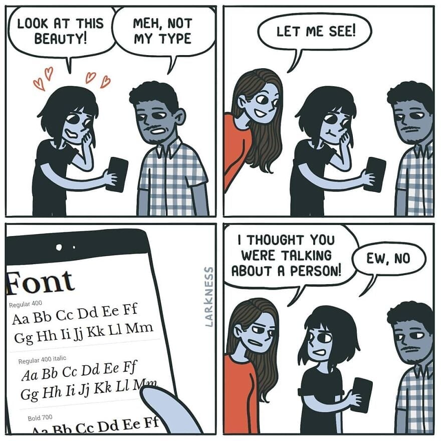
Meh, not my type
-
[email protected]replied to [email protected] last edited by
It's a good job they explained the joke.
-
I’m more of a sans serif kinda guy
-
[email protected]replied to [email protected] last edited by
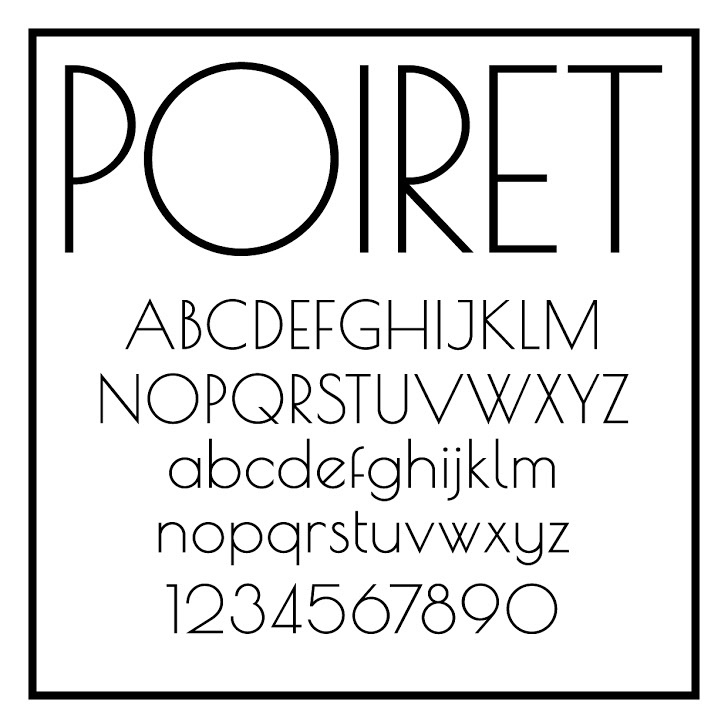
ITC Avant Garde, so beautiful
-
[email protected]replied to [email protected] last edited by

-
[email protected]replied to [email protected] last edited by
-
[email protected]replied to [email protected] last edited by
Wait, is this Comic Sans? Some just want to see the internet burn
-
[email protected]replied to [email protected] last edited by
....Isn't Avant Garde a sans serif?
-
[email protected]replied to [email protected] last edited by
Wasn't there some theory about comics being improved by removing the final panel?
-

The most beautiful font ever. Although, this Metropolis is pretty nice, too.
-
[email protected]replied to [email protected] last edited by
Definitely. I was going to post this:
Remove 4th panel.
-
[email protected]replied to [email protected] last edited by
Monaspace Krypton for coding. I'll take no questions.
-
[email protected]replied to [email protected] last edited by
I don't know, I just love how it looks
-
I have the urge to drink martini and rewatch The Great Gatsby.
-
Love the lowercase, hate the uppercase. Look at what they did to my boy B.
-
[email protected]replied to [email protected] last edited by
I feel like the comic sans hate did die down in recent years and justly so. It was overhated IMHO. It's an ok font for certain uses. The problem was mostly people misusing it to serve roles it was never designed for.

