Hello, I'm an open source software engineer in my late 30s living in #Seoul, #Korea, and an avid advocate of #FLOSS and the #fediverse.
-
Hello, I'm an open source software engineer in my late 30s living in #Seoul, #Korea, and an avid advocate of #FLOSS and the #fediverse.
I'm the creator of @fedify, an #ActivityPub server framework in #TypeScript, and @hollo, a fediverse microblog for single users.
I'm also very interested in East Asian languages (so-called #CJK) and #Unicode. Feel free to talk to me in #English, #Korean (#한국어), or #Japanese (#日本語), or even in Literary Chinese (#文言文/#漢文)!
-
洪 民憙 (Hong Minhee)replied to 洪 民憙 (Hong Minhee) last edited by [email protected]
安寧하세요, 저는 서울에 살고 있는 30代 後半 오픈 소스 소프트웨어 엔지니어이며, 自由·오픈 소스 소프트웨어와 聯合宇宙의 熱烈한 支持者입니다.
저는 TypeScript用 ActivityPub 서버 프레임워크인 @fedify 프로젝트와 싱글 유저用 聯合宇宙 마이크로블로그인 @hollo 프로젝트의 製作者이기도 합니다.
저는 東아시아 언어(이른바 #CJK)와 유니코드에도 關心이 많습니다. Mastodon에서는 國漢文混用體를 쓰고 있어요! 제게 韓國語나 英語, 日本語로 말을 걸어주세요. (아니면, 漢文으로도!)
#툿친소 #연친소 #별친소 #國漢文 #國漢文混用 #國漢文混用體 #국한문 #국한문혼용 #국한문혼용체 #한국어 #일본어 #영어 #한문 #연합우주
-
洪 民憙 (Hong Minhee)replied to 洪 民憙 (Hong Minhee) last edited by [email protected]
-
日本語圏では、introductionのように広く使われている定番の自己紹介ハッシュタグはないと思います。(サーバー単位のコミュニティでは独自の自己紹介タグがみられます)
関心の高い方が多いと思いますので、紹介させてもらいますね。
-
@noellabo 残念ながらそうなんですね!一応 #自己紹介のハッシュタグを使ったのですが、なんか広告も多いようで、あまり使われていないような気がしました。教えてくれてありがとうございます!

よろしければ、拡散お願いします!
 日本語圏のフェディバースの方々と交流したいです。
 -
@hongminhee @fedify @hollo こんにちは!ようこそ!
-
@yamako こんにちは!よろしくお願いします。
-
みりめい :no_fedibird_no_life:replied to 洪 民憙 (Hong Minhee) last edited by
@hongminhee 洪さんはじめまして!
便利なツールを開発してくださりありがとうございます。TypeScriptで書くことがあれば使わせていただきます。
私は鉄道に興味があります。大阪にあるソウルメトロと外観がそっくりな飲食店に通いつつ、いつか韓国の列車や地下鉄に乗ってみたいと思っています。 -
洪 民憙 (Hong Minhee)replied to みりめい :no_fedibird_no_life: last edited by [email protected]
@kawaiirailroads みりめいさん、初めまして!鉄道がお好きなんですね。韓国は日本ほど鉄道が発達していないため、多様性に欠けますが、それでもいつも便利に利用しています。(国鉄なので価格も安いです)いつか韓国にも遊びに来てください!
-
EllenInEdmonton :mstdnca:replied to 洪 民憙 (Hong Minhee) last edited by
@hongminhee @fedify @hollo
안녕하세요. -
Carlana Johnson :v_trans:replied to 洪 民憙 (Hong Minhee) last edited by
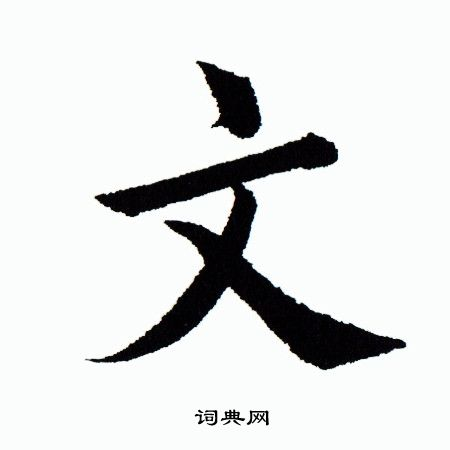
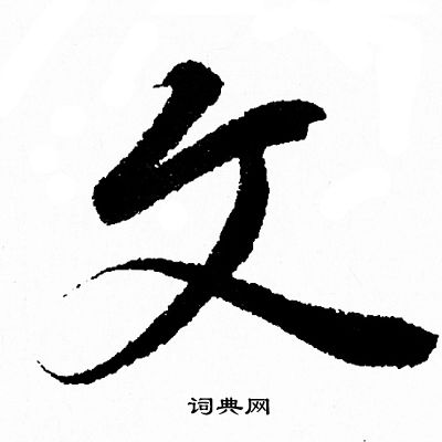
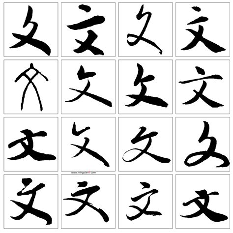
@hongminhee Okay, you read all three CJK languages, and I have a question about typography that has bothered me for a while, so I will ask you:
For the last few years, an icon that combines 文 and A has become the standard symbol for "translate" or “change language". However, to me who learned Japanese as an English speaker, the 文 often looks wrong because the third stroke doesn't touch the line above it. I attached an example from Ivory. Some examples look more like ヌ than 文 to me. My question is, is this normal in Chinese typography or are American icon designers screwing the look of 文 up? Is it acceptable in Japanese typography, and I just haven't seen enough fonts?

-
洪 民憙 (Hong Minhee)replied to Carlana Johnson :v_trans: last edited by
@carlana I guess why you haven't been exposed to such a shape of 文 is probably because modern Japanese people tend to be picky about details of Chinese characters. On handwriting, the last stroke of 文 oftentimes doesn't meet the second stroke, and people can recognize it without problem! However, on printing, it's a kind of awkward indeed.
-
Carlana Johnson :v_trans:replied to 洪 民憙 (Hong Minhee) last edited by
@hongminhee I've seen things where the first stroke is diagonal instead of vertical, but yeah, I can't recall seeing anyone in typography not connect to stroke two. But icons often have a huge gap with stroke two!
-
洪 民憙 (Hong Minhee)replied to Carlana Johnson :v_trans: last edited by
@carlana Here are few examples! In the cursive script (草書), they tend do not meet.
-
洪 民憙 (Hong Minhee)replied to EllenInEdmonton :mstdnca: last edited by
@EllenInEdmonton 안녕하세요!