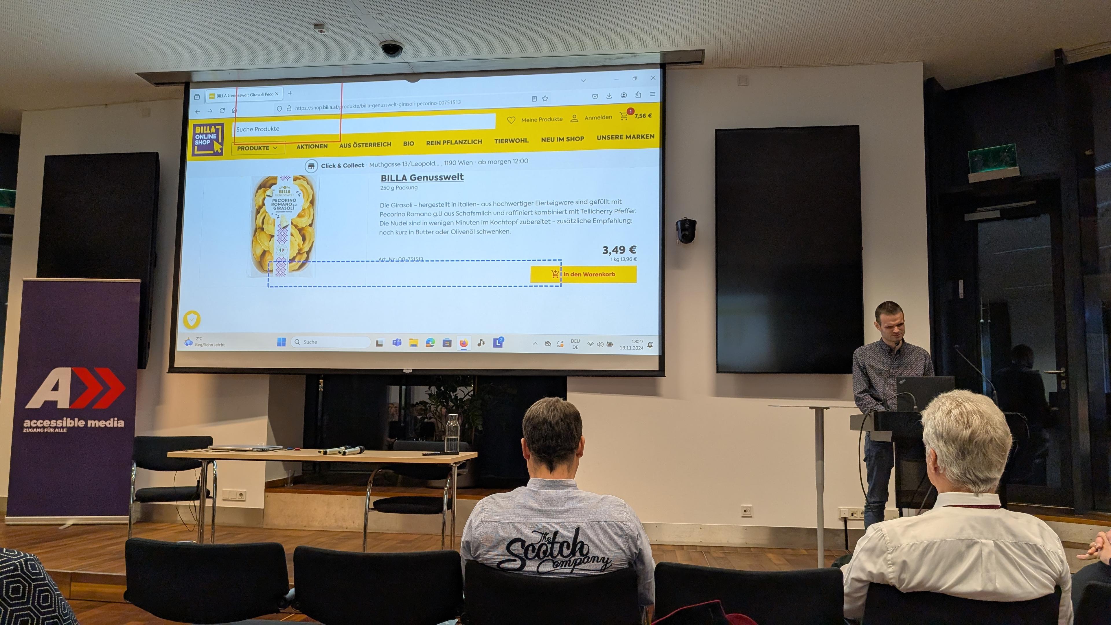
I'm at an event watching a screen reader user and dev navigate an Austrian online shop (billa.at) and explain how they order groceries online.
-
I'm at an event watching a screen reader user and dev navigate an Austrian online shop (billa.at) and explain how they order groceries online. My main takeaways:
- proper headings and landmarks are essential for navigation
- skip links are super useful
- aria-label is error prone, e.g. missing translations
- image descriptions containing info about size and packaging are useful. Generic or repetitive descriptions useless.
- focus management done right can safe time
- Apple/Google pay useful -
@matuzo Aren't these take-aways a little... basic for someone who's written an entire book on accessibility stuff?

-
@kc You can call them basic or you call them affirming.

Copyright © 2024 NodeBB | Contributors

