Minor improvements to the mobile menu for a significant improvement in user experience
-
-
-
-
-
@baris said in Minor improvements to the mobile menu for a significant improvement in user experience:
Not sure about the dropdowns in the navigation, if a site uses too many of them it might be too many items if they are visible by default.
I see. Since I felt that the left side window is quite plain now, it can take some lists/items easily.
-
@crazycells Yeah there are forums out there using the dropdowns heavily. For example

-
@baris said in Minor improvements to the mobile menu for a significant improvement in user experience:
@crazycells Yeah there are forums out there using the dropdowns heavily. For example
yes, that would be a problem for those forums...
Do you think it is possible to implement "hide on mobile" "hide on desktop" options for the navigation bar? This way, everyone could edit the navigation bar icon for each medium; and can have different navigation options (in a different format) for mobile and desktop.
-
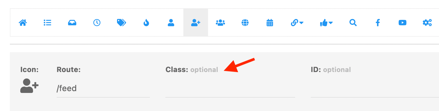
@baris There is a "class" option in the navigation bar icons...
Can I just write there a made-up class name like in the HTML widgets and then hide/show that class with CSS according to screen resolution?
-
@crazycells Yes you can give custom class names there, I think you can even use the default bootstrap classes to hide it on mobile. Try
hidden-xsand it should not show up on mobile. -
@baris said in Minor improvements to the mobile menu for a significant improvement in user experience:
@crazycells Yes you can give custom class names there, I think you can even use the default bootstrap classes to hide it on mobile. Try
hidden-xsand it should not show up on mobile.Yes,
hidden-xsworks... Thanks a lot.
But I will probably go with something not default... so I do not have any problem/conflict in the future... I will go with
hiddeninmobilehiddenindesktopclasses and write custom CSS codes for various screen resolutions. -
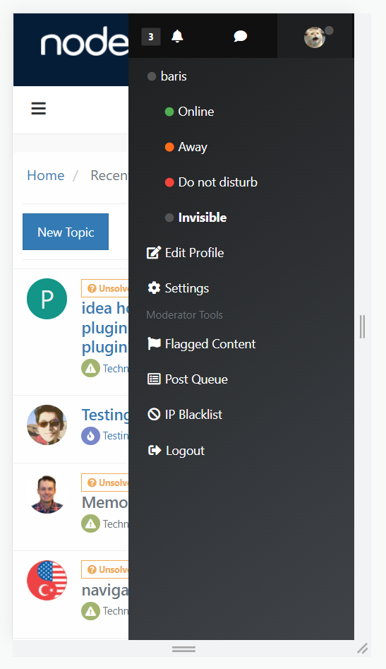
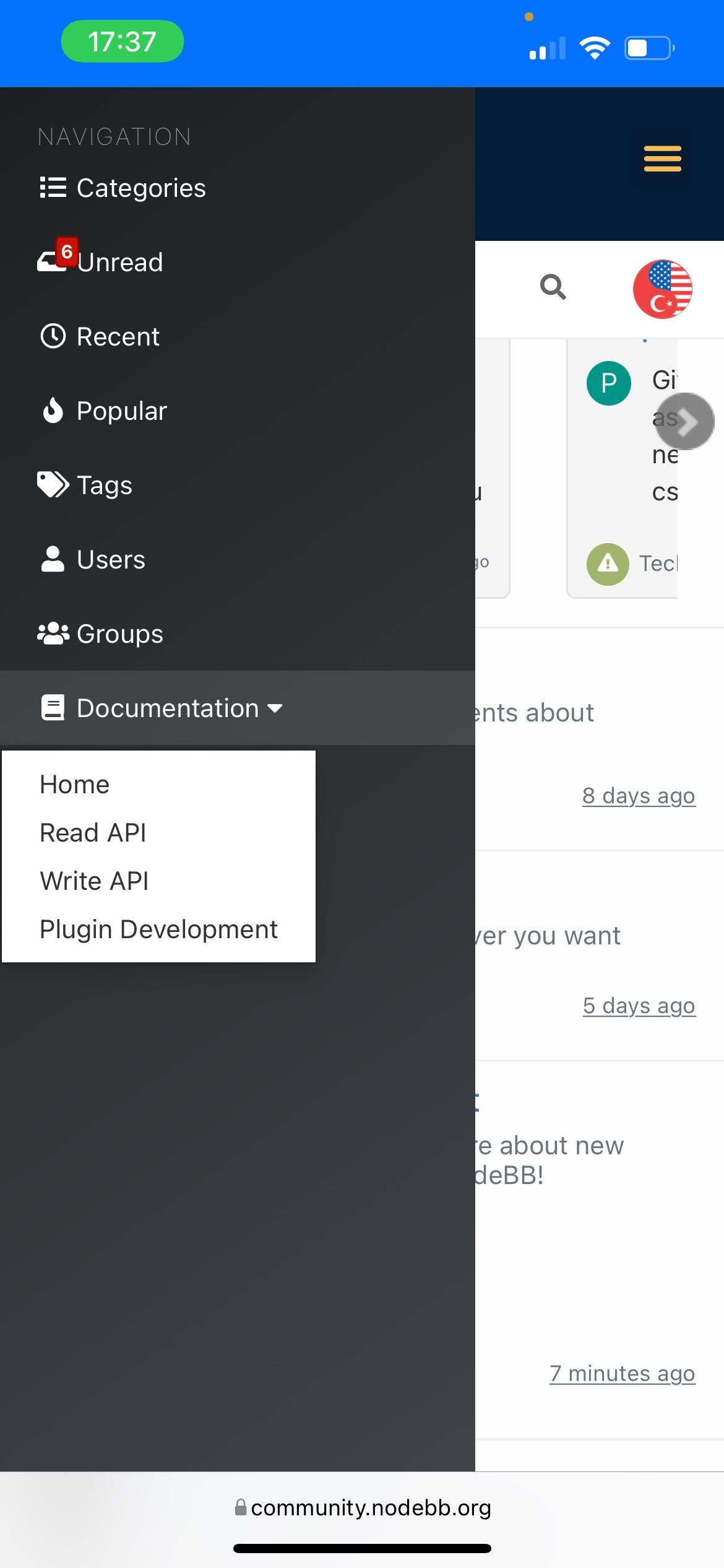
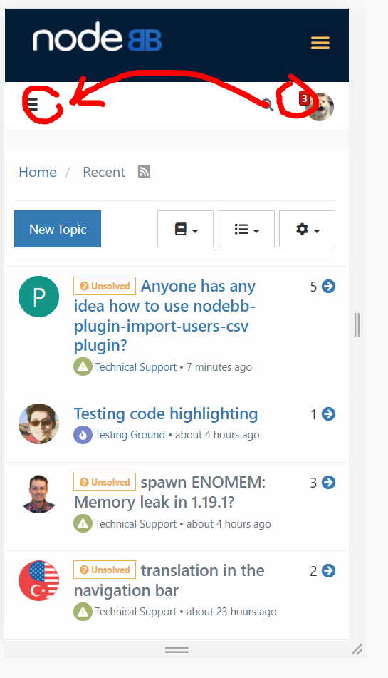
@baris The inscription Navigation in the left mobile menu can be removed. Now it is not needed. Instead, add an X for closing, as in the standard menu.
If possible, add the word search... and an icon to enable search. As in this example

-
-
-
-
-
@phenomlab said in Minor improvements to the mobile menu for a significant improvement in user experience:
@volanar A cheap workaround here would be to set the default homepage as recent
")
Why set up workarounds when you can do it more conveniently? We limit ourselves in the settings to only recent ones. We need to think about the convenience for all users
