Why polling is opinion journalism, in one chart:
-
Why polling is opinion journalism, in one chart:
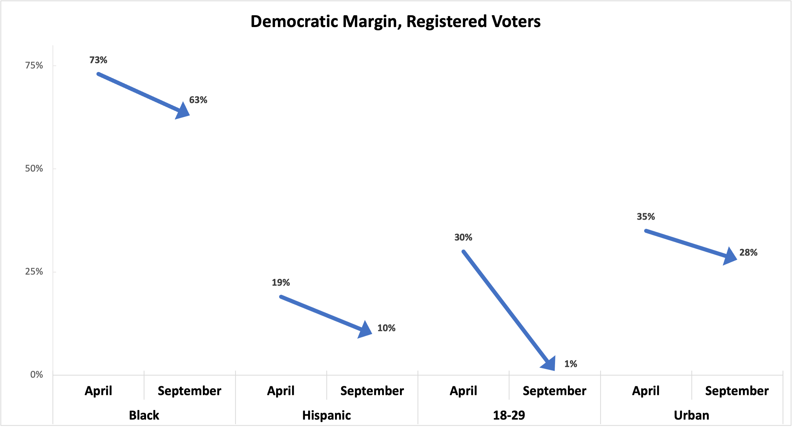
In daily political coverage, we are constantly treated to dramatic graphs like the one below.
There’s just one problem: The data points are real, but the dates are not. “April” is actually the results of a Pew survey of registered voters, and “September” is a New York Times survey of registered voters—both fielded recently over almost exactly the same time period.
-
Mike Podhorzerreplied to Mike Podhorzer last edited by
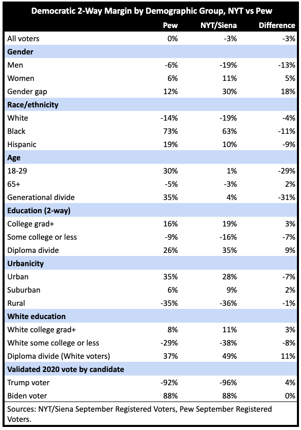
Here are the real results of the latest Pew and NYT/Siena polls.
Look at the dramatic differences in the crosstabs: An 18-point difference in the gender gap of the two-way Democratic margin! A 29-point difference on the youth vote!
-
Mike Podhorzerreplied to Mike Podhorzer last edited by
To be clear, I am not trying to “unskew” or impugn the integrity of either Pew or NYT/Siena. They are both among the highest-quality surveys we have.
This exercise is not meant to show that either survey is “wrong”—but to show that there is no “right” answer.
EVERY poll involves what I call “squeezing the balloon.” Every pollster has to make decisions about how to weight what is inevitably an unrepresentative sample.
-
Mike Podhorzerreplied to Mike Podhorzer last edited by
That’s why we very often see very wide variations in subgroups between different surveys that have the same topline horse race result.
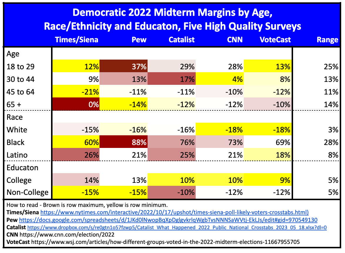
We even see this in high-quality surveys on the final results of an election. Look at this chart on the 2022 midterms (with post-election data from Pew, Catalist, CNN, and VoteCast, as well as the final pre-election NYT/Siena survey.)
-
Mike Podhorzerreplied to Mike Podhorzer last edited by
These decisions are based on informed opinions—but they are opinions. That’s why I say polling is opinion journalism.
And that’s why we need to talk more about the “MARGIN OF POLLSTER.”
Read more: https://www.weekendreading.net/p/why-polling-is-opinion-journalism
-
Mastodon Migrationreplied to Mike Podhorzer last edited by